
Excel Time Series Chart
November 21, 1999 - by Bill Jelen
Roy asks this week's Excel question.
I have a small problem regarding the x-axis on Excel charts. The Excel data that I have needs to be plotted against time down to the minute. The Excel data points are randomly spaced, so there is not an equivalent amount of time between each data point. When Excel creates my chart, it spaces each data point out equally, giving a misleading result.
In older versions of Excel, the chart wizard would assume the X-axis is a "category" type axis and spread each data point out equally across the X axis. This is fine is your categories are "apples, bananas, cherries" but does not make sense if each data point is a date value and the dates are not equally spaced.
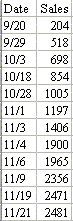
To the left are cumulative sales from Josh's popcorn sales drive. Josh is only 8, so he did not record the total sales each day. Sometimes it was a week between observations, other times when sales were heating up, it was just a day or two.
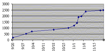
If you charted this line in an older version of Excel, the chart would evenly space out each observation, leading you to believe that the sales were nearly linear over time. To the right is the old default chart from Excel.
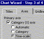
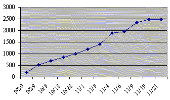
In Excel 2000, at the chart wizard step 3 of 4, click the axes tab and you can indicate that the X axis is a time-scale. Now the default chart plots the data points with the proper amounts of time between them. In this chart, you can see that sales really took off around November 8th when Josh advertised popcorn on the Internet.
If you are lucky enough to be using Excel 2000 and have daily-based dates, you are all set. However, there is one large problem with the Time Series option that Microsoft added for charting. It will not deal with an x-axis that is based on hours and minutes instead of days. One would think that if Microsoft added something a feature to handle a "time-scale" it would actually handle time instead of just days. I am sure that if Woody Leonard ever updates his book on Excel 97 Annoyances, this new problem will be mentioned.
There is a solution for Roy's problem which can be used in any version of Excel and can be scaled to used with hours, minutes, seconds, or nanoseconds. Roy did not give me particulars on his data, so here is a ficticious example.
To the left are cumulative sales from Josh's popcorn sales drive. Josh is only 8, so he did not record the total sales each day. Sometimes it was a week between observations, other times when sales were heating up, it was just a day or two.
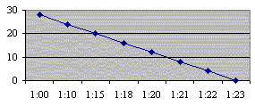
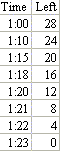
At 1:00 PM, I opened a 28 oz container of delicious chocolate caramel crunch popcorn and placed it by the water cooler at work. The chart at the left shows how much was left in the container at various points in time. The problem is how to graph this so that the times are accurately represented along the x-axis. The default line chart from Excel shown at the right would lead you to believe the popcorn was consumed in a linear fashion.
The solution to Roy's problem is to use an X-Y chart instead of a line chart. Here are the steps to create and format the chart:
- Highlight your data. From the menu, pick Insert - Chart
- In the Chart Type field, select "XY (Scatter)".
- In the Chart sub type field, select "Scatter with data points connected by smoothed Lines"
- Click finish.
- By default, Excel will draw the chart with the Y axis crossing the X axis at midnight. In this case, we would like the X axis to start around 1:00 PM and to end around 1:25 PM. It would be cool to have tick marks every five minutes.
- Calculate the start time for the X axis. In a blank section of the worksheet, enter four cells. Enter 1:00 PM, 1:25 PM, 0:05 and 0:01.
- Use Format Cells Number to reformat these four cells as a decimal with 5 decimal places. This will tell you that 1PM is 0.5417, 1:25 is 0.559, 5 minutes is 0.0035 and 1 minute increment is 0.00069444. Jot these figures down.
- Using the mouse pointer, point to a value along the x-axis of the chart. Right click and pick Format Axis.
- On the scale tab, enter the figures from above. The minimum should be 0.5417. The maximum should be 0.559, the Major unit should be 0.0035 and the minor unit 0.000694. I usually say that Value (y) axis crosses should be the minimum or 0.5417. Click OK.
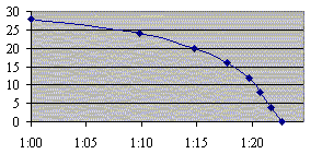
You will now have a graph which accurately represents the slope of the line based on time:
When you need to accurately graph time values along the x-axis and those time values are less than in daily increments, using an XY chart and fiddling with the x-axis values is a solution.
If you would like to try this experiment out for yourself, find you local cub scout pack and buy a tin of the white chocolatey crunch or the chocolate caramel crunch. Thanks for everyone who supported the popcorn sale. Thanks to you, the cub scout pack tripled their sales and can send all of the cubs to camp this spring for free.
Today, November 21st 1999 is the one year anniversary of when Mr. Excel debuted on the web. Thanks to all of my loyal readers who make this page a success.Mr Excel wishes all of our U.S. readers a happy Thanksgiving this week. Have a great holiday!