Area charts with smooth lines?

coldcanuck

New Member
Joined
Aug 3, 2011
Messages
4
I'm trying to plot two sets of data on one chart - the first represents revenue forecasts and are plotted against the secondary axis and the second set represents the confidence interval and is plotted against the primary access. In order to shade in the confidence interval, I plotted the two sets of data using stacked area charts. The revenue forecasts are smoothed line charts.

The problem I'm facing is that the area chart function does not have the capability to smooth the top. It seems this is a common problem. Does anyone have a solution to this common problem? Area charts are the only way I know to fill in between two lines.

Sample file here.
 

Excel Facts

Did you know Excel offers Filter by Selection?
Add the AutoFilter icon to the Quick Access Toolbar. Select a cell containing Apple, click AutoFilter, and you will get all rows with Apple
My answer has two parts:

1. Area charts do not support smoothed lines. You could subdivide the data and determine where the smoothed data goes, which is a bit of a chore. Brian Murphy has posted a file that helps make these calculations at http://www.xlrotor.com/Smooth_curve_bezier_example_file.zip.

2. Smoothed lines make a chart look "nicer" at the risk of making the chart tell lies. I describe the problem in Smooth Talking Lies.
 
Upvote 0
My answer has two parts:

1. Area charts do not support smoothed lines. You could subdivide the data and determine where the smoothed data goes, which is a bit of a chore. Brian Murphy has posted a file that helps make these calculations at http://www.xlrotor.com/Smooth_curve_bezier_example_file.zip.

I don't see how Mr. Murphy's solution is any more than creating a smoothed line graph. And how would I add fill between two Bezier curves?

2. Smoothed lines make a chart look "nicer" at the risk of making the chart tell lies. I describe the problem in Smooth Talking Lies.

Your point is well taken. However, this chart is for the CEO of a billion dollar company, so it's more eye candy and precision planning.
 
Upvote 0
However, this chart is for the CEO of a billion dollar company, so it's more eye candy and precision planning.

Maybe you should be using Microsoft Paint (ha ha).
 
Upvote 0
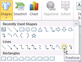
Well, had this problem for a similar situation (marketing document), and it was all going haywire. I figured, might as well draw it.

drawfreeformppt2010_01.jpg


Problem solved, took 2 minutes.
 
Upvote 0

Forum statistics

Threads
1,214,789
Messages
6,121,605
Members
449,038
Latest member
Arbind kumar

We've detected that you are using an adblocker.

We have a great community of people providing Excel help here, but the hosting costs are enormous. You can help keep this site running by allowing ads on MrExcel.com.
Allow Ads at MrExcel

Which adblocker are you using?

Disable AdBlock

Follow these easy steps to disable AdBlock

1)Click on the icon in the browser’s toolbar.
2)Click on the icon in the browser’s toolbar.
2)Click on the "Pause on this site" option.
Go back

Disable AdBlock Plus

Follow these easy steps to disable AdBlock Plus

1)Click on the icon in the browser’s toolbar.
2)Click on the toggle to disable it for "mrexcel.com".
Go back

Disable uBlock Origin

Follow these easy steps to disable uBlock Origin

1)Click on the icon in the browser’s toolbar.
2)Click on the "Power" button.
3)Click on the "Refresh" button.
Go back

Disable uBlock

Follow these easy steps to disable uBlock

1)Click on the icon in the browser’s toolbar.
2)Click on the "Power" button.
3)Click on the "Refresh" button.
Go back
Back
Top