I have a large amount of data stored in a table that is used to update about 8 charts (through named ranges). Each chart has the date and ID as the x-axis with a particular parameter being charted. Each column of the table has its own named range which allows this to work and for the charts to update as more data is added.
This all works great, but now the end user is requesting that one of the series on the charts is broken down into some other series. For example my data could be:
<tbody>
</tbody>Currently, all this data is being charted as one series, but now I would like to have different series for each of the sources. Since there is so much data, I would really rather not have to sort it and manually edit the source data for each of the charts as this would be very time consuming. Does anyone have any solutions on how to separate the named range based on the value in a particular column?
To add a visual of the chart I am trying to edit:
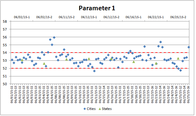
The table above is a simplified version of the data. The charts themselves include data from multiple worksheets, but the series I would like to add would be a breakdown of the Cities series shown above.
Any and all help is appreciated.
This all works great, but now the end user is requesting that one of the series on the charts is broken down into some other series. For example my data could be:
| Date | ID | Source | Parameter 1 | Parameter 2 | Parameter 3 |
| 7/21/15 | 11 | Boston | 12 | 55 | 5.25 |
| 7/21/15 | 12 | New York | 10 | 53 | 5.05 |
| 7/21/15 | 13 | Boston | 10.2 | 57 | 5.16 |
| 7/21/15 | 14 | Albany | 12 | 54 | 4.95 |
| 7/21/15 | 15 | Vermont | 15 | 56 | 5.62 |
| 7/22/15 | 11 | Albany | 14.3 | 53 | 5.34 |
| 7/22/15 | 12 | New York | 11.2 | 55 | 5.80 |
<tbody>
</tbody>
To add a visual of the chart I am trying to edit:
The table above is a simplified version of the data. The charts themselves include data from multiple worksheets, but the series I would like to add would be a breakdown of the Cities series shown above.
Any and all help is appreciated.
Last edited:


