Charting help needed: Shade area between lines, multiple data series

nitrone23

New Member
Joined
Nov 30, 2015
Messages
2
Hi all,

I have tried to follow the example by Peltier shown here: Fill Under or Between Series in an Excel XY Chart - Peltier Tech Blog to shade areas between multiple data series. 2 lines works fine, but the problem is when I try to insert multiple shaded areas in one chart. Can anyone of you help with this?
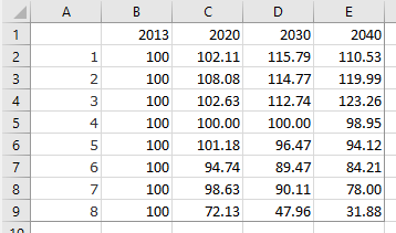
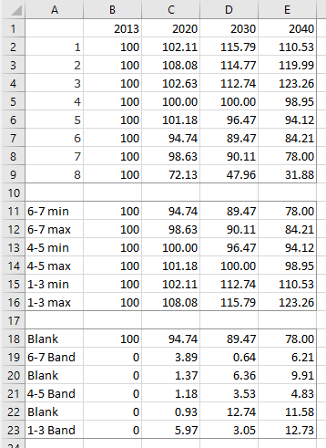
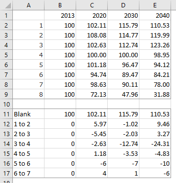
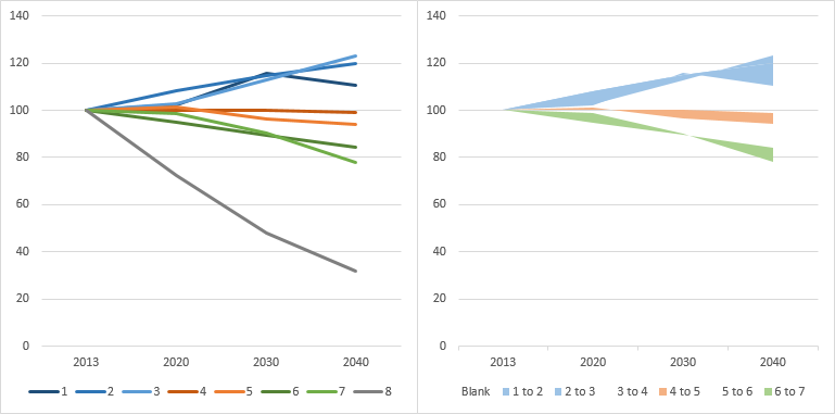
Here's the data:
A B C D E
Scenario 2013 2020 2030 2040
1 100,00 102,11 115,79 110,53
2 100,00 108,08 114,77 119,99
3 100,00 102,63 112,74 123,26
4 100,00 100,00 100,00 98,95
5 100,00 101,18 96,47 94,12
6 100,00 94,74 89,47 84,21
7 100,00 98,63 90,11 78,00
8 100,00 72,13 47,96 31,88

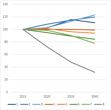
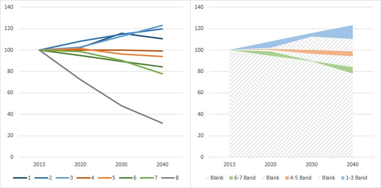
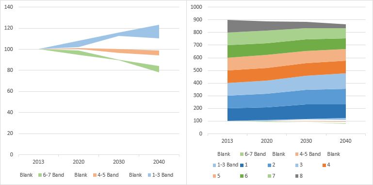
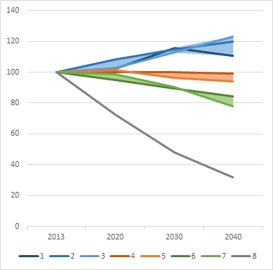
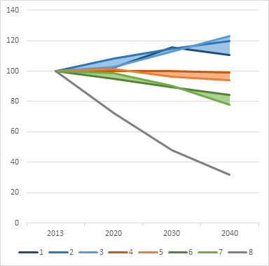
Here's what I want to achieve:

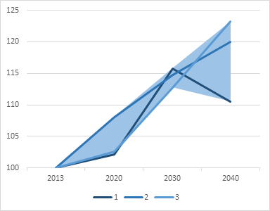
Scenario 1-3 banded together, with the difference between them shaded in one color
Scenario 4-5 banded together, with the difference between them shaded in another color
Scenario 6-7 banded together, with the difference between them shaded in a third color
Scenario 8 as a regular line chart data series.

Is this possible, and is it something that any of you could help me with?
Thanks in advance!
 

Excel Facts

Round to nearest half hour?
Use =MROUND(A2,"0:30") to round to nearest half hour. Use =CEILING(A2,"0:30") to round to next half hour.
ANSWER PART I. Mr Excel's limit of four images has forced me to break my answer into two parts.

Sure, you can do this. It helps if the bands do not overlap, but it will work anyway, as long as you apply some transparency to the fills.

Here is your data, and a line chart I made to see what it looked like. I colored series 1-3 in shades of blue, since they're grouped together, and I colored series 4-5 orange, and 6-7 green.

ThreeBandsData1.png


ThreeBandsChart1.png


In rows 11-16, I determined the min and max for each of the grouped series. Seeing that series 6-7 was lowest, I calculated that first, then 4-5, then 1-3.

Then in rows 18-23 I calculated the values needed for the stacked areas. The first blank is the lowest edge of any band, that is, the 6-7 min (row 11). The difference between 6-7 max and 6-7 min (row 12 minus row 11) is labeled 6-7 Band. The next blank is the difference between 4-5 min and 6-7 max (row 13 minus row 12). 4-5 band is row 14 minus row 13. And so on.

ThreeBandsData3.png


Here is the stacked area chart for this data, to the right of the original line chart. I plotted them together to make sure the bands look right before I make the final chart. The blank series will be fully transparent in the final chart, but I've given them a light gray diagonal pattern fill so you can tell that they represent plotted data.

ThreeBandsChart2.png


Continued...
 
Upvote 0
ANSWER PART II. Mr Excel's limit of four images has forced me to break my answer into two parts.

To make the final chart, I started with a copy of the chart with the bands, with the blank series made transparent. I copied the data from rows 1-9, selected the chart, and used Paste Special to add the data as new series in rows, categories in first row, and series names in first column. Excel added them as more stacked areas, and I shaded them as in the original line chart so you can see easily distinguish each series.

ThreeBandsChart3.png


Finally I converted each of the added series to lines, and applied the line colors from the first line chart. I also cleaned up the legend by removing the legend entries for the stacked area series. You can remove an individual legend entry by clicking once on the legend, then clicking on the specific legend entry, then clicking the Delete key.

ThreeBandsChart4.png


Of course, if you look closely at the first three series and the corresponding band, you see that the band doesn't exactly fill just between the lines, but instead fills between the locus of minima to the locus of maxima. You could do a bunch of complicated arithmetic to determine the points of intersection and compute the shaded region more precisely. Or you could say that this does in fact represent the span between min and max for each set of lines.

ThreeBandsChart5.png
 
Upvote 0
Of course, five minutes after posting that elaborate two-part answer, I realized that it's actually easy to exactly fill between the lines without calculating all the intersection points. A stacked area chart fills between one series and the next, going up or down as the data dictates. So it's really easy to construct. You don't need to compute minima or maxima, just use the data you're given.

A stacked area chart fills from one series to the next. It doesn't care which is greater, it fills up or down depending on the data, adhering to the lines between the points even when the lines cross.

The charts below show this. The first chart in the top row shows the shaded region in my first answer, which connects minimum points to maximum points, but it strays outside the lines. The second chart in the top row shows the shaded region that exactly fills between the lines.

The first chart in the bottom row shows the shaded region between lines 1 and 2, the second shows the shaded region between lines 2 and 3, and the third shows the shaded region between lines 3 and 1. If we add all of these fills to the chart, and format them the same color, we get the desired shading. In fact, we can add any two of them to get the desired shading.

ThreeBandsBChart1.png


So here's the original data plus the calculations we need. Blank is just the area from the bottom of the chart to line 1. 1 to 2 and 2 to 3 will be filled blue, 3 to 4 will be transparent, 4 to 5 will be filled orange, 5 to 6 will be transparent, and 6 to 7 will be filled green.

ThreeBandsBData1.png


These two charts show the original lines and the shaded regions.

ThreeBandsBChart2-.png


Start with a copy of the shaded chart, copy the line data and use paste special to add it to the chart as in the previous answer, then change the added stacked areas to lines, format as desired, and clean up the legend.

ThreeBandsBChart3.png
 
Last edited:
Upvote 0
Hi, again. Sorry for the late reply, have been traveling. Just wanted to say that this worked like a charm! And thank you very very much for taking the time to help.
 
Upvote 0

Forum statistics

Threads
1,214,971
Messages
6,122,521
Members
449,088
Latest member
RandomExceller01

We've detected that you are using an adblocker.

We have a great community of people providing Excel help here, but the hosting costs are enormous. You can help keep this site running by allowing ads on MrExcel.com.
Allow Ads at MrExcel

Which adblocker are you using?

Disable AdBlock

Follow these easy steps to disable AdBlock

1)Click on the icon in the browser’s toolbar.
2)Click on the icon in the browser’s toolbar.
2)Click on the "Pause on this site" option.
Go back

Disable AdBlock Plus

Follow these easy steps to disable AdBlock Plus

1)Click on the icon in the browser’s toolbar.
2)Click on the toggle to disable it for "mrexcel.com".
Go back

Disable uBlock Origin

Follow these easy steps to disable uBlock Origin

1)Click on the icon in the browser’s toolbar.
2)Click on the "Power" button.
3)Click on the "Refresh" button.
Go back

Disable uBlock

Follow these easy steps to disable uBlock

1)Click on the icon in the browser’s toolbar.
2)Click on the "Power" button.
3)Click on the "Refresh" button.
Go back
Back
Top