The first approach is to add a polygon and fill it. Problem is, shapes like this don't like to stay in the place where you put them, and especially if your axes resize themselves, all bets are off.
The way to do this is to follow my tutorial
Fill Under or Between Series in an Excel XY Chart. I'll walk you through it.
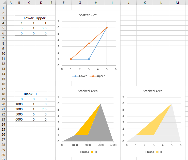
The trick is to partition the triangle's outline into a "Lower" bound and an "Upper" bound. I've done below that with the data in B3:D6 and the accompanying scatter plot. The blue line shows the lower bound and the orange line the upper bound.
To fill the triangle we need to use an area chart. We'll use a stacked area chart with an unfilled area below the lower bound and a filled area between upper and lower bounds. The data we need is in B18:D23. The first column shows the new X values needed: I've added zero and 6000 as outermost bounds on the chart, and multiplied the X values in B4:B6 by 1000 to produce the X values in B20:B22. The factor of 1000 provides the resolution we might need if there are fractional X values in the original range. For Y values I used zero for X=0 and X=6000. The Blank Y values in between equal the original lower bound Y values. The Fill Y values equal the divverence between the upper and lover bounds of the original range (for example, D20 has the formula =D4-C4).
If I make a stacked area chart with this data, I get the first stacked area chart. It's close, but a bit distorted. But when I change the X axis to a date axis, and do a little extra formatting, this gives me what I want. I just need to combine the two charts.
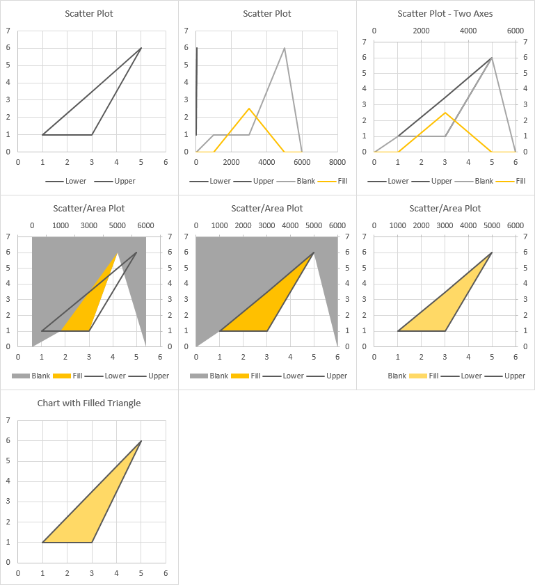
Start building the combination chart by selecting the first set of data (B3:D6) and inserting an XY Scatter chart, using the lines without markers option. Format each to use the same color lines, such as the dark gray I used (top left chart below).
Copy the second set of data (B18:D23), select the chart, go to the Home tab, click the dropdown arrow on the Paste button, and click Paste Special. Use the New Series option, Series Data in Columns, and check Series Names in First Row and Categories in First Column, but don't check Replace Existing Categories; these settings are important (middle chart in top row).
Select each of the added series (Blank & Fill) and assign them to the Secondary Axis. This adds a secondary Y axis; if necessary add a secondary X axis (last chart in top row).
Convert both of the added series to stacked area (right click on the series, select Change Series Chart Type, select Stacked Area; first chart in middle row). Don't worry that the Blank series is above everything else.
Format the secondary (top) X axis as follows (middle chart in middle row):
- Axis Type: Date Axis
- Base Units: Days
- Major Units: 1000 Days
- Axis Position: On Tick Marks
Format the Blank area series to use No Fill, and the Fill area series to use a bit less gaudy fill color (last chart in middle row).
Finally clean up the chart (bottom chart): Delete secondary vertical axis on right edge of chart. Format secondary horizontal axis at top of chart to use No Line and No Labels. Delect legend.