
Timeline Chart In Excel
December 03, 2002 - by Bill Jelen
David from the Mullins Steel Boat Club asked about creating a timeline chart. He wanted to be able to show which particular models were available in a given year. David tried creating a timeline by using timeline options in the chart wizard, but unfortunately, they did not look too appealing.
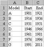
I imagine that David's data looks something like the table to the left. For each model, he lists the starting and ending year that the model was in production.
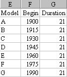
In order to create the chart, let's rearrange the data as shown at the secont picture. As in the original data, show the starting year for each model, and then replace the ending year with a duration. This duration number will indicate the width of the bar on our bar chart.
Excel doesn't offer a floating bar chart, but we can create the same thing by using a stacked bar chart and making the first chart series invisible. So, for model E, the first series will be 1960 units high and the second series will be 21 units high. When the first series is invisible, the chart will appear to have a bar floating from 1960 to 1981.
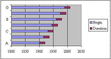
Highlight the table and click on the chart wizard. If you cannot find the icon for the chart wizard, you can go to the Insert menu and go to chart. Next, make sure that under the chart type, that you choose the Bar option, and that under the sub-type that you picked a stacked bar. Click Finish and you will have a default chart. The default chart is still a long way from what we want:
Now here is the trick to the whole thing. Go to the graph, right click on one of the blue bars and choose the Format Data Series option. Now under the Patterns tab there are two options of Border and Area. Make sure you choose the None option and then click OK. Now - boom - the start bar will disappear, leaving you will floating bars for each model.
Right click on the X-axis and choose the option called scale. Under that menu, you may want to change the minimum and maximum years to better fit the data. In this case, I chose to have the minimum start at 1900. Click on the Legend and press the delete button to delete the legend with the now-confusing reference to start year. Right click the chart area, choose Format Plot Area, and change the default gray background to None or another color if desired.
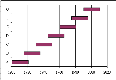
Notice it is somewhat frustrating that the Excel plots the first model in the table closest to the X - axis. Keep this in mind when setting up your data table. By listing the models in reverse order, you could easily have the oldest model appear at the top of the chart.
Thanks to MrExcel.com's summer intern from the University of Notre Dame's MIS program, Mr. Anhtuan Do, for his help in creating this tip of the week.