
The Power of Pivot Tables
September 30, 2004
They're Back!!!!
It is great to have the Call for Help TV show return to the air on TechTV Canada. These are my show notes from my appearance on Episode 31.
25th Anniversary
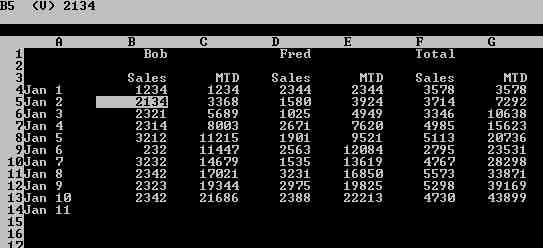
2004 marks the 25th anniversary of the invention that changed the world - the electronic spreadsheet. Back in 1978, a spreadsheet consisted of green ledger paper, a mechanical pencil and an eraser.

In the figure above, if you discovered that one number was wrong, you would have to erase all of the numbers highlighted in red below.

In 1979, two guys changed everything. In 1978, an MIT student named Dan Bricklin imagined a calculator with a mouse ball on the bottom. He thought it would be cool to be able to scroll back through past entries, change a number, and have all the future calculations update. Teaming up with Bob Frankston, they developed the world's first electronic spreadsheet. In October of 1979, they released a VISIble CALCulator for the Apple IIe and called it VisiCalc. Here is a screen shot of VisiCalc

Before VisiCalc, there was no compelling reason to buy a personal computer. Were companies going to spend thousands of dollars to play MicroChess? VisiCalc literally drove the entire PC industry, as many companies purchased a PC in order to run VisiCalc. Dan Bricklin and Bob Frankston landed on the cover of Inc. Magazine. That is Bob on the left and Dan on the right.
Today, if you visit DanBricklin.com, you can download a working copy of VisiCalc that will run in a DOS box under Windows. Remarkably, the entire program is only 28K!.
Pivot Tables
Things have come a long way in 25 years. Today, Microsoft Excel is very powerful. The most powerful feature in Excel is a Pivot Table. These were originally introduced in the mid-80's when Lotus Improv came out.
-
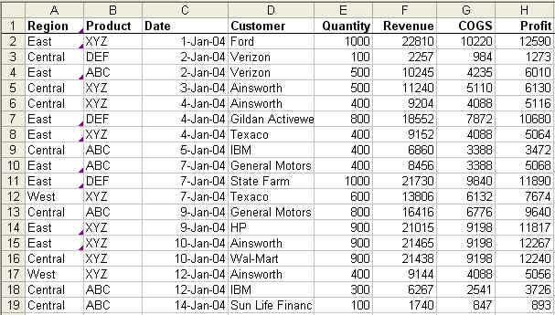
Start with well-formed data in Excel
Your data should have no entirely blank rows or columns. There should be a unique heading above each column. You should make sure that the headings are in a single row instead of spanning two or three rows. My sample data is several hundred rows of invoice data.
-
Select a single cell in the dataset.
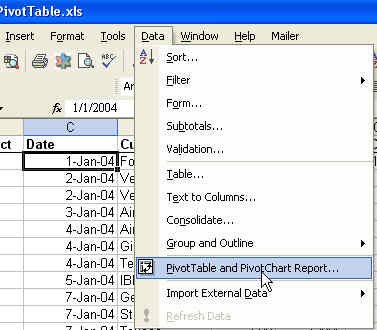
From the menu, select Data > Pivot Table and Pivot Chart Report.
-
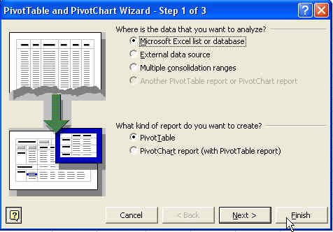
In the Pivot Table Wizard step 1, click Finish to accept all of the defaults.
-
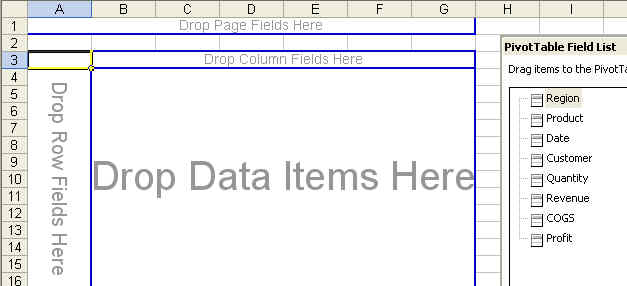
You will now have a new worksheet in your workbook. All of the fields available in your dataset appear in the Pivot Table Field List.
-
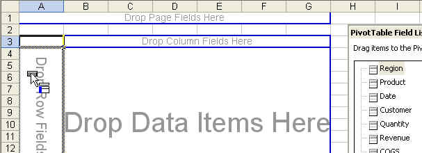
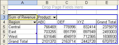
Let's say that your manager wants a report of Revenue by Region and Product. Drag the region field from the field list and drop it in the Row Fields Here section. Note that when the mouse is in the correct location, the mouse pointer will change to show the blue bar on the extreme left of the pivot table.
-
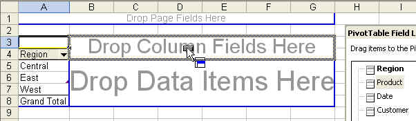
Next, drag the Product field from the Field List and drop it in the Column Fields Here section. In the image that follows, note how the blue portion of the mousepointer is in the 2nd rectangle from the top.
-
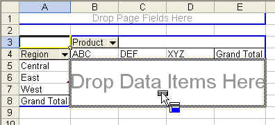
Next, drag the Revenue field from the Field List and drop it in the Data Items section. The blue section of the mousepointer is in the main area of the worksheet.
-
Your Pivot Table report is complete. You have very quickly summarized hundreds of rows of data into a small report for your manager.
-
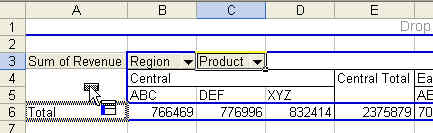
If your manager is like mine, she will see this and say it is almost perfect. Could you re-do it with products going down the size and regions going across the top? This is where the pivot table is excellent.
You can simply drag the grey field headings to a new location to change the report.
-
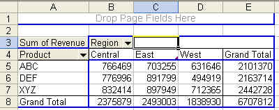
In 2 seconds, you have changed the report to meet the manager's request.
-
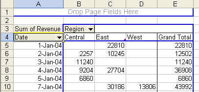
If the manager wants a different view, drag the Product field back to the Field List and replace it with the date field.
Date Magic
-
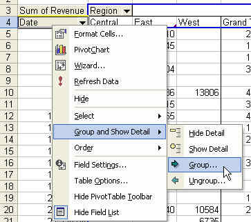
In the image above, you have a report by day. Outside of the manaufacturing plant, not many people need to see data by day. Most want a summary by month. Here is the secret way to change the daily report into a monthly report. First, right-click the Date field tab. Choose Group and Show Detail and then Group.
-
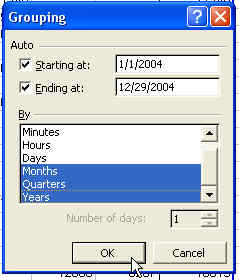
In the Grouping dialog, choose months, quarters and years. Click OK.
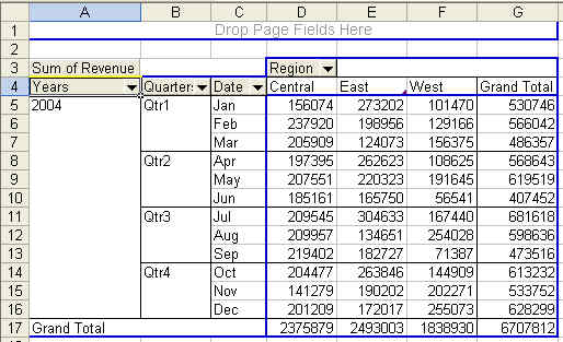
You've now changed your report from a daily report to a monthly report.
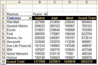
Top 10 Customers
-
Remove the date fields from the pivot table by dragging them back towards the field list. As soon as the icon changes to a red X you can release the mouse button to remove the field.

-
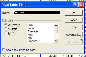
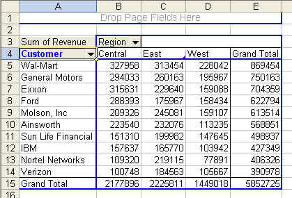
Drag the customer field to the pivot table so you have a report of all customers. If you are producing a report for the Vice President, he may not care about the entire list of customers. He might want to just see the top 10 or top 5 customers. To begin, right click the grey customer field. Choose Field Settings.

-
On the Field Settings dialog, click Advanced (how was anyone ever supposed to find this???).
-
On the right side of the Pivot Table Field Advanced Options dialog is the Top 10 Autoshow feature. Choose the radio button for On. If you wish, change to show the top 5 or 15.
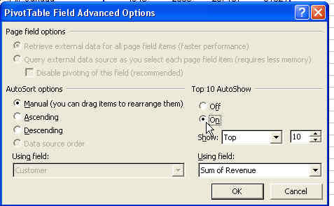
-
I didn't mention it on the show, but you can also sort the result in this dialog. On the left side, select descending and then Sum of Revenue.
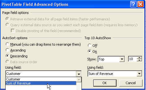
-
Click OK to close this dialog. Click OK again to close the Field Settings dialog. The result is a report of the top customers, high-to-low.
Using AutoFormat
-
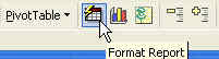
If you try to format a pivot table and then pivot it, your formatting may be lost. The pivot table toolbar offers a special Autoformat button. Choose this button as shown
-
You now have 22 pre-built formats for your report. Use the scrollbar to see them all. Select an interesting format and choose OK.
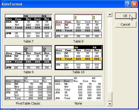
-
The resulting report is formatted and will retain the formatting even after pivoting to a new report.
Summary
Pivot Tables are very a very powerful feature of Excel. To read more about Pivot Tables, check out Guerilla Data Analysis E-Book.