
Excel Chart Lies
February 25, 2007
I am certainly not suggesting that you use charts to lie! The charts shown on this episode will help you to spot when someone is not telling the truth with a chart. They might either be purposely telling a lie with the chart, or they might have just accidentally selected a chart type that they thought looked cool.
-
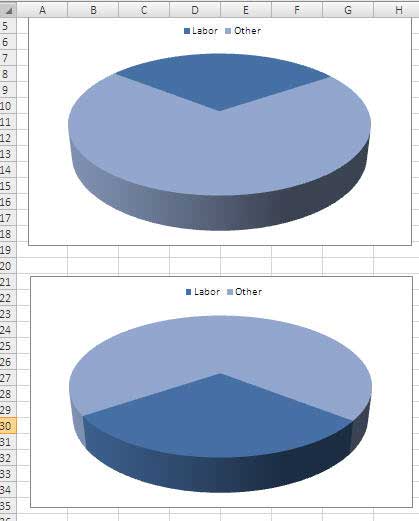
The wedge at the front of a 3-D pie chart always looks bigger. The dark blue wedge represents 30% in both charts. However, there are 104% more dark blue pixels in the bottom chart. If you are trying to convince the labor union that labor costs are too large, use the lower chart.
-
3-D column charts are difficult to read. Should the reader look at the front edge of the column or the back edge? In this case, it doesn't matter. No side of the Q4 column seems to touch the gridline for 3000 (I've highlighted the 3000 gridline in red.) However, if you look at the 2-D chart, both Q3 & Q4 clearly cross the 3000 mark.

-
Cone and pyramid charts are pure evil. If you are the CEO of a non-profit who is spending way too much on administration, then use the bottom chart. Your administration costs will practically disappear into nothing! Seriously, don't ever use the cone or pyramid chart or allow any one who works for you to give you such a chart.

-
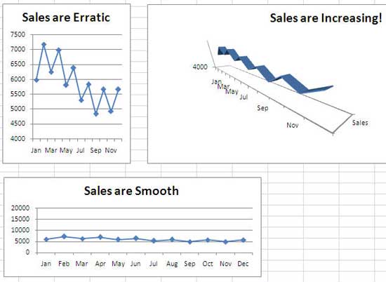
Change the scale to change the message. All three charts are for the same series. Zoom in to a tight scale to show erratic sales (top left). Zoom waaaayyy out to make sales look smooth (bottom left). Use 3-D and perspective to completely obscure the matter - are those sales actually going up in the top right?
-
Sales are great, aren't they? When I see this chart, I would be admiring those beautiful metallic accents at the top of each column.
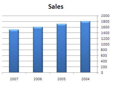
Look again! Pay attention to the bottom of the chart. This scoundrel reversed the order of the years. Easy to do - right-click the numbers along the horizontal axis. Choose Format Axis. In the Axis Options category of the Format Axis dialog, choose Categories in Reverse Order.

-
In the top chart, the VP of Marketing has caused marketing costs to nearly triple in three years. If you wanted to obscure this fact, sandwich the marketing budget in the middle of a stacked area chart.

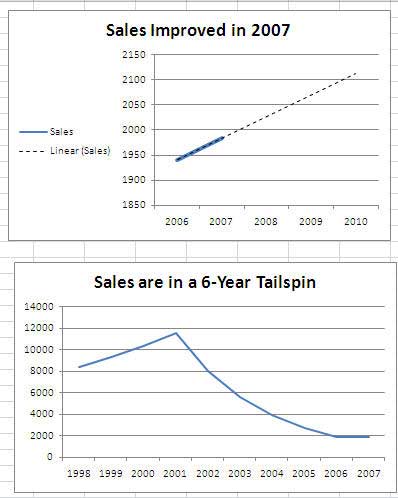
Things look good, according to the top chart. But, that is only two data points of actual data and then an extrapolated trendline. I give this liar credit for changing the trendline to a dotted line - a real liar would have made the trendline be the same line style as the actual line. If someone is only plotting two periods of data, ask to see more previous periods. In this case, sales are in a tailspin.
-
Here is one you can't actually do in Excel, but newspaper graphic artists do it all the time. If you are showing a pictograph chart, it is fine to allow the height of the picture to grow, but you should never allow the width to grow as well. Here, sales went from 100 to 300, a three-fold increase. However, the area of the 2007 picture is nine times larger than the area of the 2005 picture.
If you see a pictograph where the height and width are scaling up, it is a sure sign of a bad chart.

-
If the real news is bad, find some other meaningless statistic to plot. Here, the mayor has presided over a 50% loss of population. He puts a positive spin on this by saying that the rate of decline is slowing.

The next time you are watching a power point presentation, see how many chart lies the presenter is showing to you.
Inspiration for some of these charts came from Gene Zelazny, the charting guru for McKinsey & Company. In a nice letter, Gene pointed out to me that I had been using chart lie #1 in my Learn Excel from MrExcel book. Gene authors an excellent book on when to choose which type of chart; Say it with Charts Complete Toolkit
Chart lie #7 was inspired by the books of Edward Tufte. While all of his books are excellent, a good place to start is The Visual Display of Quantitative Information