Hello,
I am trying to add a new series to an existing chart.
The chart is a stock chart.
I would like the new series to appear as dots, balls or squares on the existing chart.
When I go to add a new series I get a message 'the data range is too complicated to be displayed, if a new range
is selected it will replace all the series in the series panel'
And, sure enough it does and I have no chart (lucky I have plenty of back-ups)
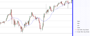
Have inserted a picture below.
Would be grateful for some ideas if anyone has any
Thank you

I am trying to add a new series to an existing chart.
The chart is a stock chart.
I would like the new series to appear as dots, balls or squares on the existing chart.
When I go to add a new series I get a message 'the data range is too complicated to be displayed, if a new range
is selected it will replace all the series in the series panel'
And, sure enough it does and I have no chart (lucky I have plenty of back-ups)
Have inserted a picture below.
Would be grateful for some ideas if anyone has any
Thank you