I have a table with two columns: one for transaction dates and the other for amounts.
I want a chart that will stack each month's transactions on top of each other to show monthly totals.
Seems like this would be simple, but I'm not a seasoned Excel user.
The closest I can get shows transactions overlapped per month, so as the column for each month shows the maximum transaction as chart column height.
Example:
For December 2019 there is one transaction for $102, for January there are two: $46 and $102.
Both chart columns "stack" to $102. Shouldn't the chart column for January be taller to show $148?
That's what I need…
Any way to do that?
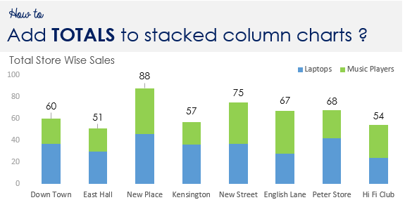
I wouldn't mind a sum label at the top of each chart column, too.
Tried to add an image, but even the smallest cropped screen shot is too large of a file to upload to this board. It's 269KB and barely legible at that size.
I want a chart that will stack each month's transactions on top of each other to show monthly totals.
Seems like this would be simple, but I'm not a seasoned Excel user.
The closest I can get shows transactions overlapped per month, so as the column for each month shows the maximum transaction as chart column height.
Example:
For December 2019 there is one transaction for $102, for January there are two: $46 and $102.
Both chart columns "stack" to $102. Shouldn't the chart column for January be taller to show $148?
That's what I need…
Any way to do that?
I wouldn't mind a sum label at the top of each chart column, too.
Tried to add an image, but even the smallest cropped screen shot is too large of a file to upload to this board. It's 269KB and barely legible at that size.
")