Basic XY graph, date is always an issue?

my8950

Board Regular
Joined
May 1, 2009
Messages
162
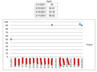
Hello, I have always had trouble trying to get specific dates to show as my X-axis.
I have the dates that I want to show in my data, but when I grab them by using a line graph, or scatter plot, Excel always fills in the gaps with other dates which are in between.
I don't want these dates, only the dates in my data.
I've uploaded a basic screen shot to show what I am talking about.
Such a simple situation, but I always have trouble trying to make this happen.
I'd be fine with the X-axis being 4 points and I'll add to this as time progresses.

Suggestions?

Thank you!
 

Attachments

  • Capture.JPG
    Capture.JPG
    39.9 KB · Views: 43

Excel Facts

Shade all formula cells
To shade all formula cells: Home, Find & Select, Formulas to select all formulas. Then apply a light fill color.
You might consider the work around described here:

Basically, you create a second data series consisting of your preferred labels. Delete the x-axis labels from your original plot, and then plot that second series (x vs. y...or "original x" vs. "new data labels in the Helper column"). Then format this second data series by deleting the markers (so that they don't show along the x-axis), and then position the data labels below the points with the desired alignment/rotation.
MrExcel20210312.xlsx
ABC
1Helper
22/1/2021502/1/2021
32/25/202190.912/25/2021
43/10/202193.39
53/11/202189.923/11/2021
Sheet4


1615586393748.png
 
Upvote 0
You might consider the work around described here:

Basically, you create a second data series consisting of your preferred labels. Delete the x-axis labels from your original plot, and then plot that second series (x vs. y...or "original x" vs. "new data labels in the Helper column"). Then format this second data series by deleting the markers (so that they don't show along the x-axis), and then position the data labels below the points with the desired alignment/rotation.
MrExcel20210312.xlsx
ABC
1Helper
22/1/2021502/1/2021
32/25/202190.912/25/2021
43/10/202193.39
53/11/202189.923/11/2021
Sheet4


View attachment 34244
Creative! Thanks for that, if I can't figure out a Plan A, I'll try this out. I did make some progress, but it ended up mashing all the dates so close to each other they can't be read.
 

Attachments

  • Capture.JPG
    Capture.JPG
    26 KB · Views: 10
Upvote 0
I'm happy to at least offer an idea. It's not ideal, but I'm not aware of a more direct way to do it in Excel. I tried adding a data point, and was disappointed with the level of effort needed to clean up the plot. First, to facilitate the creation of the labels in the helper column, I entered this in C2 and copied down: =TEXT(A2,"mm/dd/yyyy")
Then delete the unwanted data label entries (in this case, the one for 3/10/2021). By converting the dates to text in the Helper column, Excel plots them as having y values of 0 (which is what you want), but then it replots the 2nd data series and turns on the data point markers (see the orange marker points along the x-axis). Then I noticed that the new data point label for 4/23/2021 did not appear. To fix that, one needs to right click on the 2nd data series (orange points) or the 2nd data series labels and select Format Data Labels...then confirm that Value from Cells is Checked, and finally click on the Select Range button beside that option. Doing so will open a new window where the range can be adjusted. You'll see in my screen shot that the range is shown as C2:C5 and it needs to be C2:C6...so it appears that the data labels range may need to be manually adjusted this way when new points are added. Finally, format the 2nd data series by turning off the Markers...giving the final result shown further below.

I'm curious to learn if there is a better way. Good luck!
1615604106479.png
............
1615604176095.png


1615604750840.png
 
Upvote 0
I'm happy to at least offer an idea. It's not ideal, but I'm not aware of a more direct way to do it in Excel.

I'm curious to learn if there is a better way. Good luck!
..........
I appreciate your information! I was actually able to do this many years ago, my issue is I mess with it and eventually figure it out, but since I don't do it often, I forget how I did in the past. I have a excel sheet saved with it doing the way I want, except I can't backtrack/reverse engineer it enough to figure out what I did. Something to do with a line graph, then selecting the X-axis as the dates, but it's not working this time around, so that is my reason why I asked here for help. If I can figure it out I'll definitely post up how I did, at least in the future when I try to do this again, I can search my previous posts and find my notes... :)
 
Upvote 0

Forum statistics

Threads
1,214,643
Messages
6,120,702
Members
448,980
Latest member
CarlosWin

We've detected that you are using an adblocker.

We have a great community of people providing Excel help here, but the hosting costs are enormous. You can help keep this site running by allowing ads on MrExcel.com.
Allow Ads at MrExcel

Which adblocker are you using?

Disable AdBlock

Follow these easy steps to disable AdBlock

1)Click on the icon in the browser’s toolbar.
2)Click on the icon in the browser’s toolbar.
2)Click on the "Pause on this site" option.
Go back

Disable AdBlock Plus

Follow these easy steps to disable AdBlock Plus

1)Click on the icon in the browser’s toolbar.
2)Click on the toggle to disable it for "mrexcel.com".
Go back

Disable uBlock Origin

Follow these easy steps to disable uBlock Origin

1)Click on the icon in the browser’s toolbar.
2)Click on the "Power" button.
3)Click on the "Refresh" button.
Go back

Disable uBlock

Follow these easy steps to disable uBlock

1)Click on the icon in the browser’s toolbar.
2)Click on the "Power" button.
3)Click on the "Refresh" button.
Go back
Back
Top