Charting Usage Between 2 Times

Tofox2

New Member
Joined
May 31, 2018
Messages
3
Hey guys,

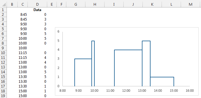
I’d like to create a chart with the following data as an example.

08:45 10:00. 3
9:50 11:15. 2
11:15 13:30. 4
13:00 15:00. 1

So it’ll show:
between 8:45 and 09:50 = 3
between 9:50 and 10:00 = 5
between 11:15 and 13:00 = 4
between 13:00 and 13:30 = 5
between 13:30 and 15:00 = 1

I’d really appreciate any help you can give, thanks.
 

Excel Facts

Can you sort left to right?
To sort left-to-right, use the Sort dialog box. Click Options. Choose "Sort left to right"
You can arrange your data like this and then insert a XY chart with line and no markers and then setting the horizontal axis min to 0.3333333 ( 8 am) and the max to 0.6666666 (4 pm) and the major unit to 0.0416667 ( one hour)


y074Zxw.png
 
Upvote 0

Forum statistics

Threads
1,214,805
Messages
6,121,664
Members
449,045
Latest member
Marcus05

We've detected that you are using an adblocker.

We have a great community of people providing Excel help here, but the hosting costs are enormous. You can help keep this site running by allowing ads on MrExcel.com.
Allow Ads at MrExcel

Which adblocker are you using?

Disable AdBlock

Follow these easy steps to disable AdBlock

1)Click on the icon in the browser’s toolbar.
2)Click on the icon in the browser’s toolbar.
2)Click on the "Pause on this site" option.
Go back

Disable AdBlock Plus

Follow these easy steps to disable AdBlock Plus

1)Click on the icon in the browser’s toolbar.
2)Click on the toggle to disable it for "mrexcel.com".
Go back

Disable uBlock Origin

Follow these easy steps to disable uBlock Origin

1)Click on the icon in the browser’s toolbar.
2)Click on the "Power" button.
3)Click on the "Refresh" button.
Go back

Disable uBlock

Follow these easy steps to disable uBlock

1)Click on the icon in the browser’s toolbar.
2)Click on the "Power" button.
3)Click on the "Refresh" button.
Go back
Back
Top