Creating a Line Graph

reberryjr

Well-known Member
Joined
Mar 16, 2017
Messages
701
Office Version
  1. 365
Platform
  1. Windows
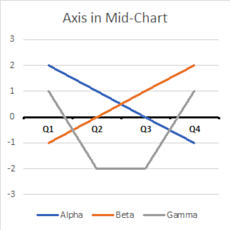
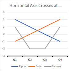
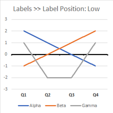
I work with Excel a lot, but have never really had the need to use graphs. For the project I'm working on, I'd like to use some. I'd like to run the values of a column along the bottom of the graph (the X axis?), and have the values of a few other columns serve as the actual lines (the Y axis?). I managed to build everything, but can't seem to get the values of the X axis to appear at the bottom of the graph. Instead, they appear smack dab in the middle of the graph.

Eventually, I'd like to have the chart created in vba, but I'm trying to build it manually first, so that I know exactly what I'm looking for.
 

Excel Facts

Return population for a City
If you have a list of cities in A2:A100, use Data, Geography. Then =A2.Population and copy down.
It looks like that will help me create the code, once I get to that point. Allow me to ask another question. Is there a way to limit the chart to only pulling in certain records? For instance, the minimum date and the 3 max dates from a column? I'm concerned that the size of the chart may get quite large, making it less useful.
 
Upvote 0
one way is to hide columns or rows, don't know if thats what you need to do
 
Upvote 0
... but can't seem to get the values of the X axis to appear at the bottom of the graph. Instead, they appear smack dab in the middle of the graph....

You most likely have negative values in the data. An example:

AlphaBetaGamma
Q12-11
Q210-2
Q301-2
Q4-121

<tbody>
</tbody>

Plots like this, by default:

HnL0ljU.png


If you have a fixed limit vertical axis,
Select the vertical or y-axis.
In the format pane, select the small icon that looks like a column chart.
Under Axis Options, in the section headed "Horizontal axis crosses", select the "Axis value" radio button.
Type in the y-value where you want the x-axis to cross. In my example, I entered -3.

v3qL7HM.png


You can move just the labels.
Select the horizontal or x-axis.
In the format pane, select the small icon that looks like a column chart.
In the section titled "Labels", change "Label Position" to "Low".

747Lu8x.png
 
Upvote 0

Forum statistics

Threads
1,214,889
Messages
6,122,097
Members
449,065
Latest member
albertocarrillom

We've detected that you are using an adblocker.

We have a great community of people providing Excel help here, but the hosting costs are enormous. You can help keep this site running by allowing ads on MrExcel.com.
Allow Ads at MrExcel

Which adblocker are you using?

Disable AdBlock

Follow these easy steps to disable AdBlock

1)Click on the icon in the browser’s toolbar.
2)Click on the icon in the browser’s toolbar.
2)Click on the "Pause on this site" option.
Go back

Disable AdBlock Plus

Follow these easy steps to disable AdBlock Plus

1)Click on the icon in the browser’s toolbar.
2)Click on the toggle to disable it for "mrexcel.com".
Go back

Disable uBlock Origin

Follow these easy steps to disable uBlock Origin

1)Click on the icon in the browser’s toolbar.
2)Click on the "Power" button.
3)Click on the "Refresh" button.
Go back

Disable uBlock

Follow these easy steps to disable uBlock

1)Click on the icon in the browser’s toolbar.
2)Click on the "Power" button.
3)Click on the "Refresh" button.
Go back
Back
Top