Dynamic charts

WillamYan

New Member
Joined
Dec 23, 2016
Messages
20
Hello))

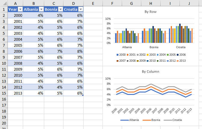
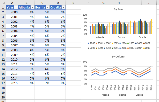
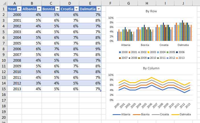
I want to create a dynamic chart to analyze the inflation rate of some countries for some years. On my range, I have the dates on the X-axis(B2:G2) and the countries on the Y-axis(A2:A5). I am making a dynamic chart that will auto-update when a new data is added to the range (I am using the combination of OFFSET and COUNTA). Everywhere I looked, there are guides on how to create a dynamic chart which will track the changes if a new column is added (a new date in H2)(I successfully did this). Now I want the dynamic chart to auto-update if a new row is added (a new country in A6).

Using the table feature to build a dynamic chart is not doing the job either. As far as I understand, the reason is, as my range takes values from another source (I am using index and match for this purpose), the table fails to auto-expand (unless I enter the data manually).

Are there any ideas how should I proceed?
 

Excel Facts

Control Word Wrap
Press Alt+Enter to move to a new row in a cell. Lets you control where the words wrap.
Look into building dynamic named ranges

Here are a couple of resources

Create a Dynamic Chart

http://www.contextures.com/xlNames01.html


Thanks for your reply. I have already gone through both of them, unfortunately they don't contain an answer to my question. As I have already mentioned, like the rest of articles, these two only explain how to create a dynamic chart which will auto-update, when new columns are added, but no word on adding new rows (referring to my example).
 
Upvote 0
The building of dynamic ranges is for rows and columns.

Look at this resource. They start off with the labels as A2:A5 (Jan, Feb, Mar, Apr) and as they progress they add to the range so it's expanded to A6 (May). The update is dynamic.

Dynamic Charts - Peltier Tech Blog

Maybe I'm still being thick, but this seems to answer your query.

This is exactly what I have just been examining. My problem is how to add another column right next to Pageviews, which will automatically be shown on the dynamic chart. In this article, Jon adds a new date, which I am successfully doing as well.
 
Upvote 0
Using the methodology of Names (a/k/a, named ranges or defined names) to add data from another column as a new series, you need to create a new Name defined by the new column, then add the series to the chart and reference it to the new Name.
 
Upvote 0
Thanks for your time Jon.

I am doing exactly what you described. It works, if I choose a clustered column chart (countries as categories and years as legend entries. But when I want to plot the change of inflation over time for each country, it fails to function (countries as Legend entries and years as categories). I edit the first category by referencing it to the column with no success.
 
Upvote 0
Your two charts (country as category with year as series, vs year as category and country as series) plot the data differently: one plots by row, the other plots by series. So you need to define two sets of Names: one by row and one by column.

But if you convert your data into an "official" Excel Table, magical things happen. Select the range and on the Insert tab of the ribbon, choose Table. It doesn't really insert anything, it just tells Excel that this range is special.

What is special? If the whole Table is used as the source data in a chart, adding rows or columns includes the new rows or columns into the chart, whether it was plotted by row or by column.

Here is an original range, converted to a table, and plotted by row and by column.

5fHr2P2.png


Here is how both charts adjust if rows are added. The chart that plots by row adds series for the new rows (note that the legend now includes 2014 and 2015), while the chart that plots by column adds points for the added rows (note that the axis extends to include 2014 and 2015).

PXlbBKV.png


And here is how both charts adjust if columns are added. The chart that plots by row adds a new category for the new column (note that the horizontal axis now includes Dalmatia), while the chart that plots by column adds a series for the added column (see Dalmatia in the legend).

qIyfOKr.png
 
Upvote 0

Forum statistics

Threads
1,214,648
Messages
6,120,725
Members
448,987
Latest member
marion_davis

We've detected that you are using an adblocker.

We have a great community of people providing Excel help here, but the hosting costs are enormous. You can help keep this site running by allowing ads on MrExcel.com.
Allow Ads at MrExcel

Which adblocker are you using?

Disable AdBlock

Follow these easy steps to disable AdBlock

1)Click on the icon in the browser’s toolbar.
2)Click on the icon in the browser’s toolbar.
2)Click on the "Pause on this site" option.
Go back

Disable AdBlock Plus

Follow these easy steps to disable AdBlock Plus

1)Click on the icon in the browser’s toolbar.
2)Click on the toggle to disable it for "mrexcel.com".
Go back

Disable uBlock Origin

Follow these easy steps to disable uBlock Origin

1)Click on the icon in the browser’s toolbar.
2)Click on the "Power" button.
3)Click on the "Refresh" button.
Go back

Disable uBlock

Follow these easy steps to disable uBlock

1)Click on the icon in the browser’s toolbar.
2)Click on the "Power" button.
3)Click on the "Refresh" button.
Go back
Back
Top