I want to create the following graph, and I am not succeeding at it yet, so help is needed from an expert charter:
I have a complicated set of data with different indicators but 2 variables I am interested in. So I will create a graph for each.
I will simplify it below:
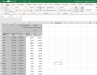
first column is Names. Second column is Start date (format 01.01.2021). Third Column is End Date. Fourth column is 1st variable.
I want to chart a period axis spreading let's say over 2 years. and the Y axis representing the variable of the 4th column.
The start date is important because it is represented on the X axis.
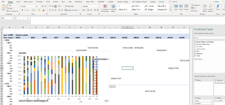
When a Name has a start date, it should trigger a vertical bar on the graph above the X axis corresponding to the amount in 4th column.
When a name has an End Date, it should trigger a vertical bar on the graph below the X axis on the negative side corresponding to the amount in 4th column too.
chart I think will get messy with all the data overlapping each other. So it should show Top 10 for each tick of the X axis over all the date period I selected like from 1.1.2021 till 31.12.2022
Advice appreciated
I have a complicated set of data with different indicators but 2 variables I am interested in. So I will create a graph for each.
I will simplify it below:
first column is Names. Second column is Start date (format 01.01.2021). Third Column is End Date. Fourth column is 1st variable.
I want to chart a period axis spreading let's say over 2 years. and the Y axis representing the variable of the 4th column.
The start date is important because it is represented on the X axis.
When a Name has a start date, it should trigger a vertical bar on the graph above the X axis corresponding to the amount in 4th column.
When a name has an End Date, it should trigger a vertical bar on the graph below the X axis on the negative side corresponding to the amount in 4th column too.
chart I think will get messy with all the data overlapping each other. So it should show Top 10 for each tick of the X axis over all the date period I selected like from 1.1.2021 till 31.12.2022
Advice appreciated