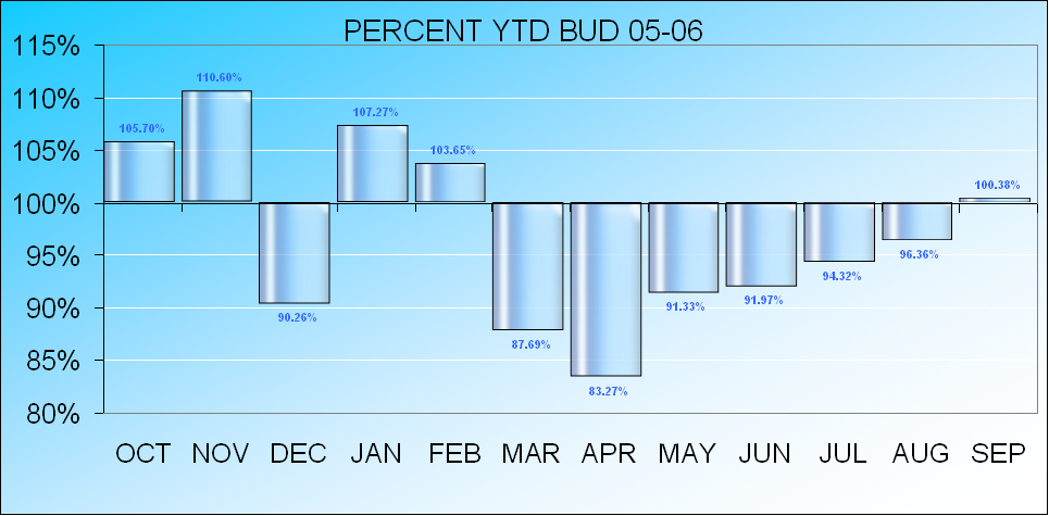
Figured out how to fake transparent 3D bar chart

babycody

Well-known Member
Joined
Jul 8, 2003
Messages
1,395
Hi everyone. I have created a Pivot Table Chart and I want to display a label above each column with the values they represent. The problem is that when I change the month I lose the labels above the columns. I also can't get a custom chart to stay. It always goes back to the built in charts. Is there a way to prevent this from happening? Thanks!
 
Yeah, I understand. I used to have a boss. Actually, a few different ones on different occasions.

I think the background is still a part of the chart that you need to address. Could you use a solid color or a simple gradient for the background? All this shiny reflective stuff is obnoxious.

Also, is there a reason other than being fancy for coloring the points for alternate months in different colors? It implies different data sets, which is probably not the case.

Another point: It's misleading to use columns that start at a value other than zero. You're using 100% as the basis instead of zero. If your intention is to show deviation from budget, subtract 100% and show columns which clearly represent percent above and below budget. In this case it would be fine to use different color columns for above and below budget.

Bottom line:

Don't do anything to confuse the viewer or to obscure or misrepresent any of the data.
 
Upvote 0

Excel Facts

Create a chart in one keystroke
Select the data and press Alt+F1 to insert a default chart. You can change the default chart to any chart type
My boss told me to put the x axis at 100% so you know that story. I tried some of the things you suggested. This is what I came up with. I'll check with my boss to see which one he prefers. I have already shown him the other one.
270828625_067524e1de_o.jpg
 
Upvote 0
It's still a little fluffy, but much better than before. Mention to the PHB how distracting all the funky effects can be, and how starting a column chart at a value that isn't zero can be misleading. Show the % deviation from budget rather than % of budget. This can be readily combined with the following technique to give a different color for + and - deviations:

http://peltiertech.com/Excel/Charts/ConditionalChart1.html
 
Upvote 0
Thanks for the link. I really like the conditional charts on your site. I'll mention the % thing to him.
 
Upvote 0
Chart tutorial

Hi Babycody...I am learning a lot only with this post, and would like to know how you did the 3D chart. As I have to make a report for college, I would like to use that 3D chart you showed.
If you could post that tutorial you mentioned, I would be thankfull.
Greetings, Miguel.
 
Upvote 0
<object width="425" height="350"><param name="movie" value="http://www.youtube.com/v/t3cODS62MFM"></param><embed src="http://www.youtube.com/v/t3cODS62MFM" type="application/x-shockwave-flash" width="600" height="350"></embed></object>

The reason for creating sections like I did was to prevent skewing when resizing. This way only the middle section is stretched. The top and bottom remain unaffected. If you plan on adjusting the width then you can group everything together and adjust it. You could also use a picture instead of a solid color which is what I did on the one that I posted a picture of. Then you could add shading and reflections to the picture for a more realistic feel. To make the bars on your chart disappear, so that you can add the one you made, right click on the bars in your chart. Choose format data series. Then click on the Patterns tab. Choose none for both borders and area.

To duplicate the entire bar group all of the objects together and copy and paste. You can then change the color. Changing the color requires a couple of extra steps because of the two right angled triangles that I used to complete the shading. I might add a video tutorial on how to do this and how to add a picture to the objects later. I would love to see what anyone comes up with when trying this. Please let everyone know how you created your graphic. This doesn't have to be limited to the bar shape. I would really like to see someone figure out how to do this with cylinders.
 
Upvote 0
Thanks

Thansk a los babycody, I am at work right now, when I get back home I will take a look at the video and get the chart done.
Thanks a lot!

Miguel.
 
Upvote 0

Forum statistics

Threads
1,214,918
Messages
6,122,241
Members
449,075
Latest member
staticfluids

We've detected that you are using an adblocker.

We have a great community of people providing Excel help here, but the hosting costs are enormous. You can help keep this site running by allowing ads on MrExcel.com.
Allow Ads at MrExcel

Which adblocker are you using?

Disable AdBlock

Follow these easy steps to disable AdBlock

1)Click on the icon in the browser’s toolbar.
2)Click on the icon in the browser’s toolbar.
2)Click on the "Pause on this site" option.
Go back

Disable AdBlock Plus

Follow these easy steps to disable AdBlock Plus

1)Click on the icon in the browser’s toolbar.
2)Click on the toggle to disable it for "mrexcel.com".
Go back

Disable uBlock Origin

Follow these easy steps to disable uBlock Origin

1)Click on the icon in the browser’s toolbar.
2)Click on the "Power" button.
3)Click on the "Refresh" button.
Go back

Disable uBlock

Follow these easy steps to disable uBlock

1)Click on the icon in the browser’s toolbar.
2)Click on the "Power" button.
3)Click on the "Refresh" button.
Go back
Back
Top