Graph dynamic range and lines don't work properly when one or more values are not present; legend

Rnkhch

Well-known Member
Joined
Apr 28, 2018
Messages
528
Office Version
  1. 365
Platform
  1. Windows
Hello,

This question is related to my previous post here:
(How to change axis spacing for dynamic axis range?)

I got the dynamic ranges, axis, and error bar (standard deviation) to work properly, but now I'm facing new issues where if one or more values in the series is not entered, then the rest of the graph line and error bars is effected. Specifically:

1) if one or more values in the beginning of the range are not entered, the graph still starts plotting at day 0 (i.e. it takes the first available data point and uses it for day 0 instead of starting at the correct day)
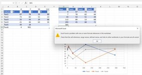
2) if one or more values in the middle of the range are not entered, the graph collapses after the first missing point and doesn't even plot any of the points after the gap (see pic)
3) similar issues happen with the error bars

4) I'm also facing a problem with the legend and lines for samples that I have not even entered/defined, but because the graph data range includes total 40 samples, I see them in the legend along with a flat line at value of 0 at the bottom of the graph (in the picture I have included only 3 samples in the graph data range, and even though I didn't define sample 3, I still see a blank legend and a corresponding 0 line). I designed the workbook such that the names pop up only if data is entered in the "input" sheet. In other words in the final graph, I don't want to see up to 40 blank lines in the legend and their corresponding 0 lines, if no data is entered for them.

Here are the dynamic ranges I defined, and I suspect the first 3 problems are caused by the COUNT mechanism I included, which doesn't recognize blank cells. Problem #4 is a bit more complicated, and I have no idea how to deal with it ?:

Xasis=Excel!$D$3:INDEX(Excel!$D$3:$R$3,COUNT(Excel!$D$3:$R$3))
Sample1=Excel!$D$4:INDEX(Excel!$D$4:$R$4,COUNT(Excel!$D$4:$R$4))
Sample1Stddev=Excel!$S$4:INDEX(Excel!$S$4:$AG$4,COUNT(Excel!$S$4:$AG$4))

Sample2=Excel!$D$5:INDEX(Excel!$D$5:$R$5,COUNT(Excel!$D$5:$R$5))
Sample2Stddev=Excel!$S$5:INDEX(Excel!$S$5:$AG$5,COUNT(Excel!$S$5:$AG$5))

Sample3=Excel!$D$6:INDEX(Excel!$D$6:$R$6,COUNT(Excel!$D$6:$R$6))
Sample3Stddev=Excel!$S$6:INDEX(Excel!$S$6:$AG$6,COUNT(Excel!$S$6:$AG$6))

... and so on for the remaining samples.

I would appreciate any suggestion on how to get this to work properly.

Thank you!
1651251729618.png
1651251777096.png
 

Excel Facts

What do {} around a formula in the formula bar mean?
{Formula} means the formula was entered using Ctrl+Shift+Enter signifying an old-style array formula.
Put your data into a Table, which is a special data structure in Excel with magical properties.

I built my data in columns, not rows as you did, but it should work either way. To create a Table, select the range of data and press Ctrl+T. The result is shown in B2:D6 of the first image below. Make a scatter plot of the data in the Table. No need to generate lots of Names for the chart source data ranges.

Here's some of that magic. I added "Test 3" to cell E2, and the Table automagically expanded to include the new column. I added 232 to cell B7, and the Table automagically expanded to include the new row. Just as magical, because I used the entire Table, all of the chart formulas adjusted themselves to include the new Table dimensions. All I did was enter the new data; the Table and chart updated without any other actions on my part.

Put your standard deviations into another Table. When rows are added, the new SD values will be added to the new points, because the custom values formula will update as the Table grows. You will have to add custom error bars to each new series, but once you add them, they will update later to include any added points.

TableForChartSourceData.png
 
Upvote 0
Wow, this is a great technique! Thanks for sharing it! I'll test this on my work data Monday, but I just did a small test, and I had problems:

1) In the row format of my original data, it doesn't work at all. I needed to do switch row/column and redefine the series, and once I did that the chart didn't update automatically.

2) I tested in the column format (like you did), and it got the chart right, but as soon as I added 365 as another day, I got the error in the picture below. I tried many times and got the same error as soon as I added anything below the table. It does work fine when I add stuff to the right of the table such as Test4. I don't think I'm doing anything different from what you did, so I'm not sure why I keep getting this error.
 

Attachments

  • 2022-04-30-2.jpg
    2022-04-30-2.jpg
    39.9 KB · Views: 5
Upvote 0
What do the series formulas look like? No need to define Names or anything, just use the default cell addresses that Excel creates with the chart. In my first example, the first series is
=SERIES(Sheet1!$C$2,Sheet1!$B$3:$B$6,Sheet1!$C$3:$C$6,1)
When I add a row, $6 turns to $7.

I also realize why the row orientation doesn't chart right. If any X values in a scatter chart are not numbers (or #N/A), Excel decides it can't plot the values as is, and replaces the counting numbers 1, 2, 3, etc. The chart still updates properly when rows or columns are added, but those X values are wrong. It's probably best practice to use the columnar alignment anyway, and it looks like Excel plotted your data by columns even though there weren't more rows than columns.
 
Upvote 0
I finally got it to work after several attempts. Not sure what was different in the working version.

But I don't think I can use this for my work data as this automatic table has problem with "formulas or rich data" in the top header row as you can see in the attached picture error message. In this example, I created a table at the left, and I made a transposed version of it on the right using formulas as =IF((ISNUMBER(C$3)),(C$3),("")), such that the names and data would be populated from the left main table. The automatic graph got rid of the formulas in the top row and replaced them with Column1 etc. I initially selected a smaller range for Ctrl+T and hoped that as I would make more data appear under the range from the main table, the automatic table would grow, but sadly it didn't (number 33 in the picture).

So it seems that this type of automatic table is only suited for manually entered data. It would have been incredible if this would work with formula cells.

(I ended up spending a lot of hours defining names ?. I have for charts for 40 samples, so for each chart, I defined 40 names for sample values and 40 names for sample error values, so 320 names, plus 4 names for X-axis values, so in total 324 names ??. But this method is working with the limitation that sample names and data must be continuous with no gaps, so I engineered "error messages" in my sheet to warn users if cells are left blank accidentally, so a very time-consuming workaround.)


2022-05-07 (7).png


2022-05-07 (6).jpg


2022-05-07 (5).jpg
 
Upvote 0
I think you're doing it the hard way, with all those names for chart data ranges. Are you forced to start with data in rows?

It might be possible to start with data in rows, and use Power Query to convert it a Table aligned by column, and the chart will just work.
 
Upvote 0
Yeah, it is the hard way for the maker of the chart (myself), but at least the people can use it almost automatically (the only non-automatic aspect would be to manually select the names from "select data" for each of the four graphs). The people like to see the days grow from left to right just as it does in the chart x-axis. They usually copy the data in that orientation and paste it under the chart in their PowerPoints, so if I change the orientation, they're gonna ask for it to be changed back ?.

But if I use the automatic table approach, then it seems that everything needs to be input manually, so it will be the harder way for the people, and easy for me. I tried several times to make it to work with formula cells, but it just doesn't like it. I hope future Microsoft updates would address this limitation of the automatic tables (unless there is some other trick to make it work with formula cells).
 
Upvote 0

Forum statistics

Threads
1,214,918
Messages
6,122,255
Members
449,075
Latest member
staticfluids

We've detected that you are using an adblocker.

We have a great community of people providing Excel help here, but the hosting costs are enormous. You can help keep this site running by allowing ads on MrExcel.com.
Allow Ads at MrExcel

Which adblocker are you using?

Disable AdBlock

Follow these easy steps to disable AdBlock

1)Click on the icon in the browser’s toolbar.
2)Click on the icon in the browser’s toolbar.
2)Click on the "Pause on this site" option.
Go back

Disable AdBlock Plus

Follow these easy steps to disable AdBlock Plus

1)Click on the icon in the browser’s toolbar.
2)Click on the toggle to disable it for "mrexcel.com".
Go back

Disable uBlock Origin

Follow these easy steps to disable uBlock Origin

1)Click on the icon in the browser’s toolbar.
2)Click on the "Power" button.
3)Click on the "Refresh" button.
Go back

Disable uBlock

Follow these easy steps to disable uBlock

1)Click on the icon in the browser’s toolbar.
2)Click on the "Power" button.
3)Click on the "Refresh" button.
Go back
Back
Top