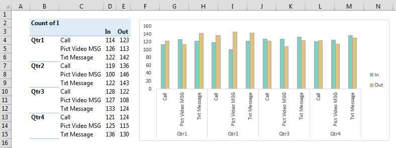
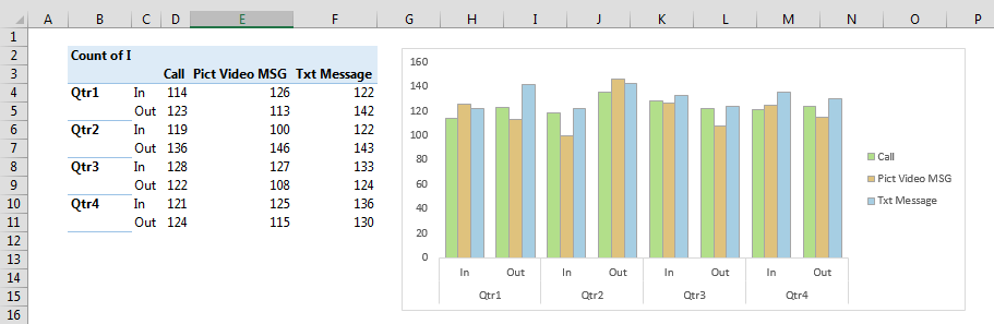
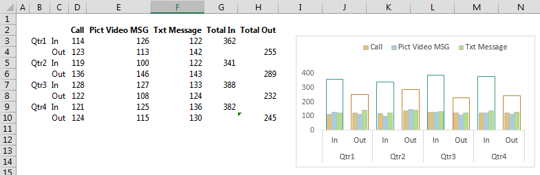
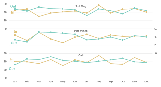
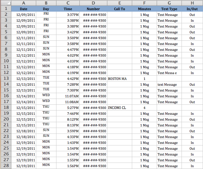
Working on a project to show text and voice call activity between sales reps and customers. Here is a small sample of what the data looks like:

The goal is to display call activity for each day of the year to show trends and volume of activity. The horizontal axis will be day of the year and show an empty space if there is no data. For days with data, the options are: text message in, text message out, call in, call out, pict video MSG in, pict video MSG out.
Each day will show the total number of actions. For the 12/09/11 example above, the total number of actions is 4, 3 text messages out, 1 in. The stacked bar graph for that day will show 3 messages out in one color and 1 message in in another color. For other action types, same rules apply, just a different color.
I have been beating myself up on this and just haven't been able to nail it. My guess is that it requires some formulas or scripting to count each day's activity and use that value versus simply selecting it using the menu-driven features. I am thinking that 365 bars across the page may be excessive so I may break it down by quarters but all of the rules above apply.
Thanks in advance for the suggestions/recommendations/solution.