How to show values in data labels of Excel Pareto Chart when chart is based on percentages

dendres

New Member
Joined
Aug 1, 2015
Messages
14
Hello,

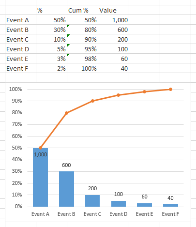
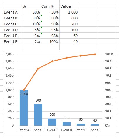
I am developing a Pareto Chart for my client in Excel 2010. They currently have a chart that shows the percentage of each category on the primary Y-axis. Then, the secondary Y-axis is used for the cumulative percentage, up to 100%. So far, this is a normal and easy to create Pareto. I should also mention it is based on a Pivot Chart with 3 different Report Filters.

They wish to show data labels above each column to indicate the number of occurrences. So for example, they may have 6 events on the x-axis:


1 - Event A, 50%, 1,000 occurrences
2 - Event B, 30%, 600
3 - Event C, 10%, 200
4 - Event D, 5%, 100
5 - Event E, 3%, 60
6 - Event F, 2%, 40


What I cannot figure out is how to show the data labels so they show the value of each category (e.g. Event B would show 30% on the left axis, have a data label of 600 and the Cumulative total line using the secondary (or right) axis would be at 80% at this point). Please keep in mind that depending on what is selected with the Report Filters on the Pivot Chart, the name/number of categories on the x-axis will change, so I don't think adding a formula into the data label is the answer either.


I've looked everywhere (I think) for an answer, but cannot figure it out. I'd prefer to avoid a VBA solution, but I do know how to write VBA code, so if that's the only way, a nudge in the right direction would be greatly appreciated.


Thank you.
 

Excel Facts

Links? Where??
If Excel says you have links but you can't find them, go to Formulas, Name Manager. Look for old links to dead workbooks & delete.
Hi Dendres,

With your set up like this:

Excel 2010
ABC
1%Value
2Event A50%1,000
3Event B30%600
4Event C10%200
5Event D5%100
6Event E3%60
7Event F2%40
Sheet1


You can do this with the following steps:
1) Create Clustered Column chart on range A1:C7
2) Move Value data series to 2nd Axis
3) Change Value data series Fill from Automatic to No Fill
4) Change 2nd Vertical Axis Labels to None
5) Add Data Labels to Value data series

Hope this helps.

Steve=True
 
Upvote 0
Hi Steve=True,

Thank you for the help. Unfortunately this isn't what I'm looking for. I need to keep my secondary axis visible since this is a Pareto Chart. The secondary axis needs to show the cumulative percentage of the values in column B (per your demonstration). Your example basically also needs to show a Column D of the cumulative percentages. Column D then gets plotted as a line along with the clustered columns to create the Pareto.

Sorry if my question wasn't clear on that.

Thank you,
dendres
 
Upvote 0
If both the bars and the line plot percentages, then you don't need a secondary axis.

I've made the chart using the first worksheet column for category labels, the second for the bars (percentages), and the third for the line cumulative percentages). I added data labels to the bars, using Excel 2013's option to use label text from cells, referencing the text in the fourth worksheet column. If you don't have Excel 2013, you can use Rob Bovey's Chart Labeler, a free addin from Welcome to Application Professionals.

Pareto1.png


Very often, Paretos plot the bars using values on the primary axis, and cumulative percentages on the secondary axis. I think that's a little misleading if the scales are not synchronized, but whatever.

I made this chart using the fourth worksheet column for the bars, on the primary axis, and put the cumulative percentages on the secondary axis. I also synched the axes, using 2000 for the primary axis full scale, which neatly corresponds to 100% full scale on the secondary axis. In real life this doesn't work so nicely very often. The labels are easy here, because they show the default Y values.

Pareto2.png
 
Upvote 0
Hi Jon,

Thank you for your reply. Unfortunately I have some pretty strict guidelines that I must follow for my client. I'm doubtful they will allow use of an add-in, but I can follow up with them regarding it. And we must also stick with Excel 2010 for development. I do agree that having percentages on both sides of the chart are a little awkward, as again, those are the guidelines I need to stick to. Perhaps though there is something I can glean from both examples to help out with an alternate suggestion to what they currently are trying to accomplish, assuming Excel just can't do it their original way.

If anyone else does have the full answer to my original question though, I'd be very excited to see it.

Thanks again for your help Jon.

dendres
 
Upvote 0
Jon,

Thank you for that link. The VBA code you have on that page (Option #2) is helping me come to a solution for this problem. I appreciate you taking the time to help me out!

dendres
 
Upvote 0

Forum statistics

Threads
1,214,394
Messages
6,119,263
Members
448,881
Latest member
Faxgirl

We've detected that you are using an adblocker.

We have a great community of people providing Excel help here, but the hosting costs are enormous. You can help keep this site running by allowing ads on MrExcel.com.
Allow Ads at MrExcel

Which adblocker are you using?

Disable AdBlock

Follow these easy steps to disable AdBlock

1)Click on the icon in the browser’s toolbar.
2)Click on the icon in the browser’s toolbar.
2)Click on the "Pause on this site" option.
Go back

Disable AdBlock Plus

Follow these easy steps to disable AdBlock Plus

1)Click on the icon in the browser’s toolbar.
2)Click on the toggle to disable it for "mrexcel.com".
Go back

Disable uBlock Origin

Follow these easy steps to disable uBlock Origin

1)Click on the icon in the browser’s toolbar.
2)Click on the "Power" button.
3)Click on the "Refresh" button.
Go back

Disable uBlock

Follow these easy steps to disable uBlock

1)Click on the icon in the browser’s toolbar.
2)Click on the "Power" button.
3)Click on the "Refresh" button.
Go back
Back
Top