Line chart with markers from separate dataset

alexisremen

New Member
Joined
Nov 15, 2021
Messages
3
Office Version
  1. 2016
Hi,

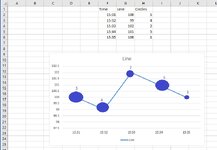
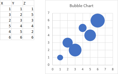
See attached example chart. I have a simple table. Header row + 5 data rows and 3 columns. First column is time, the other two are data. What I would like to do is plot the middle column in a line chart (easy), but then add the last column as circles to that line chart, preferably with a data label indicating the value and the size of the circle should increase with the value as well.

Is this possible?

Thanks!
 

Attachments

  • chart.jpg
    chart.jpg
    78.9 KB · Views: 6

Excel Facts

Show numbers in thousands?
Use a custom number format of #,##0,K. Each comma after the final 0 will divide the displayed number by another thousand
(just to be clear, in the picture the line was made with Excel, but the circles and labels I drew in with Paint)
 
Upvote 0

Forum statistics

Threads
1,214,394
Messages
6,119,262
Members
448,880
Latest member
aveternik

We've detected that you are using an adblocker.

We have a great community of people providing Excel help here, but the hosting costs are enormous. You can help keep this site running by allowing ads on MrExcel.com.
Allow Ads at MrExcel

Which adblocker are you using?

Disable AdBlock

Follow these easy steps to disable AdBlock

1)Click on the icon in the browser’s toolbar.
2)Click on the icon in the browser’s toolbar.
2)Click on the "Pause on this site" option.
Go back

Disable AdBlock Plus

Follow these easy steps to disable AdBlock Plus

1)Click on the icon in the browser’s toolbar.
2)Click on the toggle to disable it for "mrexcel.com".
Go back

Disable uBlock Origin

Follow these easy steps to disable uBlock Origin

1)Click on the icon in the browser’s toolbar.
2)Click on the "Power" button.
3)Click on the "Refresh" button.
Go back

Disable uBlock

Follow these easy steps to disable uBlock

1)Click on the icon in the browser’s toolbar.
2)Click on the "Power" button.
3)Click on the "Refresh" button.
Go back
Back
Top