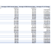
Percentage of Change as a calculated field in pivot chart comparing Average from two data points

ccastro4

New Member
Joined
Jun 14, 2022
Messages
18
Office Version
  1. 365
Platform
  1. Windows
Hi - I am trying to add a calculated field in my pivot chart that shows the % of change between 2022 AVG salary and 2021 AVG Salary. I do not know the correct way to do this.

Please Help
 

Attachments

  • Capture.PNG
    Capture.PNG
    18.1 KB · Views: 3

Excel Facts

Best way to learn Power Query?
Read M is for (Data) Monkey book by Ken Puls and Miguel Escobar. It is the complete guide to Power Query.

Forum statistics

Threads
1,214,643
Messages
6,120,707
Members
448,981
Latest member
recon11bucks

We've detected that you are using an adblocker.

We have a great community of people providing Excel help here, but the hosting costs are enormous. You can help keep this site running by allowing ads on MrExcel.com.
Allow Ads at MrExcel

Which adblocker are you using?

Disable AdBlock

Follow these easy steps to disable AdBlock

1)Click on the icon in the browser’s toolbar.
2)Click on the icon in the browser’s toolbar.
2)Click on the "Pause on this site" option.
Go back

Disable AdBlock Plus

Follow these easy steps to disable AdBlock Plus

1)Click on the icon in the browser’s toolbar.
2)Click on the toggle to disable it for "mrexcel.com".
Go back

Disable uBlock Origin

Follow these easy steps to disable uBlock Origin

1)Click on the icon in the browser’s toolbar.
2)Click on the "Power" button.
3)Click on the "Refresh" button.
Go back

Disable uBlock

Follow these easy steps to disable uBlock

1)Click on the icon in the browser’s toolbar.
2)Click on the "Power" button.
3)Click on the "Refresh" button.
Go back
Back
Top