Hi
Please see the attached file link below. Basically I want to achieve the image of the chart below in my file with the error bars. In my file, Instead of years, I have a month column and aban rate column(dummy file). What I want the pivot chart to do is in the following steps below and would appreciate your help in achieving it:
1. give the variance from current to the next month in power query or power pivot so it is automated
2. if for example the ab rate is 6.22% October 2019 and 3.07% in November 2019 than I want it to give a green arrow with variance(its getting better when its lower). Else, if the aban rate is 6.91% in December2020 and goes up to 7.32% in January then I want it to show a red with variance(.
3. Dynamic pivot chart since new month data will be appended each month so don't want format to lose as well.
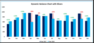
The image below is just an example of the error bar chart that I want to have on my chart in the file attached with my data in pivot table.
File link below:
variance or error bars.xlsx
Please see the attached file link below. Basically I want to achieve the image of the chart below in my file with the error bars. In my file, Instead of years, I have a month column and aban rate column(dummy file). What I want the pivot chart to do is in the following steps below and would appreciate your help in achieving it:
1. give the variance from current to the next month in power query or power pivot so it is automated
2. if for example the ab rate is 6.22% October 2019 and 3.07% in November 2019 than I want it to give a green arrow with variance(its getting better when its lower). Else, if the aban rate is 6.91% in December2020 and goes up to 7.32% in January then I want it to show a red with variance(.
3. Dynamic pivot chart since new month data will be appended each month so don't want format to lose as well.
The image below is just an example of the error bar chart that I want to have on my chart in the file attached with my data in pivot table.
File link below:
variance or error bars.xlsx