BenjaminC94
New Member
- Joined
- Feb 22, 2020
- Messages
- 1
- Office Version
- 365
- Platform
- Windows
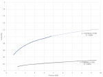
I have two sets of data on excel with differing X and Y values and I am looking to draw comparisons and get an average % increase in flow for pressure over the range.
Basically I did two experiments and want to compare the two and somehow quantify the improvement made statistically from the original (black line) to the new (blue line).
I did some other experiments on different fluids and would like to add them in and get the same percentage improvement figure between lines.
Up to now, I have added log trendlines to get them over the same range and displayed the curve equations and R^2 values.
Is this possible? I have rarely worked with data like this so unsure on how to proceed. If anyone has experience here it would be invaluable.
Thanks, Ben.