Plotting two sets of different data on one graph

dj3222

New Member
Joined
Mar 18, 2021
Messages
1
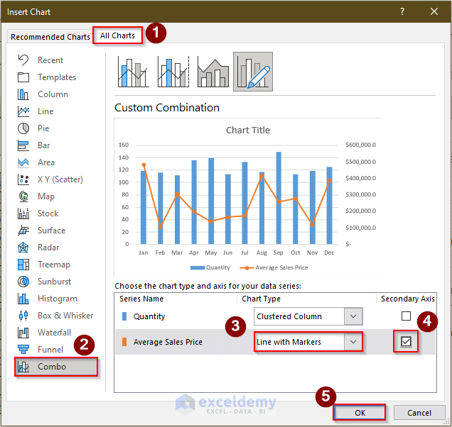
I am trying to plot different types of data onto one graph, my data is as follows:

Mar-21April 2021
Incoming MoneyOutgoing MoneyIncoming MoneyOutgoing Money
Marketing
200.00​
100.00​
300.00​
100.00​
Shop
400.00​
500.00​
700.00​
500.00​

Ideally, the x axis should have the month labels, the incoming money should be one line with the y axis on the left and the outgoing money another line in a different colour with the y axis on the right side of the graph. Is this possible to do using excel or do I need to look at an alternative solution?
 

Excel Facts

Which lookup functions find a value equal or greater than the lookup value?
MATCH uses -1 to find larger value (lookup table must be sorted ZA). XLOOKUP uses 1 to find values greater and does not need to be sorted.

Forum statistics

Threads
1,214,667
Messages
6,120,821
Members
448,990
Latest member
rohitsomani

We've detected that you are using an adblocker.

We have a great community of people providing Excel help here, but the hosting costs are enormous. You can help keep this site running by allowing ads on MrExcel.com.
Allow Ads at MrExcel

Which adblocker are you using?

Disable AdBlock

Follow these easy steps to disable AdBlock

1)Click on the icon in the browser’s toolbar.
2)Click on the icon in the browser’s toolbar.
2)Click on the "Pause on this site" option.
Go back

Disable AdBlock Plus

Follow these easy steps to disable AdBlock Plus

1)Click on the icon in the browser’s toolbar.
2)Click on the toggle to disable it for "mrexcel.com".
Go back

Disable uBlock Origin

Follow these easy steps to disable uBlock Origin

1)Click on the icon in the browser’s toolbar.
2)Click on the "Power" button.
3)Click on the "Refresh" button.
Go back

Disable uBlock

Follow these easy steps to disable uBlock

1)Click on the icon in the browser’s toolbar.
2)Click on the "Power" button.
3)Click on the "Refresh" button.
Go back
Back
Top