Plotting vertical bars with values within or outside of designated ref. range

KashBG

New Member
Joined
Jan 31, 2018
Messages
6
Hi there,
I have received a .pdf file, which is an export from an Excel worksheet. What you see is what should be on the Excel worksheet.
The meaning of the text is not important, so please ignore the theme, scientific, medical or else.
I like the design of presenting the data ( description or variable, if outside of range flagged with "L" for low or "H" for too high, bars designating the range and outside of range as well as actual value).

The lab producing this PDF export from Excel are no use contacting to obtain the source Excel template.

I would like to build Excel spreadsheet, having the same concept, except bars are vertical. Each adjacent bar (to the right) would be the new value for same variable but for another (follow up) date. This way as time goes by I can just add the new reading/ value and create an overview of previously measured values and trend.

Can anybody point how this might have been created in Excel?

Link of snapshot of concept below:
https://imgur.com/a/xj4QI
xj4QI
 

Excel Facts

What is the last column in Excel?
Excel columns run from A to Z, AA to AZ, AAA to XFD. The last column is XFD.
It's a variation of a box and whisker chart. It's not the new box and whisker included with Excel 2016, https://support.office.com/en-us/ar...er-chart-62f4219f-db4b-4754-aca8-4743f6190f0d, but a combination stacked column and scatter plot, something Jon Peltier might create, https://peltiertech.com/excel-box-and-whisker-diagrams-box-plots/

I've got something close, but not an exact duplicate.

RreqWoK.png


File download: https://www.dropbox.com/s/ycx05vbgp69pagy/box_whisker_variation.xlsx?dl=0

I'll post more in a bit.
 
Upvote 0
This was easier for me as horizontal bars. When I rotated to columns, I had to think about what I was doing.

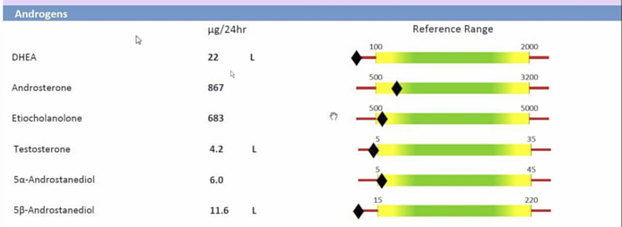
You might also look at bullet charts:
https://peltiertech.com/bullet-charts-in-excel/
http://stephanieevergreen.com/easiest-bullet-charts-in-excel/

I'll assume you have normalized the data and the sweet spot range to a zero to 100 scale. I chose to have a box for values between 15 and 80 on that 100 point scale. I've written these instructions for Excel 2013 and later

The data:


Book1
BCDE
4Stacked Columns
5LowMid
6Alpha1570
7Beta1570
8Gamma1570
9Delta1570
10
11Scatter Plot
12x1Data_Pctx3
131158985
142151385
153152685
164156985
17
18Lo_LabelsHi_Labels
193.230.1
201.87.8
210.42.6
221.67.7
Sheet1


My default charts appear with no axis lines. Yo will have to delete any that may appear.
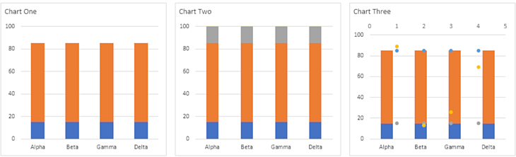
Chart One

Select cells B5:D9 and insert a stacked column chart. Set the vertical axis to a fixed minimum of zero and a fixed maximum of 100. Delete the legend. I chose a nearly square chart size of 3 x 3.25 inches.

Chart Two
Select D6:D9 (excluding the headers) and copy, Ctrl+C. Select the chart. From the Home tab, press the downward pointing arrow beneath the large clipboard icon, the Paste icon. Select Paste Special. In the pop-up dialog, select the radio buttons for "New series" and "Columns". Select the "Categories (X Labels) in First Column". The other two checkboxes should not be selected. They should be blank. Click OK and the new series will be pasted into the chart. At this point I selected one series and formatted the Gap width to 180%.

Chart Three
Select one series. From the right-click context menu, select "Change Series Chart Type". Series 3, 4, and 5 should be changed to "Scatter" (markers and no lines) on the secondary axis. If the secondary horizontal axis (that's the secondary x-axis) does not appear, add it now. The secondary vertical axis should have appeared automatically. Delete that secondary vertical axis.

The scatter plot points don't line up with the columns.

Chart Four
Change the secondary x-axis to a fixed minimum of 0.5 and a fixed maximum of 4.5. This should center the scatter plot points on the columns.

Not for Excel 2010 or earlier –
Select Series 3 and add Data labels to the right of the plotted points. With the data labels selected, go to the format pane. Under "Label Options", uncheck all the default checkboxes and place a check in the box labeled "Value From Cells". In the pop-up, enter B19:B22 or use your mouse to select those cells. Press OK.

Do the same for Series 5. This time the labels are in cells C19:C22.

The data label appeared too close to the columns. I fixed this by formatting the cells in B19:C22 with a custom number format: _)0.0 (underscore+rt.parenthesis+zero+dot+zero). This adds a space equal to the width of the parenthesis on the left side of the numbers. The cell formatting is automatically carried over to the data labels and add a small space between the column and the text.
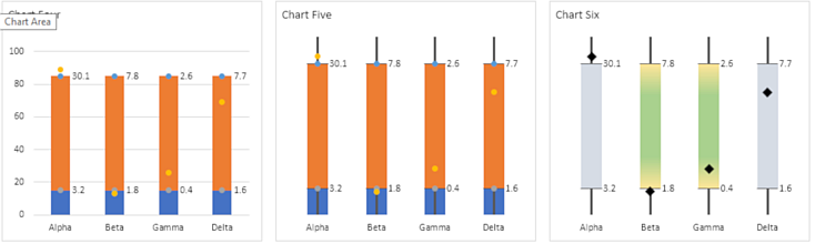
Chart Five
Choose Series 3 in the chart and add Error Bars. Format the horizontal bars ("Series 3 X Error Bars") to Direction: Both, End Style: No Cap, Error Amount: Fixed value: 0.18. The 0.18 works here; you may have to adjust the value.

Format the Series 3 Y Error Bars to Direction: Minus, End Style: No Cap, Error Amount: Percentage: 100.0%. I changed the line width from 0.75 pt to 2.0 pt for the thicker line.

Add Series 5 Error Bars. The horizontal error bar has exactly the same format settings as the Series 3 error bars. The Series 5 Y Error Bar setting differs from the Series 3 setting only in Direction, you set this to Plusfor Series 5.

We can't delete the upper horizontal axis or the scatter plot points will shift. Instead, select that axis and go to the format pane. Under "Axis Options: Number" change "Category" to "Custom". In the Format Code box, enter: ;;; (three semicolons, no spaces). This is the format code that tells Excel to not display any number or text.

At this point, I deleted the primary vertical axis and the gridlines. I then clicked inside the inner plot area to select it and used the grab handles to enlarge the plot area upwards and to the left.
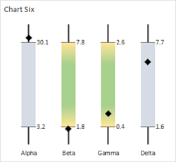
Chart Six
Select Series "Low" and format it to have no fill and no line.
Series 3 and Series 5 are formatted to have Marker: None.
Series 5 Is formatted to have a 10 pt black diamond marker.

Series "Mid" was first formatted to a light blue-gray fill with no line.

Personally, I found the gradient distracting—my attention went to the pretty colors instead of the more important plotted data point. If you want a gradient, the ones shown here are Type: Linear, Angle 270°, four stops: yellow at Position: 0%, green at Position: 25%, green at Position 75%, and yellow at Position: 100%.

FMnCpOD.png


Hl15RQC.png
 
Upvote 0
Thanks "thisoldman",

Although you make it looks so easy, I am grateful for you investing your time to help me replicate as close as possible my intended charts set up.
I followed the links that you provided and agree with you that Jon Peltier's knowledge on the subject would be quite helpful here.

Further, I wonder if you or anybody else might have an idea on how to replicate the front page as depicted in my screenshot/ link. The idea is imputing the values on the front page, which automatically populates another worksheet that actually controls the charts presentation on the front page.
 
Upvote 0
Without some idea of how your data is to be set up, it's really difficult to give any solutions. We need something more than "Can we make it look like this?"

This is your first page:

8YqKsDO.png


It's not clear to me if you want to pull up historical data or if you want to use this page for data entry. The first task can be done using formulas, perhaps Data Validation dropdown boxes. Entering new data would require VBA.

Having chart series expand dynamically as data is added is not too difficult if you use Excel's table structures. See Jon Peltier's post here: https://www.mrexcel.com/forum/excel...bar-chart-values-post4999207.html#post4999207

How are you defining the box's upper and lower limits? The traditional box plot uses the interquartile range, the middle 50 percent of the data values.

Dynamic charts have
 
Upvote 0
Thanks "thisoldman"

I now realise the complexity of what I am trying to achieve. At least, it sounds complicated to me for I am not that verse in Excel. Thank you for forwarding the link to one of Jon Peltier's posts.

The table above, depicts values of a variable for a given and single date only.
I would like to be able to present the data in a similar way (not crucial if not exactly the same) but depicting each value for specific date in a vertical bar, which would allow an automatic inclusion of another vertical bar as soon as a follow up measurements for specific date is available. Effectively, an automatic inclusion of an additional vertical bar.

The front page would keep the variables names and to the right would be the series of vertical bars designated by dates. Bars would have the actual value as depicted by the diamond shape with associated label next to it for its value. The bars would also display the recommended range for the variable, but the value may be even plotted outside that range.

I guess, in order to keep the front page as a simple template for imputing the results, there probably would be a back page/ worksheet that would be taking the inputs from front page and populating a table that helps with the construction of the vertical bars and any additional ones.

Apologies for not understanding your question about "upper box limits" and "interquartile range". This is related to me being not so advanced in Excel yet.

Thanks,
 
Upvote 0

Forum statistics

Threads
1,214,656
Messages
6,120,762
Members
448,991
Latest member
Hanakoro

We've detected that you are using an adblocker.

We have a great community of people providing Excel help here, but the hosting costs are enormous. You can help keep this site running by allowing ads on MrExcel.com.
Allow Ads at MrExcel

Which adblocker are you using?

Disable AdBlock

Follow these easy steps to disable AdBlock

1)Click on the icon in the browser’s toolbar.
2)Click on the icon in the browser’s toolbar.
2)Click on the "Pause on this site" option.
Go back

Disable AdBlock Plus

Follow these easy steps to disable AdBlock Plus

1)Click on the icon in the browser’s toolbar.
2)Click on the toggle to disable it for "mrexcel.com".
Go back

Disable uBlock Origin

Follow these easy steps to disable uBlock Origin

1)Click on the icon in the browser’s toolbar.
2)Click on the "Power" button.
3)Click on the "Refresh" button.
Go back

Disable uBlock

Follow these easy steps to disable uBlock

1)Click on the icon in the browser’s toolbar.
2)Click on the "Power" button.
3)Click on the "Refresh" button.
Go back
Back
Top