I'm trying to follow this tutorial https://peltiertech.com/Excel/ChartsHowTo/PanelUnevenScales.html and am running into some chart creation problems.
I've recreated the tutorial up to this point:
But my use case needs a full days worth of data at one-minute intervals so I
1) moved the min/max/relative table to the right
2) changed the date format to time
3) added my extra data
4) extended the ranges in the formulas
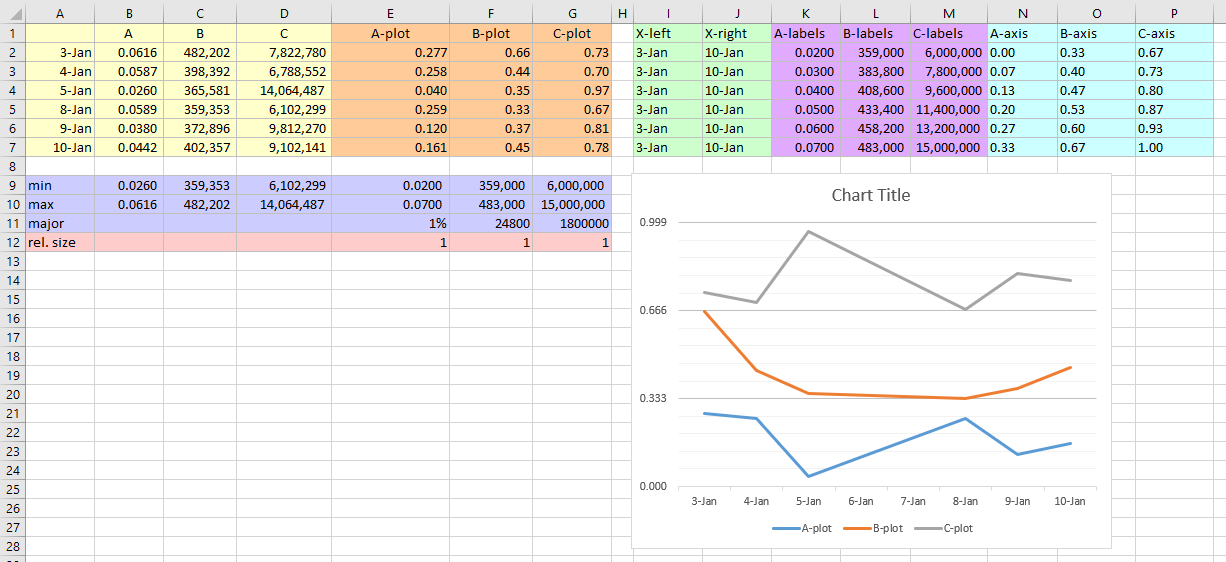
Here is a partial day at the same point in the tutorial
[I can only have four images]
Here is where I always hit the roadblock...
[I can only have four images]
Well, so far so good, now this is where all hell breaks loose...
I'm not even sure what version I am running because the good old Help-About menu is no where to be found.
I try this step using
And I get a totally F^% up axis...
I've tried this like a 100 times going back to the first step and recreating always with the same result.
Does anyone recognize what I am doing wrong???
I've recreated the tutorial up to this point:
But my use case needs a full days worth of data at one-minute intervals so I
1) moved the min/max/relative table to the right
2) changed the date format to time
3) added my extra data
4) extended the ranges in the formulas
Here is a partial day at the same point in the tutorial
[I can only have four images]
Here is where I always hit the roadblock...
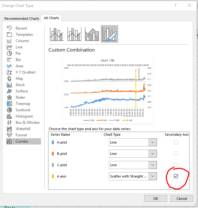
Great start. Add the first axis: select I1:I12 (X-left), hold CTRL while selecting N1:N12, copy this two-area range, select the chart, and from the Edit menu, select Paste Special. Choose New Series, Values in Columns, Series Names in First Row, and Categories (X Labels) in First Column.
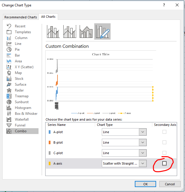
The new axis series is not aligned along the Y axis, because Excel thinks it's another line chart series. Select just this series, go to the Chart menu, choose Chart Type, then select an XY chart type. I've used markers connected by lines to help show the series.
[I can only have four images]
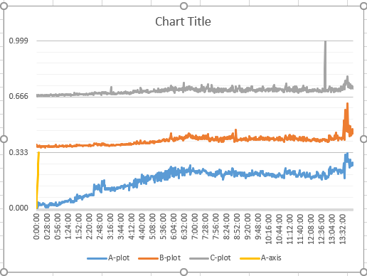
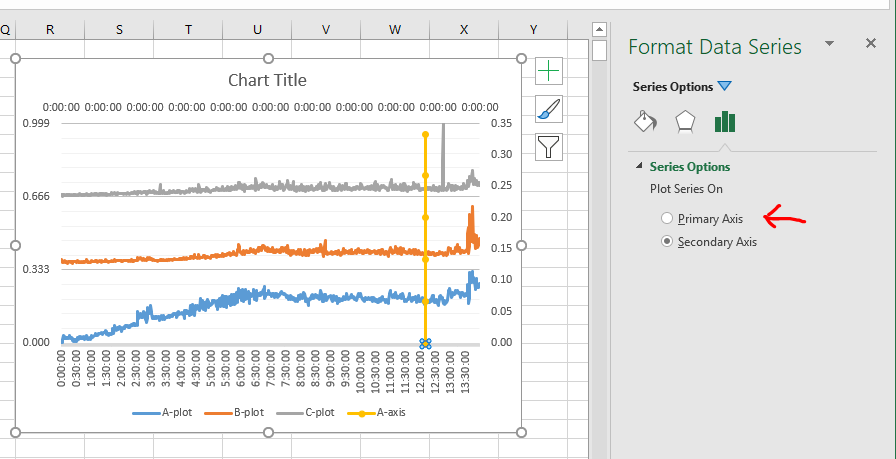
Well, so far so good, now this is where all hell breaks loose...
The new XY series is totally misaligned from the line chart series, and it even has its own misaligned secondary X and Y axes. Move the XY series to the primary axis: double click the series, and on the Axis tab, choose Primary.
I'm not even sure what version I am running because the good old Help-About menu is no where to be found.
I try this step using
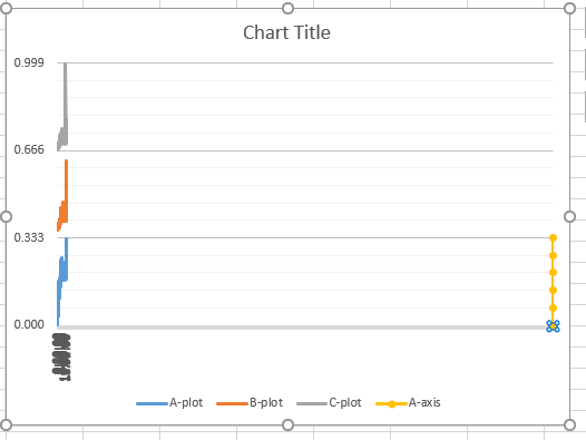
And I get a totally F^% up axis...
I've tried this like a 100 times going back to the first step and recreating always with the same result.
Does anyone recognize what I am doing wrong???