shanghaileon
New Member
- Joined
- Sep 11, 2013
- Messages
- 4
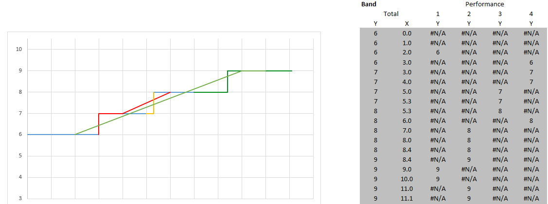
Hi Guys, I'm working on creating a scatter plot with lines graph to show both progression in levels for a person, year by year, as well as the performance rating that the person received that year. I'd like to do the formatting based on rating on a yearly basis (only one rating a year) and in the year they're promoted, they still hold that same rating, but move up a level.
I have most of the ground work laid for what I"m trying to do in the attached file, but I"m having trouble getting rid of connector lines across non sequential data points. For example, in 2013, someone is green, 2012, someone is yellow, and 2011 they were also green. I want each of those years colored respectively, but not 2011 with a line to 2013.
Any help would greatly be appreciated. I know that I can get around some of these issues by ordering the series, and I have a backup version that doesn't use the connecting lines which is decent, but I'm hoping there's a way to make this work! Thanks in advance!
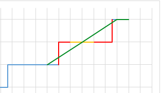
Each vertical gridline represents a year.
I have most of the ground work laid for what I"m trying to do in the attached file, but I"m having trouble getting rid of connector lines across non sequential data points. For example, in 2013, someone is green, 2012, someone is yellow, and 2011 they were also green. I want each of those years colored respectively, but not 2011 with a line to 2013.
Any help would greatly be appreciated. I know that I can get around some of these issues by ordering the series, and I have a backup version that doesn't use the connecting lines which is decent, but I'm hoping there's a way to make this work! Thanks in advance!
Each vertical gridline represents a year.