Shade Different Areas Under a Curve

rjbinney

Active Member
Joined
Dec 20, 2010
Messages
279
Office Version
  1. 365
Platform
  1. Windows
I KNEW I shouldn't have slept through calculus!

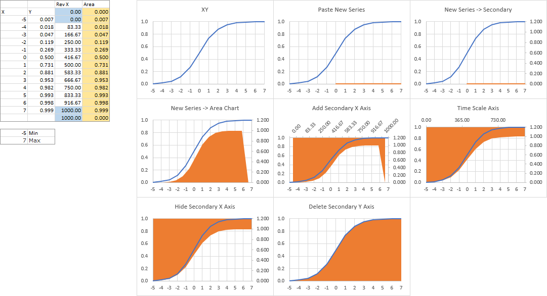
I would like a generic S-curve, but I'd like to color in under the curve. I have figured out how to color the entire area under the curve:
Excel 2016 (Windows) 32 bit
A
B
C
D
3
Rev XArea
4
XY
0​
0​
5
-5​
0.006693​
0​
0.006693​
6
-4​
0.017986​
83.33333​
0.017986​
7
-3​
0.047426​
166.6667​
0.047426​
8
-2​
0.119203​
250​
0.119203​
9
-1​
0.268941​
333.3333​
0.268941​
10
0​
0.5​
416.6667​
0.5​
11
1​
0.731059​
500​
0.731059​
12
2​
0.880797​
583.3333​
0.880797​
13
3​
0.952574​
666.6667​
0.952574​
14
4​
0.982014​
750​
0.982014​
15
5​
0.993307​
833.3333​
0.993307​
16
6​
0.997527​
916.6667​
0.997527​
17
7​
0.999089​
1000​
0.999089​
18
19
-5​
Min
20
7​
Max

<tbody>
</tbody>
Sheet: Sheet1

<tbody>
</tbody>

Where Column B=1/(1+EXP(-A))
Column C = 1000 * (A- MIN(A:A)) / (MAX(A:A)-MIN(A:A))

Which gives me:
Curve.png


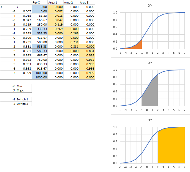
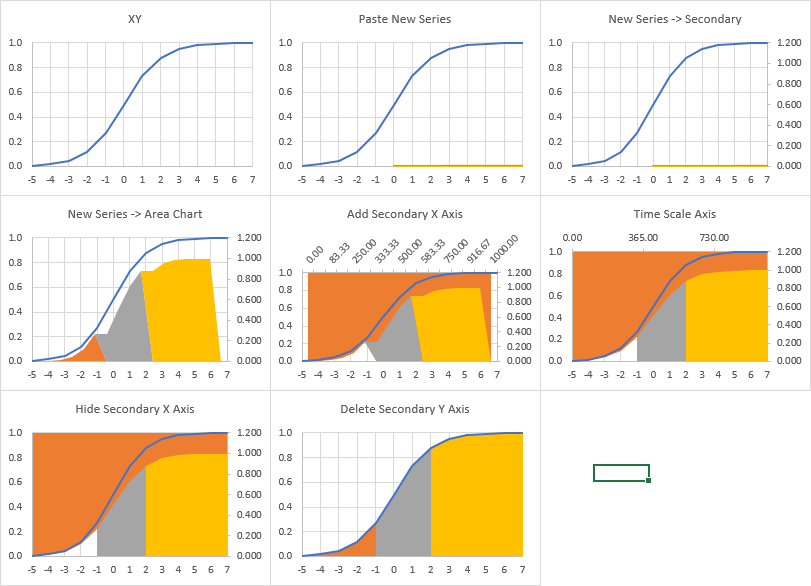
What I'd like to do is have multiple colors under the curve:
COlored%20Curve.png
 

Excel Facts

Links? Where??
If Excel says you have links but you can't find them, go to Formulas, Name Manager. Look for old links to dead workbooks & delete.
Thanks. That second link is where I got the formula to attempt the original. Trouble is, the curve is a function of the length, so if you just "cut off" the formula at a certain X, it throws the whole curve off. I may just have to plot the curve and manually fill it in.
 
Upvote 0
Your first attempt followed my tutorial Fill Under or Between Series in an Excel XY Chart, summarized below.

The first two columns of data are the X-Y coordinates of the curve to fill under, the values below the table are the minimum and maximum of the horizontal axis, and the third and fourth columns are the data for the area chart series that fills below the curve. Note that the first and last X values for the area chart data are repeated, and the first and last Y values for the area chart are zero; these features ensure a vertical edge on the left and right.

Select the first two columns and create an XY chart (top left chart). Copy the next two columns, select the chart, and use Paste Special to add the data as a new series, series in columns, first column has X data, first row has series names (top center chart). Format the new series, and select Secondary Axis (top right chart).

Right click the new series, choose Change Series Chart Type, and select Area Chart (middle left chart). Add a secondary horizontal axis (middle center chart). Convert secondary horizontal axis to a date-scale (middle right chart).

Hide the secondary horizontal axis: format so it uses no line, has no axis tick labels and no axis tick marks (bottom left chart). Delete the secondary vertical axis (bottom center chart).

45c3RO1.png


It's the same for multiple fill regions. Here is the data and the three individual filled regions under the curve. Not in addition to min and max below the data table, there is also the two X values where the different colored fill regions meet. They are here for reference and are not used in any formulas, although they could be if you wanted to get clever. Not only are the first and last X values repeated, but so are the X values where the fill colors change. There are three columns with area chart Y values for the three series we will have to add, and note that each range of nonzero values is surrounded by zeros.

6h7ac5Z.png


The protocol is the same as for one fill region.

Select the first two columns and create an XY chart (top left chart). Copy the next four columns, select the chart, and use Paste Special to add the data as new series, series in columns, first column has X data, first row has series names (top center chart). Format the three new series, and select Secondary Axis (top right chart).

Right click each new series, choose Change Series Chart Type, and select Area Chart (middle left chart). Add a secondary horizontal axis (middle center chart). Convert secondary horizontal axis to a date-scale (middle right chart).

Hide the secondary horizontal axis: format so it uses no line, has no axis tick labels and no axis tick marks (bottom left chart). Delete the secondary vertical axis (bottom center chart).

kjd2Nl2.png
 
Upvote 0
What color do you use for Mind. BLOWN!!! ?

Thanks, will play with this tonight.

Thank you!
 
Upvote 0
The Max cell threw me at first, until I realized it was the max X of the graph, and Excel will change the maximum of the x axis as you modify the data. So you need to watch the X axis and be ready to change Max to match the graph.
I now have the graph I want, so BIG thank you!! RAK_da_Pira.
 
Upvote 0

Forum statistics

Threads
1,214,646
Messages
6,120,717
Members
448,985
Latest member
chocbudda

We've detected that you are using an adblocker.

We have a great community of people providing Excel help here, but the hosting costs are enormous. You can help keep this site running by allowing ads on MrExcel.com.
Allow Ads at MrExcel

Which adblocker are you using?

Disable AdBlock

Follow these easy steps to disable AdBlock

1)Click on the icon in the browser’s toolbar.
2)Click on the icon in the browser’s toolbar.
2)Click on the "Pause on this site" option.
Go back

Disable AdBlock Plus

Follow these easy steps to disable AdBlock Plus

1)Click on the icon in the browser’s toolbar.
2)Click on the toggle to disable it for "mrexcel.com".
Go back

Disable uBlock Origin

Follow these easy steps to disable uBlock Origin

1)Click on the icon in the browser’s toolbar.
2)Click on the "Power" button.
3)Click on the "Refresh" button.
Go back

Disable uBlock

Follow these easy steps to disable uBlock

1)Click on the icon in the browser’s toolbar.
2)Click on the "Power" button.
3)Click on the "Refresh" button.
Go back
Back
Top