Hi,
I have data in the following format with multiple entries which are partially overlapping:
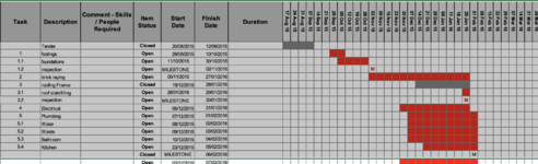
Is it possible to visualize this as a Gantt chart? The closest match I can see is the clustered bar chart, but that's not quite what I need. I would rather have the data like that:

I have data in the following format with multiple entries which are partially overlapping:
Name | Start date | Stop date |
| John | 01-Jan-2020 | 20-Nov-2020 |
| Jack | 15-May-2020 | 01-Mar-2021 |
| Jennifer | 01-Dec-2020 | 01-Sep-2021 |