Slicer and pivot table chart

Pedro Morais

Board Regular
Joined
Dec 5, 2007
Messages
90
Hi guys,

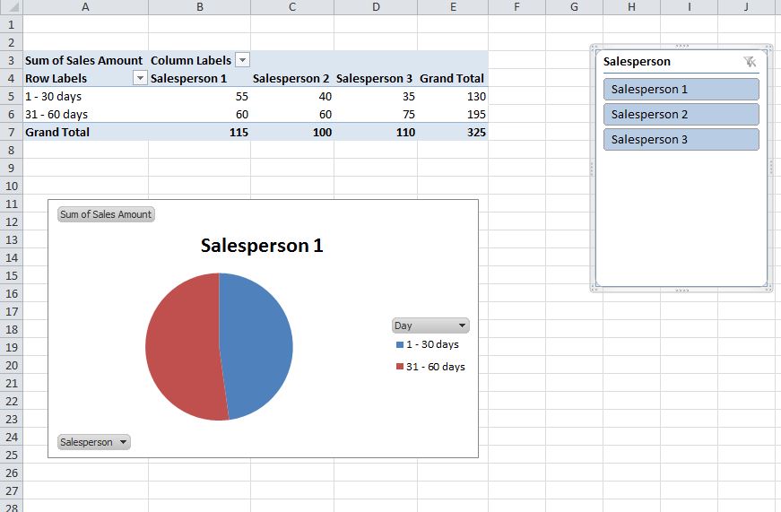
I have a pivot table pie chart associated with a Slicer.

Have 2 problems with it:
1 - when I clear the slicer filter (so all items are selected), the graph shows values of the first item on the list, instead of showing the totals for all items.
2 - every time I select one item, the color of the pie slices changes. I need to format each slice for each of the possible selection items which is a problem as per the volume and also that the list will change.

Any thoughts?

Thanks
Pedro
 

Excel Facts

Can you sort left to right?
To sort left-to-right, use the Sort dialog box. Click Options. Choose "Sort left to right"
1 - when I clear the slicer filter (so all items are selected), the graph shows values of the first item on the list, instead of showing the totals for all items.

It sounds like you have too many columns in the PivotTable. If you only want totals in the chart, you should only have totals in the PivotTable. No other values or columns (besides the row labels).

2 - ... I need to format each slice for each of the possible selection items which is a problem as per the volume and also that the list will change.

Can you explain what this means? Format each slice in what way?
 
Upvote 0
It sounds like you have too many columns in the PivotTable. If you only want totals in the chart, you should only have totals in the PivotTable. No other values or columns (besides the row labels).


Can you explain what this means? Format each slice in what way?

Thanks

1- I have X columns as X being the number of persons (eg: salespersons). When I select one individual it works fine. But when I make no selection, instead of giving me the totals for all, it shows me the values of the first individual.

2 - Eg: I want the first slice of the pie to be green. I format it that way but then when I change individual (on the slicer) it picks up the original formatting. So I'd have to format the colour for each salesperson.
 
Upvote 0
I don't think you understood my solution posted above. It might be helpful if you could post a few lines of your data, and tell me precisely how your PivotTable is presently configured.
 
Upvote 0
Columns is the name of the salesperson and varies as per the number of sales persons.
Rows a category that is related to days. For example "1-30 days";"31-to 60 days". And its a fixed number of rows, doesn't vary.

There is a pie chart for the 2 rows, so when you select on the slicer the sales person you want to see, the pie chart varies showing the split between the 2 categories (rows).

Everything works fine unless i clear the fliter of the slicer, then the table still looks fine BUT the graph shows me the split for the first sales person on the slicer.

Not sure how I can paste or send an example but hopefully that will help.

Thanks!
 
Upvote 0
Ok, if I understand you correctly, your raw data looks something like this:


Excel 2010
ABC
1DaySalespersonSales Amount
21 - 30 daysSalesperson 155
331 - 60 daysSalesperson 160
41 - 30 daysSalesperson 240
531 - 60 daysSalesperson 260
61 - 30 daysSalesperson 335
731 - 60 daysSalesperson 375
Sheet1


and your PivotTable looks something like this:

Pivot.JPG


In that case, my initial assumption was correct, that you are trying to analyze too much information in a single pie chart. A pie chart should be used to compare two metrics. For instance Salespeople and Sales amount, or 'days' and Sales amount. It can't look at all three. Can you explain in words what you are trying to accomplish with the pie chart?

As far as your second question goes, what would you like to happen? Tell me which colors are currently appearing and what you like to see instead.
 
Upvote 0
First of all, many thanks for taking the time. It's appreciated.

Yes, you got that right in large lines.
I defer a bit on the part that the graph isn't accomplishing what I need.
It's showing this in the way I want. I understand it might not make sense to you.

The Only part (neglecting the colour piece) that is not working is that if you look at the slicer on your pic, you have no person chosen (or better said you have all chosen) and yet, it is showing the data for Sales person 1.
For me it should either:
- not show any or - show the cumulative data for all 3 sales persons as all are chosen.

Again, when you select just one person at a time, the graph displays exactly what I need, only when the filter is cleared, the above happens.

I understand that The answer might be that there isn't a solution.

As for the second question, your graph as blue and red. as colours. when you select sales person 1.
Lets say that I want green and red. I change it and the change is applied for sales person 1 but if you then select sales person 2, it will be blue again.
(which is a scalability problem)
 
Upvote 0
When you filter to one salesperson, you are correctly comparing Days to Sales Amount, for the one sales rep. If you release the filter you have too many columns for the pie chart. In order to graph all Sales Amounts, you should remove Salesperson from the Columns fields.

In fact, I think that may solve all of your issues. You can still filter by Salesperson using the slicer.
 
Upvote 0
Thanks.
Hence what I am looking for is a solution that would either should me totals or nothing (when I release the filter).

From an user perspective, having to explain that although you see details, theres no person selected isnt the type of experience I want to give people not familiar with the data.
 
Upvote 0
Did you try Ben's last suggestion of removing salesperson from the column area of the pivot?
 
Upvote 0

Forum statistics

Threads
1,214,561
Messages
6,120,239
Members
448,951
Latest member
jennlynn

We've detected that you are using an adblocker.

We have a great community of people providing Excel help here, but the hosting costs are enormous. You can help keep this site running by allowing ads on MrExcel.com.
Allow Ads at MrExcel

Which adblocker are you using?

Disable AdBlock

Follow these easy steps to disable AdBlock

1)Click on the icon in the browser’s toolbar.
2)Click on the icon in the browser’s toolbar.
2)Click on the "Pause on this site" option.
Go back

Disable AdBlock Plus

Follow these easy steps to disable AdBlock Plus

1)Click on the icon in the browser’s toolbar.
2)Click on the toggle to disable it for "mrexcel.com".
Go back

Disable uBlock Origin

Follow these easy steps to disable uBlock Origin

1)Click on the icon in the browser’s toolbar.
2)Click on the "Power" button.
3)Click on the "Refresh" button.
Go back

Disable uBlock

Follow these easy steps to disable uBlock

1)Click on the icon in the browser’s toolbar.
2)Click on the "Power" button.
3)Click on the "Refresh" button.
Go back
Back
Top