Vertical value and range chart

Data_Cognition_Ltd

New Member
Joined
May 10, 2022
Messages
1
Office Version
  1. 365
Platform
  1. Windows
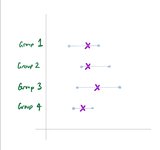
First time I'm creating a post as I think I'm usually okay at finding solutions in Excel, but this has got me scratching my head. I'm trying to create a chart that shows a vertical list of categories that each have a value, and whiskers that plot the range in which the category values should be within. I've attached a drawing of what i would like the chart to look like. My initial thought was line chart with high/low lines, but you cannot flip the axis. Any help/solutions appreciated.
 

Attachments

  • Example chart.jpg
    Example chart.jpg
    63 KB · Views: 7

Excel Facts

Can you sort left to right?
To sort left-to-right, use the Sort dialog box. Click Options. Choose "Sort left to right"

Forum statistics

Threads
1,214,827
Messages
6,121,818
Members
449,049
Latest member
cybersurfer5000

We've detected that you are using an adblocker.

We have a great community of people providing Excel help here, but the hosting costs are enormous. You can help keep this site running by allowing ads on MrExcel.com.
Allow Ads at MrExcel

Which adblocker are you using?

Disable AdBlock

Follow these easy steps to disable AdBlock

1)Click on the icon in the browser’s toolbar.
2)Click on the icon in the browser’s toolbar.
2)Click on the "Pause on this site" option.
Go back

Disable AdBlock Plus

Follow these easy steps to disable AdBlock Plus

1)Click on the icon in the browser’s toolbar.
2)Click on the toggle to disable it for "mrexcel.com".
Go back

Disable uBlock Origin

Follow these easy steps to disable uBlock Origin

1)Click on the icon in the browser’s toolbar.
2)Click on the "Power" button.
3)Click on the "Refresh" button.
Go back

Disable uBlock

Follow these easy steps to disable uBlock

1)Click on the icon in the browser’s toolbar.
2)Click on the "Power" button.
3)Click on the "Refresh" button.
Go back
Back
Top