Waterfall charts : Combo Chart or Automatically Adding a line at 0 to highlight the breakeven

perph001

New Member
Joined
May 9, 2022
Messages
3
Office Version
  1. 365
Platform
  1. Windows
Hi,

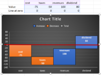
I have a file with multiple automations that allows me to create as much projects as I want (between 40-50).

I just found out that Excel had "Waterfall" charts and my problem is that I want to emphasize on the breakeven point by adding a line on 0 (like the red line on the image), but the Waterfall charts seems to be incompatible with "Combo Charts" in Excel (therefore, the line with all the "0" remains unused).

Is there a way to do this ? To automate this ? I know my way around VBA relatively well, so that is not a problem.

Thanks !!


P.S. Each project are based on the "reference project" sheet, therefore, if I get it right on this sheet, it would work on any of my 40-50 projects ...
 

Attachments

  • Waterfall_Line_at_zero.png
    Waterfall_Line_at_zero.png
    168.6 KB · Views: 32

Excel Facts

Do you hate GETPIVOTDATA?
Prevent GETPIVOTDATA. Select inside a PivotTable. In the Analyze tab of the ribbon, open the dropown next to Options and turn it off
Precision : I would like to have this result, but with a Waterfall chart ...
 

Attachments

  • Combo Chart - Line at zero.png
    Combo Chart - Line at zero.png
    61.5 KB · Views: 45
Upvote 0
I will be answering my own post :

Waterfall charts are very picky :
~~~~~~~~~~~~~~~~~~~~~
- They do not accept any value linking to other cells in the workbook (eg. Title, Axis name, etc.)
- They do not accept "Combo Charts" which is what I need.
- With a big project, they can create an Excel meltdown where the calculation time is multiplied by 30, 50 or even 100 times what it should be (in rare cases where I have not observed any pattern, but going from 20 seconds to 15 minutes for the same task is not normal ... and with a restart of Excel or a Reboot, everything is going fine ...)

Logically speaking, stay away from these charts if you can ;)
 
Upvote 0
Solution
The built-in Excel waterfall charts are problematic in many ways.

Couldn't you just format the horizontal axis to use a red line color?

If not, perhaps you could start with one of these waterfall charts, and add a line chart series with the red line color: Excel Waterfall Charts (Bridge Charts).
 
Upvote 0

Forum statistics

Threads
1,214,832
Messages
6,121,851
Members
449,051
Latest member
excelquestion515

We've detected that you are using an adblocker.

We have a great community of people providing Excel help here, but the hosting costs are enormous. You can help keep this site running by allowing ads on MrExcel.com.
Allow Ads at MrExcel

Which adblocker are you using?

Disable AdBlock

Follow these easy steps to disable AdBlock

1)Click on the icon in the browser’s toolbar.
2)Click on the icon in the browser’s toolbar.
2)Click on the "Pause on this site" option.
Go back

Disable AdBlock Plus

Follow these easy steps to disable AdBlock Plus

1)Click on the icon in the browser’s toolbar.
2)Click on the toggle to disable it for "mrexcel.com".
Go back

Disable uBlock Origin

Follow these easy steps to disable uBlock Origin

1)Click on the icon in the browser’s toolbar.
2)Click on the "Power" button.
3)Click on the "Refresh" button.
Go back

Disable uBlock

Follow these easy steps to disable uBlock

1)Click on the icon in the browser’s toolbar.
2)Click on the "Power" button.
3)Click on the "Refresh" button.
Go back
Back
Top