
Adjust Xy Chart Scaling For Correct Aspect Ratio
May 03, 2021 - by Bill Jelen

Challenge: You want to adjust an XY (scatter) chart so that both axes have the same scale per unit axis value. That is, you need to adjust the chart in Figure 88 so the square and a circle appear as shown in Figure 89.You want to adjust an XY (scatter) chart so that both axes have the same scale per unit axis value. That is, you need to adjust the chart in Figure 88 so the square and a circle appear as shown in Figure 89.
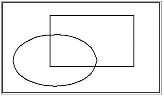
Figure 88. You start with an oval and a rectangle.
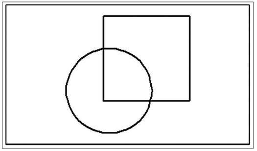
Figure 89. You want a circle and a square, as shown here.
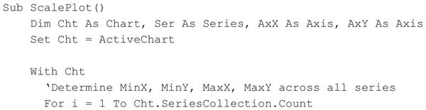
Solution: The following code works on both embedded charts and chart sheets. Ensure that the chart is selected or that the chart sheet is activated and then run the following code:
The sample chart in Figure 89 is a plot of a circle of radius 4 units, with a center at (5,5), and a square of side 8 units, with the top-left corner at (4.5,12).
Breaking It Down: This problem crops up in situations where the x and y data are of similar orders of magnitude—for example, when you are plotting a shape rather than an algebraic function. In the general case, when such a chart is created, the scaling of the x and y axes are not the same. The height and width of the plot area also contribute to the degree of distortion of the plotted series. The idea is to determine which of the two axes needs to be set to a larger range of Min/Max scale values so the series appears with the correct aspect ratio, so the required Min/Max scale values are calculated, and so the axis scale is set accordingly.
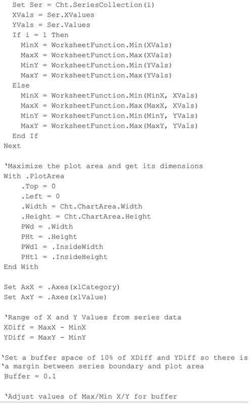
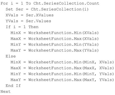
The following section of code calculates the Min/Max x and y across all series in the chart:
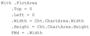
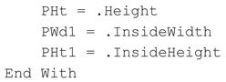
The following section maximizes the plot area to the chart boundaries and gets the inside dimensions of the plot area (these dimensions are required for the scaling exercise):
The next section calculates the range of extreme x and y values,:
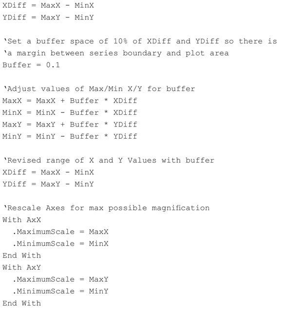
A buffer of 10% of x and y ranges is set to accommodate the series comfortably within the plot area, the ranges are recalculated (including the buffer zone), and the Min/Max scales of the axes are set to the newly calculated Min/Max values.
The final section of code calculates the new scaling of the internal dimensions of the plot area for the modified x and y ranges:
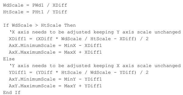
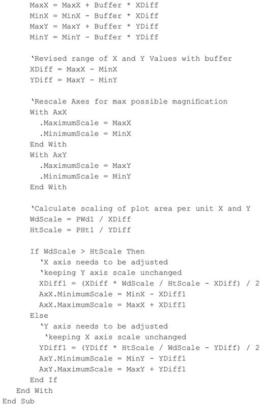
If the horizontal scaling is greater than the vertical scaling, the x axis needs to be set to a larger scale range (XDiff1), which is calculated from the horizontal scaling of the inside width of the plot area. XDiff1 is applied symmetrically to the x axis scaling (i.e., the minimum scale for the x axis is reduced by XDiff1/2), and the maximum scale is incremented by the same amount. The same is done with the y axis if the vertical scaling is greater than the horizontal scaling.
Summary: The code in this solution programmatically adjusts a scatter chart containing series of similar orders of magnitude to display correctly proportioned series.
Title Photo: Sigmund on Unsplash
This article is an excerpt from Excel Gurus Gone Wild.