
Excel 2020: Build Dashboards with Sparklines and Slicers
June 03, 2020 - by Bill Jelen

New tools debuted in Excel 2010 that let you create interactive dashboards that do not look like Excel. This figure shows an Excel workbook with two slicers, Region and Line, used to filter the data. Also in this figure, pivot charts plus a collection of sparkline charts illustrate sales trends.
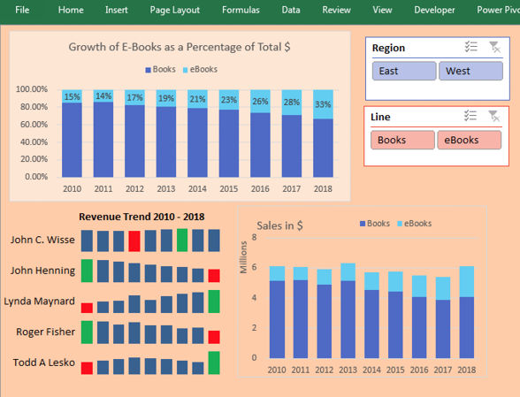
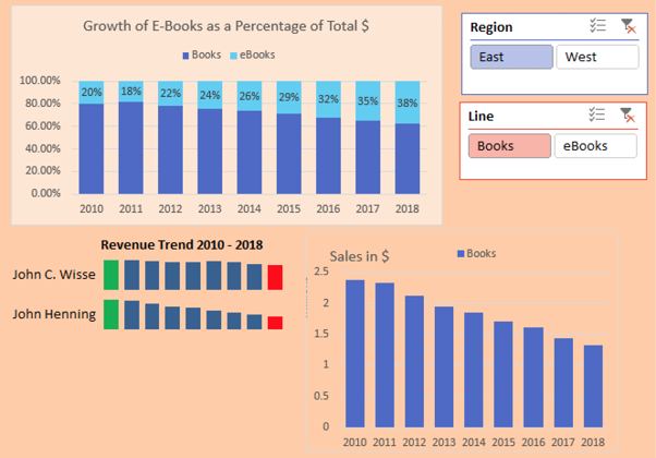
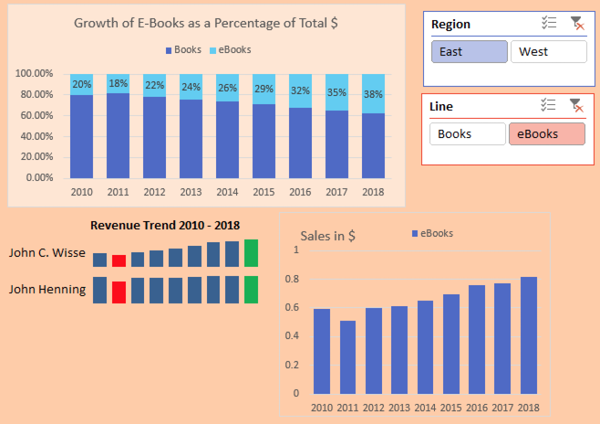
You can use a setup like this and give your manager’s manager a touch screen. All you have to do is teach people how to use the slicers, and they will be able to use this interactive tool for running reports. Touch the East region and the Books line. All of the charts update to reflect sales of books in the East region.
Switch to eBooks, and the data updates.
Pivot Tables Galore
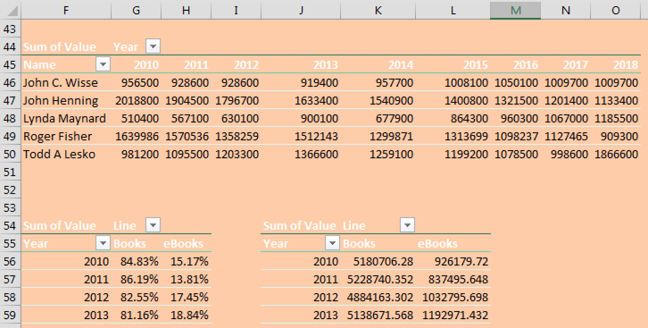
Arrange your charts so they fit the size of your display monitor. Each pivot chart has an associated pivot table that does not need to be seen. Those pivot tables can be moved to another sheet or to columns outside of the area seen on the display.
Note
This technique requires all pivot tables share a pivot table cache. I have a video showing how to use VBA to synchronize slicers from two data sets at http://mrx.cl/syncslicer.
Filter Multiple Pivot Tables with Slicers
Slicers provide a visual way to filter. Choose the first pivot table on your dashboard and select Analyze, Slicers. Add slicers for region and line. Use the Slicer Tools tab in the Ribbon to change the color and the number of columns in each slicer. Resize the slicers to fit and then arrange them on your dashboard.
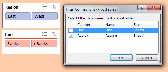
Initially, the slicers are tied to only the first pivot table. Select a cell in the second pivot table and choose Filter Connections (aka Slicer Connections in Excel 2010). Indicate which slicers should be tied to this pivot table. In many cases, you will tie each pivot table to all slicers. But not always. For example, in the chart showing how Books and eBooks add up to 100%, you need to keep all lines. The Filter Connections dialog box choices for that pivot table connect to the Region slicer but not the Line slicer.
Sparklines: Word-Sized Charts
Professor Edward Tufte introduced sparklines in his 2007 book Beautiful Evidence. Excel 2010 implemented sparklines as either line, column, or win/loss charts, where each series fills a single cell.
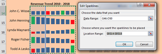
Personally, I like my sparklines to be larger. In this example, I changed the row height to 30 and <gasp> merged B14:D14 into a single cell to make the charts wider. The labels in A14:A18 are formulas that point to the first column of the pivot table.
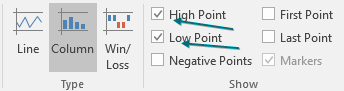
To change the color of the low and high points, choose these boxes in the Sparkline Tools tab:
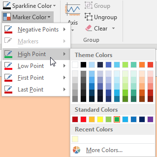
Then change the color for the high and low points:
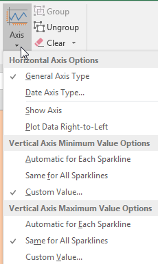
By default, sparklines are scaled independently of each other. I almost always go to the Axis settings and choose Same for All Sparklines for Minimum and Maximum. Below, I set Minimum to 0 for all sparklines.
Make Excel Not Look Like Excel
With several easy settings, you can make a dashboard look less like Excel:
- Select all cells and apply a light fill color to get rid of the gridlines.
-
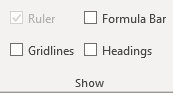
On the View tab, uncheck Formula Bar, Headings, and Gridlines.
- Collapse the Ribbon: at the right edge of the Ribbon, use the ^ to collapse. (You can use Ctrl+F1 or double-click the active tab in the Ribbon to toggle from collapsed to pinned.)
- Use the arrow keys to move the active cell so it is hidden behind a chart or slicer.
- Hide all sheets except for the dashboard sheet.
-
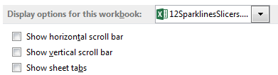
In File, Options, Advanced, hide the scroll bars and sheet tabs.
Jon Wittwer of Vertex42 suggested the sparklines and slicers trick. Thanks to Ghaleb Bakri for suggesting a similar technique using dropdown boxes.
Title Photo: Carlos Muza at Unsplash.com
This article is an excerpt from MrExcel 2020 - Seeing Excel Clearly.