
Excel 2024: Create a Bell Curve
April 01, 2024 - by Bill Jelen

I have 2600 Excel videos on YouTube. I can never predict which ones will be popular. Many videos hover around 2,000 views. But for some reason, the Bell Curve video collected half a million views. I am not sure why people need to create bell curves, but here are the steps.
A bell curve is defined by an average and a standard deviation. In statistics, 68% of the population will fall within one standard deviation of the mean. 95% falls within two standard deviations of the mean. 99.73% will fall within three standard deviations of the mean.
Say that you want to plot a bell curve that goes from 100 to 200 with the peak at 150. Use 150 as the mean. Since most of the results will fall within 3 standard deviations of the mean, you would use a standard deviation of 50/3 or 16.667.
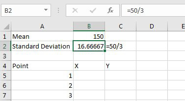
1. Type 150 in cell B1.
2. Type =50/3 in cell B2.
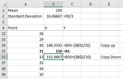
3. Type headings of Point, X, Y in cells A4:C4.
4. Fill the numbers 1 to 61 in A5:A65. This is enough points to create a smooth curve.
5. Go to the midpoint of the data, point 31 in B35. Type a formula there of =B1 to have the mean there.
6. The formula for B36 is =B35+($B$2/10). Copy that formula from row 36 down to row 65.
7. The formula for B34 is =B34-($B$2/10). Copy that formula up to row 5. Note that the notes in columns C:E of this figure do not get entered in your workbook - they are here to add meaning to the figure.
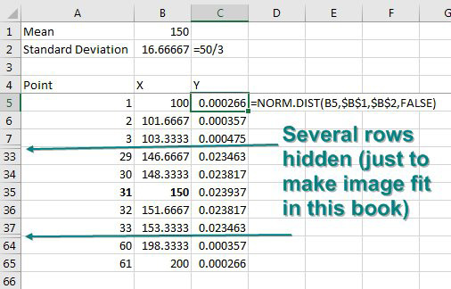
The magic function is called NORM.DIST which stands for Normal Distribution. When statisticians talk about a bell curve, they are talking about a normal distribution. To continue the current example, you want a bell curve from 100 to 200. The numbers 100 to 200 go along the X-axis (the horizontal axis) of the chart. For each point, you need to calculate the height of the curve along the y-axis. NORM.DIST will do this for you. There are four required arguments: =NORM.DIST(This x point, Mean, Standard Deviation, False). The last False says that you want a bell curve and not a S-curve. (The S-Curve shows accumulated probability instead of point probability.)
8. Type =NORM.DIST(B5,$B$1,$B$2,False) in C5 and copy down to row 65.
|
9. Select B4:C65. On the Insert tab, open the XY-Scatter drop-down menu and choose the thumbnail with a smooth line. Alternatively, choose Recommened Charts and the first option for a bell curve. 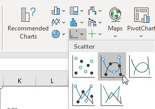 |
The result: a bell curve, as shown here. 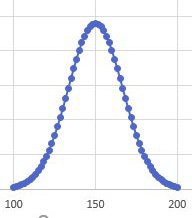 |
This article is an excerpt from MrExcel 2024 Igniting Excel
Title photo by Luís Perdigão on Unsplash