Excel 2024: Create Funnel Charts and Filled Map Charts


March 27, 2024 - by

Excel 2024: Create Funnel Charts and Filled Map Charts

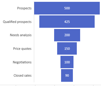
In 2016, Microsoft 365 introduced Funnel charts, as well as Treemap, Sunburst, Box & Whisker, Pareto, and Histogram charts. A Funnel chart is great for showing a sales funnel.

A funnel chart is like a bar chart where the bars are centered. At the top, there are 500 prospects. The next bar shows 425 qualified prospects. Then 250 of those customers had a Needs Analysis. 150 had price quotes. 100 went to negotiations. Then 90 Close Sales. The bars form the shape of a funnel.

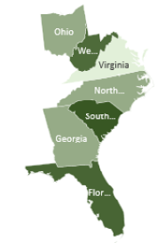
Early in 2017, Map Charts appeared on the Insert tab in Microsoft 365. A Map chart shades closed regions on a map such as countries, states, counties, even zip code boundaries.


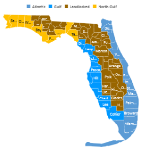
When you format a series in a Map, you can choose if it should show all 50 states or only the regions with data. Choose what makes the most sense for your data. In the chart on the left, the series color is a two-color gradient. You can choose three-color gradients or a category map, as shown on the right.

This filled map chart shows the states of Ohio, West Virginia, Virginia, North Carolina, South Carolina, Georgia, and Florida. Each state is lighter or darker based on the number associated with the state. In this particular chart, it is the number of miles logged in each state when driving from Akron  Ohio to Cape Canaveral.  You spend 180 miles in WV, SC, and FL but only 50 miles to cross the narrow part of western Virginia.
This filled map chart shows the states of Ohio, West Virginia, Virginia, North Carolina, South Carolina, Georgia, and Florida. Each state is lighter or darker based on the number associated with the state. In this particular chart, it is the number of miles logged in each state when driving from Akron Ohio to Cape Canaveral. You spend 180 miles in WV, SC, and FL but only 50 miles to cross the narrow part of western Virginia.


This article is an excerpt from MrExcel 2024 Igniting Excel

Title photo by GeoJango Maps on Unsplash