Excel 2024: Create Perfect One-Click Charts


March 15, 2024 - by

Excel 2024: Create Perfect One-Click Charts

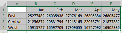
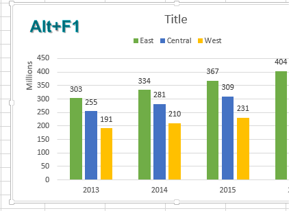
One-click charts are easy: Select the data and press Alt+F1.

Three regions appears in A2:A4. Five months appear in B1:F1. Numbers appear in B2:F4. The top-left corner cell A1 is blank. You have A1:F4 selected.

Press Alt+F1 and you get a default chart: Clustered Columns, with legend at the bottom and a title of Chart Title at the Top.

What if you would rather create bar charts instead of the default clustered column chart? To make your life easier, you can change the default chart type. Store your favorite chart settings in a template and then teach Excel to produce your favorite chart in response to Alt+F1.


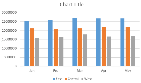
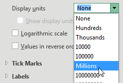
Say that you want to clean up the chart above. All of those zeros on the left axis take up a lot of space without adding value. Double-click those numbers and change Display Units from None to Millions.

Change the Display Units for the chart axis. Choices are None, Hundreds, Thousands, 10000, 100000, Millions, and so on, up to Trillions.

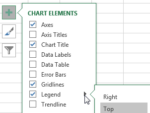
To move the legend to the top, click the + sign next to the chart, choose the arrow to the right of Legend, and choose Top.

Change the color scheme to something that works with your company colors.

Click the Plus icon to the right of the chart. Hover over the entry for Legend and choose Top as the location.


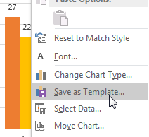
Right-click the chart and choose Save As Template. Then, give the template a name. (I called mine ClusteredColumn.)

The context menu for a chart offers Reset to Match Style, Font, Change Chart Type, Save as Template, Select Data, and Move Chart. Choose Save as Template.

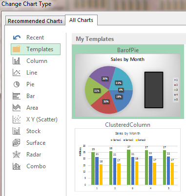
Select a chart. In the Design tab of the Ribbon, choose Change Chart Type. Click on the Templates folder to see the template that you just created.

After setting up a template, the All Charts tab in the Change Chart Type dialog offers a new category at the top called Templates.

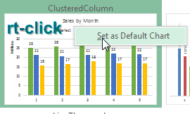
Right-click your template and choose Set As Default Chart.

In the Dialog box with all of the chart types, right-click on any chart tile and choose Set As Default Chart.

The next time you need to create a chart, select the data and press Alt+F1. All your favorite settings appear in the chart.

After customizing the Default Chart, the legends appear at the top, the left axis is in millions. Data labels (also in millions) appear above each column.

Thanks to Areef Ali, Olga Kryuchkova, and Wendy Sprakes for suggesting this feature.


This article is an excerpt from MrExcel 2024 Igniting Excel

Title photo by Isaac Smith on Unsplash