
Excel 2020: Create Funnel Charts in Office 365
March 18, 2020 - by Bill Jelen

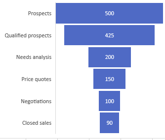
In 2016, Office 365 introduced Funnel charts, as well as Treemap, Sunburst, Box & Whisker, Pareto, and Histogram charts. A Funnel chart is great for showing a sales funnel.
Title Photo: YIFEI CHEN at Unsplash.com
This article is an excerpt from MrExcel 2020 - Seeing Excel Clearly.