
Excel 2020: Get Ideas from Artificial Intelligence
April 20, 2020 - by Bill Jelen

A new artificial intelligence feature debuted in Office 365 in early 2018. Originally called Insights, the feature was re-branded as Ideas and moved to the far right side of the Home tab of the Ribbon by September of 2018. This is the first new feature to be added to the Home tab since January 30, 2007. Excel Insights will analyze your Excel data to search for patterns and return a series of interesting facts or trends about the data.
For the feature to work properly, your data needs to be tabular data with no blank rows or columns. Every column has to have a one-row heading, and no two headings should be the same. The data should also include a date field.
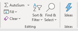
Select one cell in your data and click the Ideas icon.
Initially, Excel will return a small number of results. Each result contains a headline and a thumbnail of a chart. At the bottom of the first few results is a link to return all 30+ results.
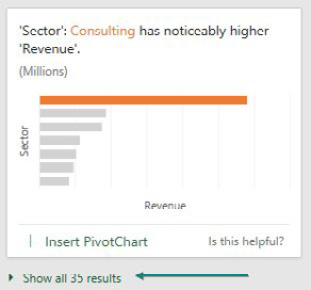
The Is This Helpful? link allows you to vote for which charts are useful. Excel will learn your preferences and return more of those types of results in the future. If you find a chart that you like, click the Insert Pivot Chart link and Excel inserts a new worksheet with a pivot table and a full-sized version of the chart.
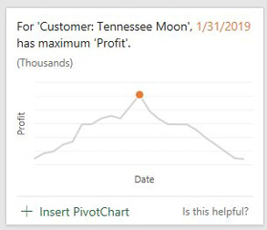
The first few Ideas results are going to look exactly like the Excel-2013-era Recommended Pivot Tables. Skip those first few boring charts and Excel will start to suggest charts that find rank, evenness, trend, composite signal, attribution, outstanding top two, monotonicity (always increasing or always decreasing), or unimodality (having a single peak data point).
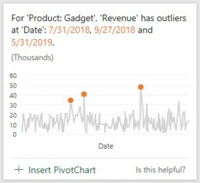
My one complaint about Ideas is shown in the following chart. Ideas was able to find some outliers in this data and offers to create a chart with those points called out in orange. For this chart to work correctly, Excel would have to support conditional formatting in charts and it does not. That means that the pivot chart will always call out these three points, even if the underlying data changes and new outliers emerge. You would have to re-run Ideas and hope that a similar result is offered.
Title Photo: Thomas Chan at Unsplash.com
This article is an excerpt from MrExcel 2020 - Seeing Excel Clearly.