
Excel 2024: Paste New Data on a Chart
March 18, 2024 - by Bill Jelen

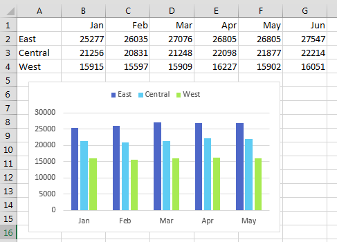
You might be responsible for updating charts every month, week, or day. For example, in my last job, a collection of charts were updated during the month-end close process. The charts would track progress throughout the year.
There is an easy way to add new data to an existing chart. Here, the chart shows data for January through May, and there is new data for June that is not on the chart.
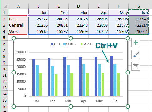
Rather than re-create the chart, you can paste new data on it. Select the new data in the worksheet, including the heading. Press Ctrl+C to copy.
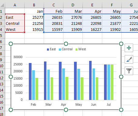
Click on the chart and press Ctrl+V to paste the data on the chart. As shown below, the new data is added to the existing chart.
As you keep adding months to the right side, what if you want to remove data from the left side? Is there any way to Ctrl+X that data off the chart?
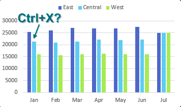
No, but there is another way. Select the chart. Outlines appear around the charted data in the worksheet. A blue box surrounds the data points for the charts, and in each corner of the blue box is a square dot as shown below. The square dot is a resizing handle.
Click on the lower-left resizing handle and drag to the right.
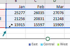
The data is removed from the left side of the chart.
You can use resizing handles to resize or drag the blue box to change the data that appears on the chart. Of course, you could have dragged the bottom-right resizing handle to add June to the chart in the first place, but it is good to know this copy-and-paste trick in case the chart and data are on different sheets in the workbook.
Tip
If you want to remove East from the chart, you can click on any East column in the chart and press Delete on your keyboard to remove that series. To temporarily hide a series, you can hide the row or column where the underlying data is stored. In Excel 2013 or newer, you can use the Filter funnel icon located to the right of the chart to hide any series or category from the chart.
This article is an excerpt from MrExcel 2024 Igniting Excel
Title photo by Nick Fewings on Unsplash