
Excel 2024: Plotting Employees on a Bell Curve
April 03, 2024 - by Bill Jelen

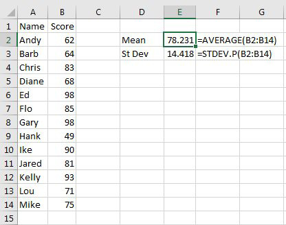
Rather than creating a generic bell curve, how about plotting a list of employees or customers on a bell curve? Start with a list of people and scores. Use the AVERAGE and STDEV.P functions to find the mean and standard deviation.
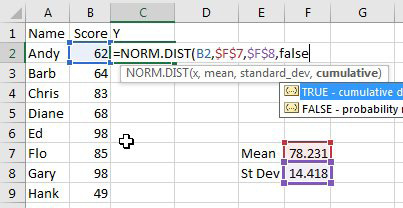
Once you know the mean and standard deviation, add a Y column with the formula shown below.
|
After adding the Y column, sort the data by Score ascending. 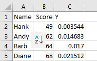 |
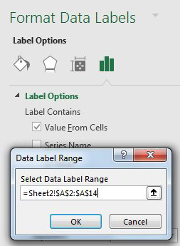
Select Score & Y columns and add a Scatter with Smooth Lines as shown in the previous technique. Labelling the chart with names is tricky. Use the + icon to the right of the chart to add data labels. From the Data Labels flyout, choose More Options. In the panel shown below, click the icon with a column chart and then choose Value from Cells and specify the names in column A. |
 |
Tip
You will often have two labels in the chart that appear on top of each other. You can rearrange single labels so they appear with a small leader line as shown for Gary and Ed at the right side of the chart. Click on any label and all chart labels are selected. Next, click on either of the labels that appear together. After the second click, you are in "single label selection mode". You can drag that label so it is not on top of the other label.
The result:

This article is an excerpt from MrExcel 2024 Igniting Excel
Title photo by Алекс Арцибашев on Unsplash