
Excel 2024: Show Two Different Orders of Magnitude on a Chart
March 21, 2024 - by Bill Jelen

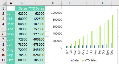
It is nearly impossible to read a chart where one series is dramatically larger than other series. In the following chart, the series for Year to Date Sales is 10 times larger than most of the monthly sales. The blue columns are shortened, and it will be difficult to see subtle changes in monthly sales.
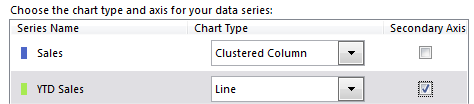
Combo charts are easy using the Combo Chart interface. Choose the chart above and select Change Chart Type. Choose Combo from the category list on the left. You then have the choices shown below. Move the larger number (YTD Sales) to a new scale on the right axis by choosing Secondary Axis. Change the chart style for one series to Line from Clustered Column.
The result: Columns for the monthly revenue are taller, so you will be able to make out subtle changes like a decrease from July to August.
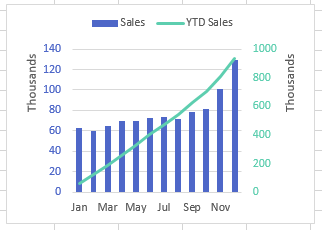
To get the additional formatting to the chart above, select the numbers on the left axis. Use the Font Color dropdown on the Home tab to choose a blue to match the blue columns. Select the green line. Select Format, Shape Outline to change to a darker green. Select the numbers on the right axis and change the font color to the same green. Double-click each axis and change Display Units to Thousands. Double-click a blue column and drag the Gap Width setting to be narrower. Double-click the legend and choose to show the legend at the top.
This article is an excerpt from MrExcel 2024 Igniting Excel
Title photo by Pierre Bamin on Unsplash