
Pivot Table Chart Colors
July 30, 2002 - by Bill Jelen
Shari sends in this week's Excel question.
I haven't been able to find the answer to this one from our IT department, Excel help files, or Microsoft Excel online help, and am hoping you can help.
I am analyzing Excel data over a period of twenty years, and need to make Excel pie charts for each year. The Excel charts are based on a pivot table (or Pivot Chart in Excel 2000), with the year as a page field.The problem is that not all years contain the same items, so each Excel chart will use a different color for the same pie slice.
We're trying to compare data across these 20 years, so having the same colors for each chart is essential. I end up having to change each many slices on many charts to match the first one, sometimes several times because the colors can change if the data changes and I have to recompute the pivot table the chart is based on.
MrExcel tried out the pivot chart for the first time. Pivot charts are a very powerful way to create a chart for several different scenarios of data, but they do have this annoying flaw. I set up the pivot table with class year as the row, year as the page. I asked for the class year to sort based on descending scores. As you change the pivot chart from year to year, the colors of the pie slices associated with Freshman will change. Some years there are members from all four classes, other years there are members from just 3 classes.
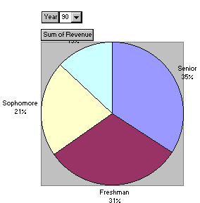
Excel applies a default order of colors to each slice, so the corresponding colors will change from year to year. I can see my manager shaking his head in disgust as I handed him these charts.
There is a way with a visual basic macro to solve this problem. If you set the datalabels up to display the label name, then it is possible to find the name of each slice from within visual basic. Once you have a name, you can recolor the color of that slice based on the value of the name.
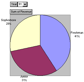
Excel used the colors above for 1990, but in 1991 the colors change as the number of items and their sequence changes:
The following macro is hard-coded for Shari's specific example where she has possible values of Freshman, Sophomore, Junior and Senior. By adding additional Case statements with different color indices, you can customize this to handle your particular situation.
Sub ColorPieSlices()
' Copyright 1999 MrExcel.com
' This macro will re-color the pie slices in a chart
' So that slices for a specific category are similarly colored
' Select the chart before calling the macro
'
' Find the number of pie slices in this chart
    NumPoints = ActiveChart.SeriesCollection(1).Points.Count
    ' Loop through each pie slice
    For x = 1 To NumPoints
        ' Save the label currently attached to this slice
        If ActiveChart.SeriesCollection(1). _
            Points(x).HasDataLabel = True Then
                SavePtLabel = ActiveChart.SeriesCollection(1) _
                    .Points(x).DataLabel.Text
        Else
            SavePtLabel = ""
        End If
        ' Assign a new data label of just the point name
        ActiveChart.SeriesCollection(1).Points(x).ApplyDataLabels Type:= _
            xlDataLabelsShowLabel, AutoText:=True
        ThisPt = ActiveChart.SeriesCollection(1).Points(x).DataLabel.Text
        ' Based on the label of this slice, set the color
        Select Case ThisPt
            Case "Freshman"
                ActiveChart.SeriesCollection(1). _
                    Points(x).Interior.ColorIndex = 3
            Case "Sophomore"
                ActiveChart.SeriesCollection(1). _
                    Points(x).Interior.ColorIndex = 4
            Case "Junior"
                ActiveChart.SeriesCollection(1). _
                    Points(x).Interior.ColorIndex = 5
            Case "Senior"
                ActiveChart.SeriesCollection(1). _
                    Points(x).Interior.ColorIndex = 6
            Case Else
                ' Add code here to handle an unexpected label
        End Select
        ' Return the label to it's original pre-macro state
        ActiveChart.SeriesCollection(1). _
            Points(x).DataLabel.Text = SavePtLabel
    Next x
End Sub
Start the VB editor with alt-F11. Do Insert - Module. Insert Procedure. Type ColorPieSlices as the Name and click OK. Enter the above macro.
To make life easier, assign the macro to a shortcut in Excel. In Excel, do Tools - Macro. Highlight ColorPieSlices and click the options button. In the shortcut key box, enter a "d". Click OK and close the Macro dialog box by clicking the "x" in the upper right hand corner. Now, after you change your Pivot Chart, you can hit Ctrl + D to recolor the pie slices to your preferred color set.