
Pivot Table on a Map
September 29, 2017 - by Bill Jelen

Display an Excel Pivot Table on a Map using the new Power Map or 3D Maps feature in Windows versions of Excel. Animate data over time using Excel. Zoom in on the neighborhood of each store location.
3D Maps (née Power Map) is available in the Office 365 versions of Excel 2013 and all versions of Excel 2016. Using 3D Maps, you can build a pivot table on a map. You can fly through your data and animate the data over time.
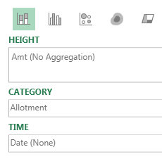
3D Maps lets you see five dimensions: latitude, longitude, color, height, and time. Using it is a fascinating way to visualize large data sets.
3D Maps can work with simple one-sheet data sets or with multiple tables added to the Data Model. Select the data. Choose Insert, 3D Maps.
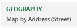
Next, you need to choose which fields are your geography fields. This could be Country, State, County, Zip Code, or even individual street addresses.
You are given a list of fields in your data the drop zones HEIGHT, CATEGORY, and TIME.
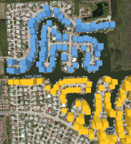
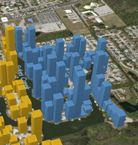
Here is a map of Merritt Island, Florida. The various colors are different housing allotments. Each colored dot on the map is a house with a dock, either on a river or one of many canals dredged out in the 1960s and 1970s.
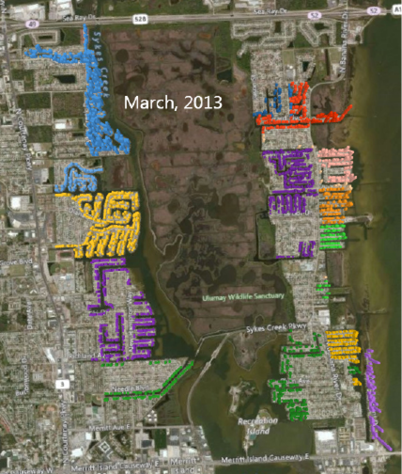
Using the time slider, you can go back in time to any point. Here is when NASA landed the first man on the Moon. The NASA engineers had just started building waterfront homes a few miles south of Kennedy Space Center.
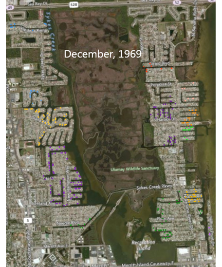
Use the wheel mouse to scroll in. You can actually see individual streets, canals, and driveways.
Hold down the Alt key and drag sideways to rotate the map. Hold down the Alt key and drag up to tip the map so your view is closer to the ground.
Hover over any point on the map to get details such as last sale date and amount.
In the default state of Power Map, each data point occupies about one city block. To be able to plot many houses on a street, use the Gear Wheel, Layer Options and change the thickness of the point to 10%.
To get the satellite imagery, open the Themes dropdown and use the second theme.
The 3D Maps feature provides a completely new way to look at your data. It is hard to believe that this is Excel.
By the way, my thanks to Tony Giannotti at Serving Brevard Realty for showing me many of the houses in this area. If you need a house near Merritt Island, give Tony a call.
Thanks to Igor Peev and Scott Ruble at Microsoft for this cool new feature.

Watch Video
- Power Map is in Office 365 editions of Excel 2013
- Power Map Preview can be downloaded for Excel 2013
- In Windows editions of Excel 2016, renamed to 3D Maps
- Works with one worksheet (as a Ctrl + T table or not)
- Works with multiple worksheets added to the Data Model
- Once in Power Map, choose Geography
- Category changes color
- Height plots the height
- Consider a flat map to see the whole world
- Add a time field to animate over time
- Wheel mouse to scroll in
- Alt + mouse up or down to tilt
- Alt+ mouse left or right to rotate
- Add labels
- Theme 2
- Use the time scrubber to animate data over time
Video Transcript
Learn Excel from MrExcel podcast, episode 2038 – Pivot Table on a Map!
I am podcasting this entire book, click the “i” in the top-right hand corner to get to the playlist for all of these videos!
Alright, this time we're going to take a Pivot table and put it on a map, this is data that people who watched the episode filled out this data. I asked for Name, Country, and Postal Code, I had to fill in a few cities and states for countries that I guess the postal code wasn't recognized by Bing. If you're in Excel 2016, it's called a 3D map, if you're in Excel 2013 and you're paying the Office 365 fee, it's called Power Map. If you're in Excel 2013 and you don't have this on the Insert tab, go out and download Power Map Preview, and you can get a beta version that's pretty close to what I'm going to show you today. Alright, so I ‘m going to to take this data, and we're going to put it on a map. OK, so it automatically recognized the city, country, state and zip code as those fields, I would be allowed to add more fields if I have misnamed one.
I'm going to try and change things by taking the Category field, and putting in category that will get me different colors. So A, B, and C, those really aren't that important, so I'm probably going to get rid of that legend by pressing Delete. I have a numeric field, this was just a RANDBETWEEN, I’m going to add that to the Height, just to add some variability to each place. And now that I have these all, I also added a Date field, I'm going to put that in Time, alright. OK, so now that I've applied the right fields to the field list, I'm actually going to close the field list, so I can see more of the map, and over here, this Tour pane, I'm going to close that, and here's what we have. So every row on the Excel screen, with 83 % accuracy, and a bunch of these were just, Veracruz, it wanted it without a space, and this one, I don't understand it, was exactly right, and so there's only one here that it couldn't find. So all of the data except for one point is here, and I can cruise around the map.
OK, let's take a look at some of the different things we can do here, I'm starting out with the Column Chart, and with the column chart I've already changed the colors of the categories. Now to navigate here, I can just click and drag to re-center, I can just use the wheel mouse to zoom in and out. And then the Alt key, if I hold down the Alt key and drag up, I get to tip the map, drag down, I get to look at it from above, and then left and right, I can rotate the map and look at it from different areas. I always like to add map labels here, I'm great at geography but I'm not awesome at geography, so the map labels help. And as you zoom in, the map labels will definitely help identify cities and things like that, alright.
The other types of maps here, I'm going to change over to a Country map and then the Filled Area, alright, so now we actually have- the darker it is, the higher the rating, and then the various items. Now the problem is, though, I can't see, this is awesome, how great the MrExcel world is, right? There’s people from all over who filled out my survey, and so since I want to see the whole map at once, I'm going to use a Flat Map, and then zoom out, alright and that lets me see the whole world. So if I need to see the US and Australia at the same time, opposite sides of the globe, I can still manage to do that. The other ones, I'm not a big fan of the heat map, it just doesn't look good to me, it seems kind of meaningless, and then a bubble chart.
Alright, so we'll go back to the Clustered Column chart here, and then this is one feature that is not there in the preview version. So if you just have regular Excel 2013, I'm going to add a Filter by Country and ask for just USA, and then once I have the USA then I'm going to show the data by Zip Code, alright. So we have all of our data there and we'll take the Category field, and put that back in, so that way we have the different colors. Alright, so now we have a nice map here of all the folks in the United States who answered the survey, but you'll see this time indicator up here. And I've had a random date, some date in September, and so I can watch this data accumulate over time. I'll press the Play button, and as the dates change up there, you'll see the various dates pop in. Now this isn’t the date you filled out the survey, it's just a completely random date, so I can illustrate that feature.
And then the other thing we can do is they have a lot of different themes here, we always start out with this white theme, but the 3rd theme, actually the 2nd theme will apply a satellite map. So let's zoom in here, zoom in, and so there you can actually see, you know, what's going on here. There’s the launch pads at Kennedy Space Center, and that should be me right there, somewhere in 32953. Alright so, just an amazing way to look at data, this is all Excel data right? Using Power Map in Excel 2013, the Office 365, or Power Map Preview in Excel 2013, or 3D maps in Excel 2016, great, great way to blow away your manager. And of course, you can actually create scenes, and then create a video and a tour and all things like that, which I've never actually really used that. I always just want to be able to interactively scroll in, scroll out, and see various items, you know. And you can even you can even hover and see, you know, all the values there in case there's a data point that's interesting, so just beautiful, beautiful bit of technology in Power Map. Alright, Power Map is tip #39 in this book, buy the entire book, you have so much knowledge in the palm of your hand, click that “i” up here in the top-right hand corner to get to a link where you can buy the book.
Alright recap: Power Map, it is started in Excel 2013 if you have Office 365, there is a Power Pap Preview for those in Excel 2013 without Office 365. In Windows editions of 2016, it's there all the time called 3D maps. Works with one worksheet, Ctrl+T the data, or multiple worksheets, and add them to the Data Model. You choose your geographies, Category changes the color, Height plots the height. If you need to see the whole world use use a Flat Map, Time Field to animate over time, wheel mouse to scroll in, Alt+mouse up or down to tilt, Alt+mouse left or right to rotate, you can add labels. And then, it's actually Theme 2, Theme 2 is my favorite one, with a satellite map, cool, cool bit of way to show boring Excel data on a map.
Hey, thanks for stopping by, we'll see you next time for another netcast from MrExcel!
Download File
Download the sample file here: Podcast2038.xlsx
Title Photo: stokpic / Pixabay