
Place People on Bell Curve
June 19, 2018 - by Bill Jelen

Jimmy in Huntsville wants to plot a bell curve showing the average scores of several people. When Jimmy asked the question during my Power Excel Seminar, I thought back to one of my more popular videos on YouTube.
In Podcast 1665 - Create a Bell Curve in Excel, I explain that to create a bell curve, you need to calculate the mean and standard deviation. I then generate 30 points along the x-axis that span a hypothetical population of people. In that video, I generated that spanned from -3 Standard Deviations to + 3 Standard Deviations around a mean.
For example, if you have a mean of 50 and a standard deviation of 10, I would create an x-axis that ran from 70 to 130. The height of each point is calculated using =NORM.DIST(x,mean,standard deviation,False).
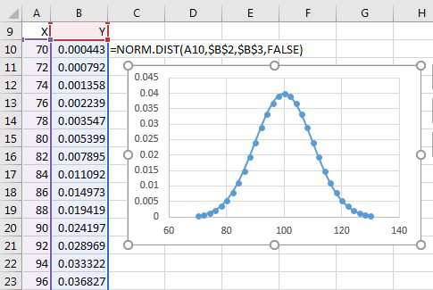
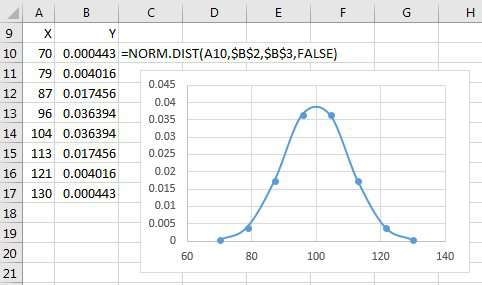
In the image above, the numbers in A10:A40 are essentially "fake data points". I generate 31 numbers to create a nice smooth curve. If I would have used only 7 data points, the curve would look like this:
For Jimmy's data set, the actual average scores of his employees are essentially points along an x-axis. To fit them on a bell curve, you need to figure out the height or Y-value for each employee.
Follow these steps:
-
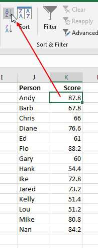
Sort the data so the scores appear lowest to highest.
Sort the data - Calculate a Mean using the AVERAGE function.
- Calculate a Standard Deviation using the STDEV function.
-
Calculate the Y value to the right of the scores using
=NORM.DIST(L2,$H$2,$H$3,FALSE). The Y-value will generate a height of each person's point along the bell curve. The NORM.DIST function will take care of plotting people near the mean at a higher location than people near the top or bottom.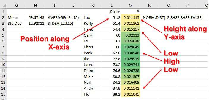
Generate a series of Y values. - Select your data in L1:M15
-
An odd bug recently started appearing in Excel so to ensure success, choose All Charts on the Insert tab.
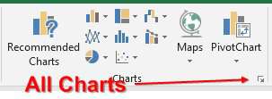
The dialog launcher takes you to all chart types In the Insert Chart dialog, click the All Charts tab. Click X Y (Scatter) along the left. Choose the second icon along the top. Choose the preview on the right.
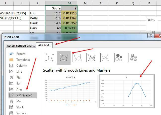
Four clicks to chose the chart Your intial bell curve will look like this:
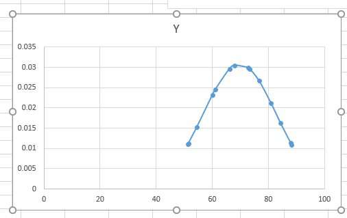
The bell curve
To clean up the bell curve, follow these steps:
- Click on the title and press the Delete key.
- Double-click any number along the Y-axis at the bottom of the chart. The Format Axis panel will appear.
-
Type new values for the Minimum and Maximum. The range here should be just wide enough to show everyone on the chart. I used 50 to 90.
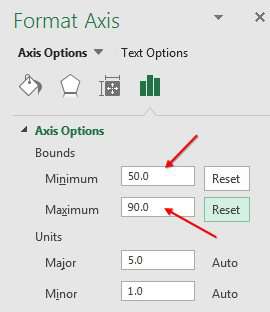
Change the minimum and maximum - Make the chart wider by dragging the edge of the chart.
- Click the + icon to the right of the chart and select Data Labels. Don't worry that the labels do not make sense yet.
- Double-click one label to open the Format Labels panel.
- There are four icons along the top of the panel. Choose the icon that shows a column chart.
- Click the arrow next to Label Options to expand that part of the panel.
- Choose Value from Cells. A dialog box will appear asking for the location of the labels. Choose the names in K2:K15.
-
Still in the Format Data Label panel, un-select Y values. It is important to finish Step 15 before doing Step 16 or you will inadvertently remove the labels.
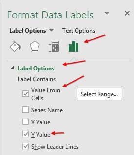
Get the labels from the cells containing names.
Note
The ability to get labels from cells was added in Excel 2013. If you are using Excel 2010 or earlier, download the XY Chart Labeler add-in from Rob Bovey. (Google to find it).
At this point, see if you have any chart labels that are crashing in to each other. To fix them, carefully follow these steps.
- Single-click on one chart label. This selects all labels.
- Single-click on one of the labels that is on top of another label to select just that label.
- Hover over various parts of the label until you see a four-headed arrow. Click and drag the label to a new position.
-
Once you have only a single label selected, you can single-click any other label to select that label. Repeat for any other labels that need to be moved.
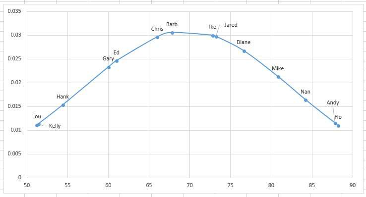
The final chart
Watch Video
Video Transcript
Learn Excel from MrExcel Podcast, Episode 2217: Place People on a Bell Curve.
Hey, welcome back to the MrExcel netcast, I'm Bill Jelen. Today's question, from Jimmy in my seminar in Huntsville, Alabama. Jimmy has data, he wants to summarize this data and then plot the results on a bell curve.
Alright? Now, one of my most popular videos out on YouTube is this one: number 1663, Create a Bell Curve in Excel. And given a mean and a standard deviation, I figured out the low, which is 3 times the standard deviation less than the mean, and the high-- 3 times the standard deviation more than the mean-- where the gap is-- and a series of X values here, and to figure out the height, use this function: =NORM.DIST of the X value, the mean, and the standard deviation, comma false (=NORM.DIST(A10,$B$2,$B$3,FALSE)).
And if you think about it, this video is really just using a series of fake X values here in order to get a nice looking curve. And we're going to use the same concept here but instead of fake X values, we're actually going to have the people down here and then the height will be this exact same formula. Alright.
So, now, Jimmy wanted to create a pivot table. So we'll Insert, PivotTable, put it here on this sheet, click OK. People down the left-hand side and then their Average Score. Alright, so it starts out with Sum of Score, I'll double-click there and change that to an average. Great. Now, at the very bottom, I don't want a grand total-- right-click and Remove Grand Total-- and we want to arrange these People high to low and this is easy to do in a pivot table. Data, A to Z-- excellent. Alright. Now, we're going to do the exact same thing that we did back in Podcast 1663, and that's calculate a mean and a standard deviation. So the mean is an average of these scores, and then equals standard deviation of those scores. Alright. Now that I know that, I'm able to create my y-value.
Alright, so a couple things we're going to do here. First off, you can't create a pivot table-- a scatter chart-- from a pivot table. So I'm going to copy all of this data over and I'm just going to do that with =D2. Notice I'm careful not to use the mouse or the arrow keys to point to those. And so we have our values here. These will become X values, the Y value is going to become =NORM.DIST, here's the x value, comma, for the mean, that number, I'll press F4 to lock that down; for the standard deviation it's this number, again, press F4 to lock that down, and cumulative FALSE. (=NORM.DIST(K2,$H$2,$H$3,FALSE)) And we'll double-click to copy that down. Alright. And then, don't choose the labels, just choose the X Y and we will insert a scatter chart with lines-- you can either choose the one with curved lines or a little straight lines. Here, I'll go with curved lines like this. And we now have all of our People placed on a bell curve.
Alright. Now, some things-- some formatting type things-- we're going to do here: First off, double-click down here along the scale, and it looks like our lowest number is probably somewhere around 50-- so I'll set a min of 50-- and our largest number-- our largest number-- is 88-- so I'll set a max of 90. Alright. And now, we have to label these points. If you're in Excel 2013 or newer, this is easy to do; but if you're in an older version of Excel, you're going to have to go back and use Rob Bovey's Chart Labeler add-in in order to have these point labels come from some place that's not in the chart. Alright, so we start out here. We're going to add Data Labels, and it adds numbers and they look horrible. I'll come here and say that I want More Options, Label Options, and I want to get the Value From Cells-- Value From Cells. Alright? So the Range of cells is right there, click OK. Very important to use Value from cells before I uncheck the Y value. It starts to look good. I'll get rid of this. Now, the whole key here-- because you have some people that are kind of overwriting each other-- is to try and make the chart as large as possible. We don't need a heading up there. Why? Just delete that. And I still see, like, Kelly and Lou and Andy and Flo are almost in the same place; Jared and-- Alright. So now, this is going to be frustrating-- these ones that overlap. But when we click on a label, we selected all the labels, and then click on a label again, and we select just a single label. Alright? So now. very carefully. try and click on Andy, and just drag Andy up into the left. Looks like Jared and Ike are together, so now that I'm in single label selection mode, it's easier. And then Kelly and Lou, drag them up like that. Maybe there's a better place that's not over-running Lou, or even, like, here I can drag it on either side. Alright, so, what do we have? We have started with a bunch of data, created a pivot table, figured out the mean and standard deviation, which just allows us to figure out the height-- the Y position for each of those scores, and the height of those, hopefully, we'll get people into a nice parabola shaped bell curve, like that.
I Love this question from Jimmy, this question is not in this book, but it'll be in the next time I write this book. I'll have to add this-- it's a a cool request and a cool little trick. Bell curves are very popular in Excel.
But check out my book, MrExcel LIVe, The 54 Greatest Excel Tips of All Time.
Alright, wrap-up from this episode: Jimmy from Huntsville, wants to arrange people on a bell curve. So we use a pivot table to figure out the average score, sort the pivot tables to the scores-- arranged high to low-- get rid of the grand total at the bottom-- these are essentially going to be the X values-- and then off to the side, calculate the average and standard deviation of those scores and use formulas to copy the data from the pivot table to a new range, because you can't have an XY chart that intersects with a pivot table. Calculate a y-value for each person with =NORM.DIST of their x-value, the mean, the standard deviation, comma FALSE; create an XY scatter chart with smooth lines-- if you're an Excel 2010 or earlier, you're going to use Ron Bovey's Chart Labeler add-in. I'm going to have you google that because, in case Rob changes his URL, I don't want the wrong URL here. In Excel 2013, had Data Labels, From Cells, specify the names, and then some adjustments-- change the scale along the bottom, I change them in and Max and then move the labels that over-set each other.
To download the workbook from today's video, use the URL in the YouTube description. I want to thank Jimmy for this awesome question in Huntsville, and I want to thank you for stopping by. I'll see you next time for another netcast from MrExcel.
Download Excel File
To download the excel file: place-people-on-bell-curve.xlsx
Thanks to Jimmy in Huntsville for today's question!
Excel Thought Of the Day
I've asked my Excel Master friends for their advice about Excel. Today's thought to ponder:
"If you've put excel in manual recalculate mode in the past month, it's time for power pivot (you'll never need manual mode again)"
Title Photo: Igor Ovsyannykov on Unsplash