Auto-Generate Graphs with standardized data

Zenru

New Member
Joined
Oct 19, 2017
Messages
29
Hello, I am need to create about 60 graphs for some data I have in a workbook. As I said in the title, my data is standardized. The thing is, I simple have no idea how to approach this since I have never dealt with something like this.

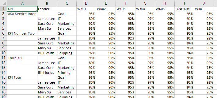
My data, normal range, goes like this:

KPILeaderWK01WK02WK03WK04WK05JANUARYWK01
Goal95%95%95%95%95%95%95%
James Lee.IT80%90%92%97%95%91%92%
ASA Service InterSara CurtMarketing92%90%95%95%98%94%75%
Mary SuServices95%95%95%95%95%95%95%

<tbody>
</tbody>

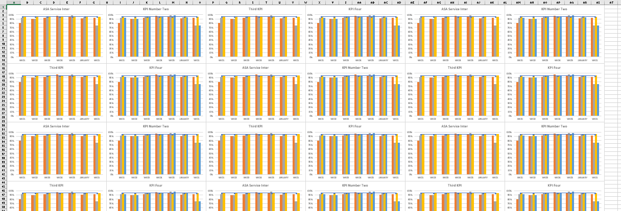
And the table goes on forward with 4-5 weeks per month. It also goes downwards with about 30 KPIs. My goal would be to have a macro automatically create a graph in another sheet with the current selection OR in an ideal world to iterate to the whole worksheet and create a graph for each KPI.

It would take:
*The KPI as a the chart name
*The Goal and each department as a series (the goal being linear and the depts being clustered columns) with their respective values
*And the weeks and months being the categories.

Can someone please help me in accomplishing this? Or giving me at least some idea of how to work this out? With the graph formatting I can deal with.
 

Excel Facts

What is the shortcut key for Format Selection?
Ctrl+1 (the number one) will open the Format dialog for whatever is selected.
I wrote a little routine that does what you describe. It assumes the same number of series per KPI (3 in your example). For each KPI it inserts a new sheet, repeats the header and goal data on each new sheet, and copies the KPI data on the new sheet, and finally creates a clustered column chart on the sheet and makes the Goal series into a line.

Code:
Sub MultipleKPICharts()
  Dim rTotal As Range, rHeader As Range, rKPI As Range
  Dim wsActive As Worksheet, wsKPI As Worksheet
  Dim iRowTop As Long, iRowKPI As Long
  Dim nCols As Long, nRows As Long
  Dim chtKPI As Chart
  Const nRowsPerKPI As Long = 3
  
  Set wsActive = ActiveSheet
  Set rTotal = ActiveCell.CurrentRegion
  
  nRows = rTotal.Rows.Count
  nCols = rTotal.Columns.Count
  
  iRowTop = rTotal.Row
  iRowKPI = iRowTop + 2
  
  Set rHeader = rTotal.Resize(2)
  
  Do
    Set wsKPI = Worksheets.Add(After:=Worksheets(Worksheets.Count))
    
    Set rKPI = rTotal.Offset(iRowKPI - iRowTop).Resize(nRowsPerKPI)
    
    rHeader.Copy wsKPI.Range("A1")
    rKPI.Copy wsKPI.Range("A3")
    
    wsKPI.Name = wsKPI.Range("A4").Value
    
    Set chtKPI = wsKPI.Shapes.AddChart2(201, xlColumnClustered).Chart
    With chtKPI
      .SetSourceData Source:=wsKPI.UsedRange.Offset(, 2).Resize(, nCols - 2), PlotBy:=xlRows
      .Axes(xlValue).MaximumScale = 1
      .SeriesCollection(1).ChartType = xlLine
    End With
    
    iRowKPI = iRowKPI + nRowsPerKPI
    If iRowKPI > iRowTop + nRows - 1 Then Exit Do
  Loop
  
End Sub
 
Upvote 0
Thanks for the input, but I dont want it to make a new WS for each KPI, I would have about 60+ WS then, probably more.

What if I edit my format to be more readable to your code? Like:
Column A has KPIs. A new KPI starts by a cell with a "Start" value and ends with a cell with a "End" value.
Column B, the leaders, you can ignore.
Column C, the series. It starts by "GOAL" and ends with another "GOAL" which means a new KPI started.

Is there a way to modify the macro to do that? Perhaps you wish a WB with more example data?
 
Upvote 0
I guess I made too many assumptions.

If you insert a new chart for each KPI, won't you still have that many sheets? Or that many charts embedded on a single worksheet, which has to be worse?

I don't know what this means: "A new KPI starts by a cell with a 'Start' value and ends with a cell with a 'End' value."

How about putting the KPI name in the row with the Goal numbers? Then the code could easily pick out the KPI name and Goal values, then plot the rows until the next KPI/Goal row.

Code:
KPI                     Leader		        WK01    WK02    WK03    WK04    WK05    JANUARY    WK01
ASA Service Inter                    Goal     	 95%     95%     95%     95%     95%        95%     95%
                        James Lee    IT          80%     90%     92%     97%     95%        91%     92%
                        Sara Curt    Marketing	 92%     90%     95%     95%     98%        94%     75%
                        Mary Su	     Services	 95%     95%     95%     95%     95%        95%     95%
KPI Number Two                       Goal     	 95%     95%     95%     95%     95%        95%     95%
                        James Lee    IT          80%     90%     92%     97%     95%        91%     92%
                        Sara Curt    Marketing	 92%     90%     95%     95%     98%        94%     75%
                        Mary Su	     Services	 95%     95%     95%     95%     95%        95%     95%
                        Bill Smith   Shipping    92%     90%     95%     95%     98%        94%     75%

Where are the charts going to go?
 
Upvote 0
KPI and Goal in the same row sounds way better.

Now, my graphs would go to another sheet (one for all of them). If needed I would even divide my KPIs in 3 sheets and create another 3 sheets to hold the graphs of each sheet. I see it better to have 30-40 graphs inside one sheet than 30-40 sheets.

Afterwards, I can move them around to make them easier to understand.
 
Upvote 0
Okay, assuming data like below. The code with use whatever number of columns you have. There should be nothing else on the worksheet but this data.

y2Z1bAP.png


The code spits out a grid of charts on a new worksheet, like this. I've zoomed out to 40% to show it all. You can choose how many charts in each row (it's 6 below).

znWROHh.png


Here is the code.

Code:
Sub Build_KPI_Charts()
  Dim wsDataSheet As Worksheet, wsChartSheet As Worksheet
  Dim rData As Range, rX As Range, rY As Range, rName As Range, rLabel As Range
  Dim nRows As Long, nCols As Long, iRow As Long
  Dim iLeft As Double, iTop As Double
  Dim sLabel As String
  Dim chtKPI As Chart, iChart As Long
  
  Const nChartRow As Long = 6 ' charts per row
  
  Set wsDataSheet = ActiveSheet
  Set rData = wsDataSheet.UsedRange
  Set wsChartSheet = ActiveWorkbook.Worksheets.Add(After:=wsDataSheet)
  
  nRows = rData.Rows.Count
  nCols = rData.Columns.Count
  
  Set rX = rData.Rows(1).Offset(, 3).Resize(, nCols - 3)
  iLeft = 0
  iTop = 0
  
  For iRow = 2 To nRows
    Set rLabel = rData.Cells(iRow, 1)
    sLabel = rLabel.Value
    If Len(sLabel) > 0 Then
      ' if first cell has label, start a new chart
      Set chtKPI = wsChartSheet.Shapes.AddChart2(201, xlColumnClustered, iLeft, iTop).Chart
      iLeft = iLeft + chtKPI.Parent.Width
      iChart = iChart + 1
      If iChart = nChartRow Then
        iLeft = 0
        iTop = iTop + chtKPI.Parent.Height
        iChart = 0
      End If
    End If
    
    Set rY = rX.Offset(iRow - 1)
    Set rName = rData.Cells(iRow, 3)
    
    With chtKPI.SeriesCollection.NewSeries
      ' add and populate series
      .Values = rY
      .XValues = rX
      .Name = "=" & rName.Address(, , , True)
      If rName.Value = "Goal" Then
        .ChartType = xlLineMarkers
      Else
        .ChartType = xlColumnClustered
      End If
    End With
    
    If Len(sLabel) > 0 Then
      ' first series of chart
      ' set axis scale 0% to 100%
      chtKPI.Axes(xlValue).MinimumScale = 0
      chtKPI.Axes(xlValue).MaximumScale = 1
      ' link chart title to KPI cell
      chtKPI.ChartTitle.Text = "=" & rLabel.Address(, , , True)
    End If
  Next
End Sub
 
Upvote 0
Sorry it took me long to answer, but we started holidays and I didn’t have a chance to answer with so many last minute things that needed to be done.

I tried this and it worked perfectly. Thank you very much. I modified your code from before and I managed to do as I wanted (except for making them so orderly in another sheet, mine were alI together), but yours is much cleaner and I understand everything you did so I can continue to work on this.

Believe me when I tell you that in a company that love graphs, many people will have their data on this format from now on.
 
Upvote 0

Forum statistics

Threads
1,214,944
Messages
6,122,391
Members
449,080
Latest member
Armadillos

We've detected that you are using an adblocker.

We have a great community of people providing Excel help here, but the hosting costs are enormous. You can help keep this site running by allowing ads on MrExcel.com.
Allow Ads at MrExcel

Which adblocker are you using?

Disable AdBlock

Follow these easy steps to disable AdBlock

1)Click on the icon in the browser’s toolbar.
2)Click on the icon in the browser’s toolbar.
2)Click on the "Pause on this site" option.
Go back

Disable AdBlock Plus

Follow these easy steps to disable AdBlock Plus

1)Click on the icon in the browser’s toolbar.
2)Click on the toggle to disable it for "mrexcel.com".
Go back

Disable uBlock Origin

Follow these easy steps to disable uBlock Origin

1)Click on the icon in the browser’s toolbar.
2)Click on the "Power" button.
3)Click on the "Refresh" button.
Go back

Disable uBlock

Follow these easy steps to disable uBlock

1)Click on the icon in the browser’s toolbar.
2)Click on the "Power" button.
3)Click on the "Refresh" button.
Go back
Back
Top