PivotChart formatting help

GavinR

New Member
Joined
May 30, 2019
Messages
9
Hi all,

I have a fairly large dataset that is broken down as minute-by-minute data.

I am plotting various charts from the PivotTable data, generally using averages.

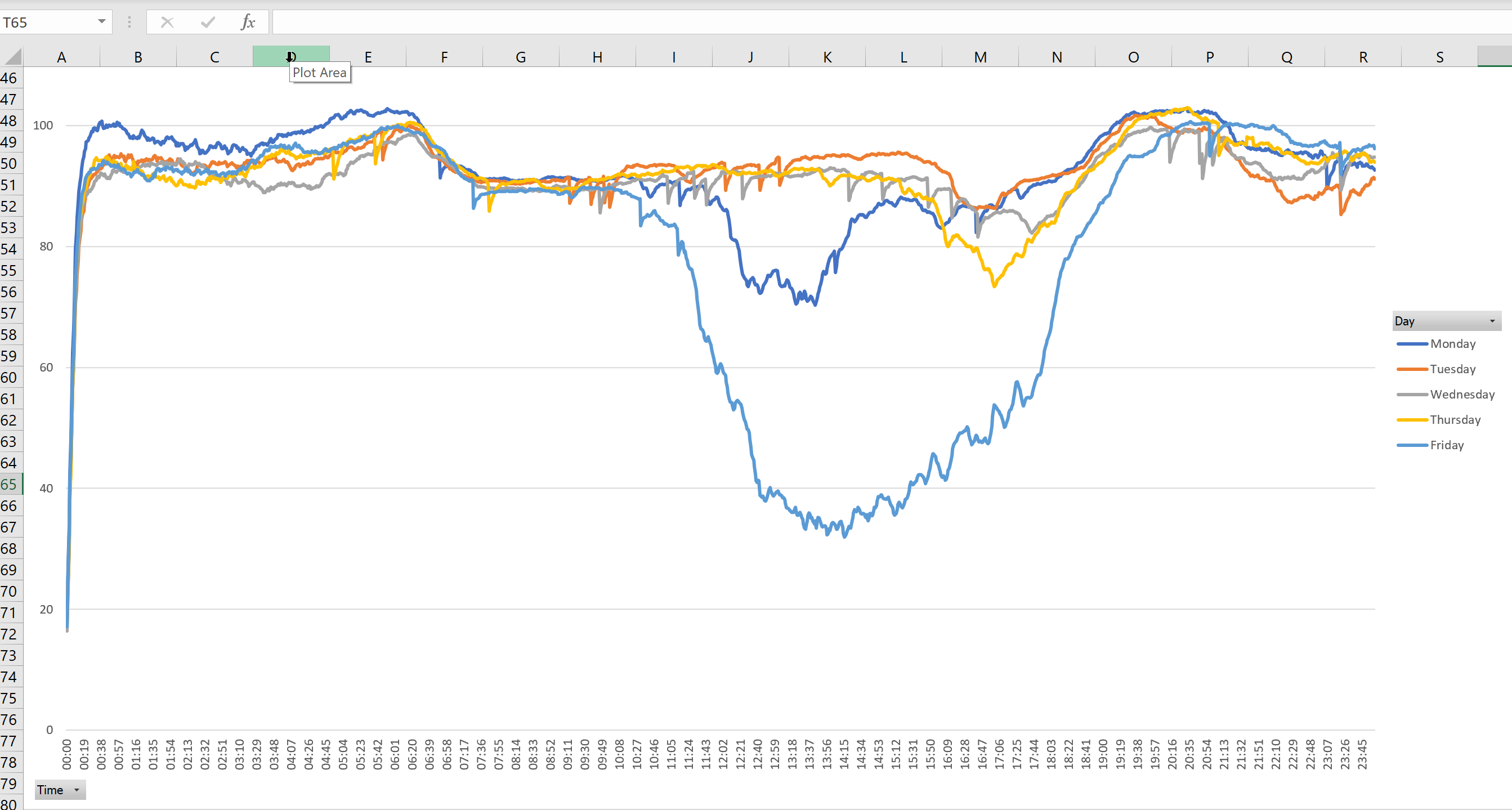
I have "Time" in the row field on my PivotTable, but when I plot a chart it gives me some strange time values along the X axis, see screenshot below.

So I have a couple of questions.

1) As my data contains values from every minute of the day, how can I format the X axis to something more logical, such as every 15 minutes, starting at 00:00, then 00:15, 00:30, 00:45, etc.

2) Secondly following on from that, how can I make some vertical gridlines appear at set intervals, say on the hour, so every xx:00 has a vertical gridline?

As always, grateful for any help :)

Thanks

KENGN0c.png
 

Excel Facts

Lock one reference in a formula
Need 1 part of a formula to always point to the same range? use $ signs: $V$2:$Z$99 will always point to V2:Z99, even after copying
Yeah, patience. We're volunteers here. Anyway...

So in the pivot table, the times are probably treated as text labels. If you have a label every minute reliably, and you want to show a label for each 15 minutes, then you can set the interval between X axis tick labels to 15.

To add the complication of vertical gridlines every hour, I'd have to really see the pivot table. But usually your only option is to get a gridline at every tickmark (every 15 minutes in your case), or add a dummy series to build a dummy set of gridlines, and pivot charts don't let you add data that's not in the pivot table. It's complicated, but it can be done.
 
Upvote 0
Yeah, patience. We're volunteers here. Anyway...

So in the pivot table, the times are probably treated as text labels. If you have a label every minute reliably, and you want to show a label for each 15 minutes, then you can set the interval between X axis tick labels to 15.

To add the complication of vertical gridlines every hour, I'd have to really see the pivot table. But usually your only option is to get a gridline at every tickmark (every 15 minutes in your case), or add a dummy series to build a dummy set of gridlines, and pivot charts don't let you add data that's not in the pivot table. It's complicated, but it can be done.

Hi Jon,

Yeah no worries - appreciate that. It wasn't a patience thing, more a worried it had fallen down the page thing that was all. Always grateful for help.

I've managed to get it working, thanks very much :)
 
Upvote 0

Forum statistics

Threads
1,212,927
Messages
6,110,722
Members
448,294
Latest member
jmjmjmjmjmjm

We've detected that you are using an adblocker.

We have a great community of people providing Excel help here, but the hosting costs are enormous. You can help keep this site running by allowing ads on MrExcel.com.
Allow Ads at MrExcel

Which adblocker are you using?

Disable AdBlock

Follow these easy steps to disable AdBlock

1)Click on the icon in the browser’s toolbar.
2)Click on the icon in the browser’s toolbar.
2)Click on the "Pause on this site" option.
Go back

Disable AdBlock Plus

Follow these easy steps to disable AdBlock Plus

1)Click on the icon in the browser’s toolbar.
2)Click on the toggle to disable it for "mrexcel.com".
Go back

Disable uBlock Origin

Follow these easy steps to disable uBlock Origin

1)Click on the icon in the browser’s toolbar.
2)Click on the "Power" button.
3)Click on the "Refresh" button.
Go back

Disable uBlock

Follow these easy steps to disable uBlock

1)Click on the icon in the browser’s toolbar.
2)Click on the "Power" button.
3)Click on the "Refresh" button.
Go back
Back
Top