Clustered column chart - highlight specific column if condition met

JackDanIce

Well-known Member
Joined
Feb 3, 2010
Messages
9,922
Office Version
  1. 365
Platform
  1. Windows
Hi,

I have:

A time line from A1:A10 (months)
Revenue data: B1:B10 (+ve values)
Cost of Revenue: C1:C10 (+ve values)
Difference: D1:D10 with formula =ABS(C1-B1)<1000

I currently use A1:C10 to show a clustered column table comparing Revenue vs Cost of Revenue over time

I've been asked to highlight specific month(s) on the chart where D1:D10 = TRUE

How can I do this please?

TIA,
Jack
 

Excel Facts

Create a Pivot Table on a Map
If your data has zip codes, postal codes, or city names, select the data and use Insert, 3D Map. (Found to right of chart icons).
Hi JackDanIce,

You could insert two new columns B and C with the formulae:
Code:
=IF(ABS(E1-D1) < 1000,E1,"")
=IF(ABS(E1-D1) >= 1000,E1,"")
...so either will populate but not both. Revenue becomes column D and Costs is no longer graphed.

If you now make the chart based on the first 4 columns you will still only see two entries in the stacked column but the colours will differ between TRUE and FALSE results of your comparison (so just use a colour scheme to highlight).


ABCDE
1Jan155552200015555
2Feb115551111111555
3Mar337773333333777
4Apr239002345623900
5May188882121218888
6Jun188883939318888
7Jul161101566616110
8Aug193321888819332
9Sep122221888812222
10Oct193321888819332

<colgroup><col style="width: 25pxpx"><col><col><col><col><col></colgroup><thead>
</thead><tbody>
</tbody>
JackDanIce

Worksheet Formulas
CellFormula
B1=IF(ABS(E1-D1)<1000,E1,"")
C1
=IF(ABS(E1-D1)>=1000,E1,"")

<thead>
</thead><tbody>
</tbody>

<tbody>
</tbody>
 
Upvote 0
Hi @Toadstool, thanks for replying :)

I think I can adapt this, my dates are horizontal rather than vertical (unfortunately it's not a normalised table). Assume I can, unless I reply back with more issues!

Best,
Jack
 
Upvote 0
I saw you said A1:A10 were months so thought it was vertical. Works the same horizontal.

ABCDEFGHIJ
1JanFebMarAprMayJunJulAugSepOct
221222144662390021211161101933219332
3337771888812222
422000144442222223456212123939316110188881888818888
521222144663377723900212111888816110193321222219332

<tbody>
</tbody>


Horizontal

Worksheet Formulas
CellFormula
A2
to
J2
=IF(ABS(A4-A5)<1000,A5,"")
A3
to
J3
=IF(ABS(A4-A5)>=1000,A5,"")

<tbody>
</tbody>

<tbody>
</tbody>

Just format the series the desired colour to highlight.

Jack-Dan-Ice.jpg
 
Upvote 0
I tried a bunch of different ways to highlight one or the other of the columns in the chart, and nothing I did clearly highlighted anything. I don't really think the effort by Toadstool really highlights what's happening: it's too complicated when more colors are incorporated.

But then I thought of something else I could try.

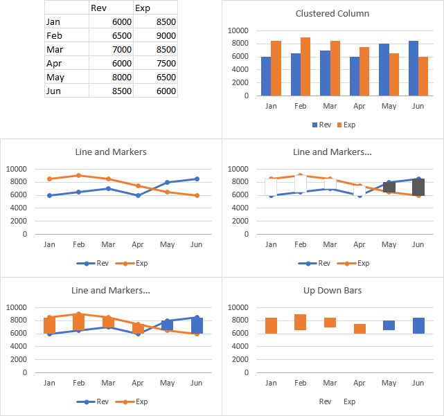
Here's the setup. Simple data and simple clustered column chart in the first row. In the second row, I've made instead a simple line chart, then I added up-down bars (select either series, click the plus icon next to the chart, check Up-Down Bars). I formatted the bars and then hid the lines. This doesn't really show what we want, but I'm not done yet. I'm going to combine the two approaches.

h7iFkAC.png


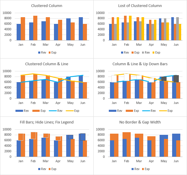
So I'll start with the simple clustered column chart, and the columns have a gap width of 100%, so the gap between clusters is 100% as wide as a column in the cluster (top left). I copy the data range, select the chart, and use Paste Special on the Home tab's Paste dropdown, and I choose the options to add the data as new columns, in columns, series names in first row, categories in first column (top right).

I right click on one of the series, choose Change Series Chart Type, and I change the added series to lines (middle left). Then I select one of the lines, and add up-down bars as before (middle right).

I change the fill of the bars to match the columns (I left the border in place temporarily so you can see the bars against the columns), I change the line color of the line series to no line, and I delete the unwanted legend entries (click once to select the legend, click again to select the legend entry, then press the Delete key), which results in the bottom left chart.

Finally I remove the borders from the up down bars, then I change the gap width of the up down bars. You do this by selecting one of the line series (click at the top or bottom of an up-down bar, and you should see the hidden markers highlighted) and formatting it. A gap width of 50% works good for a column chart gap width of 100% (bottom right).

jJZrBl6.png
 
Upvote 0
Thank you both, lots to review! And much appreciated.
@Toadstool correct, I got my ranges wrong, meant A1:L1 etc
@Jon Peltier, I think "No Border & Gap Width" may be best work around or visually easiest to show then change when Revenue ~= (or >) Exp
 
Upvote 0
Yes, of all of the things I tried, that was the best outcome.

Note that the chart titles do not show options so much as progressive steps in the protocol.
 
Upvote 0

Forum statistics

Threads
1,214,400
Messages
6,119,292
Members
448,885
Latest member
LokiSonic

We've detected that you are using an adblocker.

We have a great community of people providing Excel help here, but the hosting costs are enormous. You can help keep this site running by allowing ads on MrExcel.com.
Allow Ads at MrExcel

Which adblocker are you using?

Disable AdBlock

Follow these easy steps to disable AdBlock

1)Click on the icon in the browser’s toolbar.
2)Click on the icon in the browser’s toolbar.
2)Click on the "Pause on this site" option.
Go back

Disable AdBlock Plus

Follow these easy steps to disable AdBlock Plus

1)Click on the icon in the browser’s toolbar.
2)Click on the toggle to disable it for "mrexcel.com".
Go back

Disable uBlock Origin

Follow these easy steps to disable uBlock Origin

1)Click on the icon in the browser’s toolbar.
2)Click on the "Power" button.
3)Click on the "Refresh" button.
Go back

Disable uBlock

Follow these easy steps to disable uBlock

1)Click on the icon in the browser’s toolbar.
2)Click on the "Power" button.
3)Click on the "Refresh" button.
Go back
Back
Top