Column A is my Y axis, Column B is my X axis.
First, my bad! I mixed up your columns: I thought column A has x-values, and column B has y-values.
That is more common, since the Insert Chart feature works best that way.
joeu2004 - I am not sure where I would enter the formula in this step "Select X1:Y1 and array-enter (press ctrl+shift+Enter instead of just Enter) the following formula:"
Honestly, I don't know how to say that any more clearly. "Select X1:Y1 and array-enter ..." means that the formula goes into X1 and Y1.
I will share some sample data so we can all be looking at the same data
[....]
I created a line chart with 1 data series: Y values =Sheet1!$A$2:$A$7 and then horizontal axis values = =Sheet1!$B$2:$B$7
Then I right click to add trendline, then choose exponential.
Then when I display equation on chart, it shows: y = 1448.5e-0.111x
Yes, it is always best to share some data.
And I see that I'm not the only one who can't follow instructions: two people (shg and me) have told you
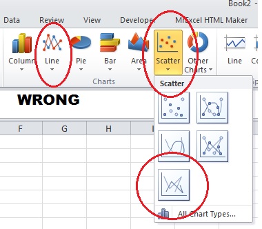
not to use Line Chart.
The trendline is wrong because the Line Chart trendline uses x-values 1, 2, 3,..., regardless of what you display in the x-axis.
Use a Scatter Chart, instead, optionally choosing the Straight Line subtype if you want it to look like a Line Chart.
I hope the images below clarify things for you.
-----
First, how to select the proper chart:
-----
Second, how to set up the Excel design. To simplify things, I put the coefficients in E2:F2 instead of X1:Y1.
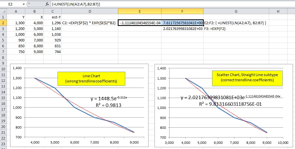
The Line Chart on the left demonstrates the incorrect coefficients.
The Scatter Chart on the right (Straight Line subtype) demonstrates how to display the trendline equation in format Scientific with 14 decimal places (i.e. 15 significant digits, the most that Excel formats).
You can manually copy-and-paste the trendline coefficients (with 15 significant digits) into E2 and F2. But note that in my design, -1.11...E-04 goes into E2, and 2.02...E+02 goes into F2, the opposite of the order that they appear in the trendline equation.
(I did that for consistently with LINEST below.)
Also, you would enter a
different formula into C2 than what appears in the image above, and copy it into C3:C7, to wit:
=$F$2 * EXP($E$2*B2)
-----
But I recommend that you use LINEST.
Select E2:F2 (that is where the formula goes),
type the formula below, then
press ctrl+shift+Enter instead of just Enter to array-enter the formula:
=LINEST(LN(A2:A7), B2:B7)
Note that F2 looks very different than the corresponding coefficient in the trendline equation.
The reason it: it is the (natural) log of the coefficient. The actual coefficient is EXP($F$2), which I show in F3.
Then, enter the following formula into C2, and copy it into C3:C7:
=EXP($F$2) * EXP($E$2*B2)
In the image above, C2:C7 show the resulting estimate-y values. Note that they are close to the values in column A.
-----
What I am hoping to do, is get a formula where I can enter an X value of 10,000 or 11,000 or 59,321 etc...any X value, and get the corresponding Y value based on the trendline.
Enter other values of X (10,000, 11,000, 59,321, etc) into B8, B9, B10, etc, and copy the formula in C2 into C8, C9, C10, etc.


