Hi. I'm brand new here and definitely an Excel novice. Here's what I'm looking for:
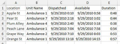
Our local 911 center makes some statistical data available to each service they dispatch for in excel format. Here is an example of a snippet of data:
The data is sorted chronologically by time dispatched.
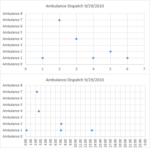
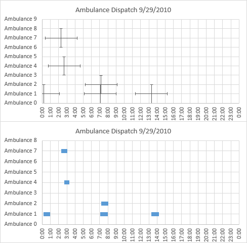
What we want to do is chart WHEN each unit is committed to an incident. A horizontal bar chart, where the entire length of a row on the chart would represent a 24 hour period (one day). For each UNIT NAME, a colored block/section representing when they were on a call and blank/white when they were available.
Using the example above, 'Ambulance 1' would have 3 blocks of time on the same bar, showing they were committed from 00:10 to 00:58, 07:04 to 07:58 and again from 13:18 to 14:15. Each UNIT NAME would have its own bar. In the above example, the chart would have a total of 4 bars, sorted by UNIT NAME.
Hopefully, I've sufficiently explained what I'm looking for. Please ask for any clarifications or omissions. travelug@yahoo.com
Thanks in advance for any/all help!
<!--[if gte mso 9]><xml>
<o:DocumentProperties>
<o:Author>dispatch</o:Author>
<o:LastAuthor>dispatch</o:LastAuthor>
<o:Revision>1</o:Revision>
<o:TotalTime>2</o:TotalTime>
<o:Created>2010-09-29T12:48:00Z</o:Created>
<o:LastSaved>2010-09-29T12:51:00Z</o:LastSaved>
<o:Pages>1</o:Pages>
<o:Words>236</o:Words>
<o:Characters>1349</o:Characters>
<o:Company>SVEMS</o:Company>
<o:Lines>11</o:Lines>
<o:Paragraphs>3</o:Paragraphs>
<o:CharactersWithSpaces>1582</o:CharactersWithSpaces>
<o:Version>11.9999</o:Version>
</o:DocumentProperties>
</xml><![endif]--><!--[if gte mso 9]><xml>
<w:WordDocument>
<w:SpellingState>Clean</w:SpellingState>
<w:GrammarState>Clean</w:GrammarState>
<w:PunctuationKerning/>
<w:ValidateAgainstSchemas/>
<w:SaveIfXMLInvalid>false</w:SaveIfXMLInvalid>
<w:IgnoreMixedContent>false</w:IgnoreMixedContent>
<w:AlwaysShowPlaceholderText>false</w:AlwaysShowPlaceholderText>
<w:Compatibility>
<w:BreakWrappedTables/>
<w:SnapToGridInCell/>
<w:WrapTextWithPunct/>
<w:UseAsianBreakRules/>
<w:DontGrowAutofit/>
</w:Compatibility>
<w:BrowserLevel>MicrosoftInternetExplorer4</w:BrowserLevel>
</w:WordDocument>
</xml><![endif]--><!--[if gte mso 9]><xml>
<w:LatentStyles DefLockedState="false" LatentStyleCount="156">
</w:LatentStyles>
</xml><![endif]-->
Our local 911 center makes some statistical data available to each service they dispatch for in excel format. Here is an example of a snippet of data:
HTML:
LOCATION    UNIT NAME       DISPATCHED           AVAILABLE
Apple St    Ambulance 1     9/29/2010 00:10      9/29/2010 00:58
Pear St     Ambulance 7     9/29/2010 02:18      9/29/2010 03:02
Plum Alley  Ambulance 4     9/29/2010 02:40      9/29/2010 03:18
Peach Lane  Ambulance 1     9/29/2010 07:04      9/29/2010 07:58
Grape Way   Ambulance 2     9/29/2010 07:10      9/29/2010 08:03
Orange St Ambulance 1 9/29/2010 13:18 9/29/2010 14:15What we want to do is chart WHEN each unit is committed to an incident. A horizontal bar chart, where the entire length of a row on the chart would represent a 24 hour period (one day). For each UNIT NAME, a colored block/section representing when they were on a call and blank/white when they were available.
Using the example above, 'Ambulance 1' would have 3 blocks of time on the same bar, showing they were committed from 00:10 to 00:58, 07:04 to 07:58 and again from 13:18 to 14:15. Each UNIT NAME would have its own bar. In the above example, the chart would have a total of 4 bars, sorted by UNIT NAME.
Hopefully, I've sufficiently explained what I'm looking for. Please ask for any clarifications or omissions. travelug@yahoo.com
Thanks in advance for any/all help!
<!--[if gte mso 9]><xml>
<o:DocumentProperties>
<o:Author>dispatch</o:Author>
<o:LastAuthor>dispatch</o:LastAuthor>
<o:Revision>1</o:Revision>
<o:TotalTime>2</o:TotalTime>
<o:Created>2010-09-29T12:48:00Z</o:Created>
<o:LastSaved>2010-09-29T12:51:00Z</o:LastSaved>
<o:Pages>1</o:Pages>
<o:Words>236</o:Words>
<o:Characters>1349</o:Characters>
<o:Company>SVEMS</o:Company>
<o:Lines>11</o:Lines>
<o:Paragraphs>3</o:Paragraphs>
<o:CharactersWithSpaces>1582</o:CharactersWithSpaces>
<o:Version>11.9999</o:Version>
</o:DocumentProperties>
</xml><![endif]--><!--[if gte mso 9]><xml>
<w:WordDocument>
<w:SpellingState>Clean</w:SpellingState>
<w:GrammarState>Clean</w:GrammarState>
<w:PunctuationKerning/>
<w:ValidateAgainstSchemas/>
<w:SaveIfXMLInvalid>false</w:SaveIfXMLInvalid>
<w:IgnoreMixedContent>false</w:IgnoreMixedContent>
<w:AlwaysShowPlaceholderText>false</w:AlwaysShowPlaceholderText>
<w:Compatibility>
<w:BreakWrappedTables/>
<w:SnapToGridInCell/>
<w:WrapTextWithPunct/>
<w:UseAsianBreakRules/>
<w:DontGrowAutofit/>
</w:Compatibility>
<w:BrowserLevel>MicrosoftInternetExplorer4</w:BrowserLevel>
</w:WordDocument>
</xml><![endif]--><!--[if gte mso 9]><xml>
<w:LatentStyles DefLockedState="false" LatentStyleCount="156">
</w:LatentStyles>
</xml><![endif]-->